react-native-lights-pipesort
Version:
A modernised light-weight UI kit for mobile apps.
182 lines (122 loc) • 4.38 kB
Markdown
# **Lights**
Light-Weight React Native UI library to build modern Mobile apps.
## Contains
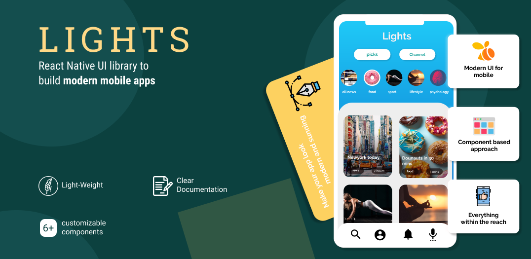
+ **6+** completely customizable components built and tested to ease your efforts.
+ Based on **Modern UI and UX trends**.
+ **Light-weight**
+ **Simple and clear** documentation with examples.
## Quick start
**Lights** is a library that's tested and built for you to develop modern mobile apps using React Native.
We give you modern and highly customizable general use components that you use in & out in all your projects.
## Installation
```javascript
yarn add react-native-lights
```
**OR**
```javascript
npm install --save react-native-lights
```
## Usage:
## BottomSheet
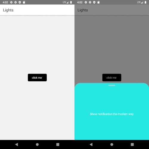
BottomSheet is the new modal window. BottomSheet component is a fully customizable component that **shows notifiation and alert message in apps.**
```javascript
import BottomSheet from "react-native-lights";
const BottomSheet = () => {
const data =
{
buttonText: 'click me',
buttonStyles:{borderRadius:5,backgroundColor:"black", buttonTextColor:"white"},
bottomSheetStyles:{backgroundColor:"#25e8e2" , textFontSize:15, textColor:"white"},
bodyText: 'Show notification the modern way',
}
return (
<View style={{flex:1}}
<BottomSheet data={data} />
</View>
);
};
```
### Example
## CardSlider
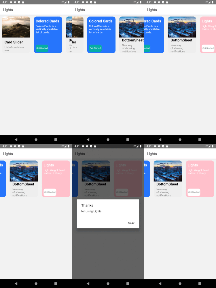
Pass in the array and have your card slider ready to use in your app.
```javascript
import CardSlider from "react-native-lights";
const CardSlider = () => {
const cardItems = [
{git
title: 'Card 1 ',
description: 'Include images to your card',
buttonTitle: 'Get Started',
backgroundImage: {uri:'https://i.imgur.com/2nCt3Sbl.jpg'},
buttonFunction: function(){
Alert.alert("Thank You", "for choosing Lights!", [{text:"Welcome"}])
}
},
{
title: 'Card 2',
description: 'You can choose to just have background color',
buttonTitle: 'Get Started',
backgroundColor: 'black',
},
{
title: 'Card 3 ',
description: 'onPress function is tagged to the image.',
buttonTitle: 'Get Started',
backgroundImage: {uri:'https://i.imgur.com/2nCt3Sbl.jpg'},
buttonFunction: function(){
Alert.alert("Thank You", "for choosing Lights!", [{text:"Welcome"}])
}
},
{
title: 'Card 2',
description: 'Lorem ipsum dolor sit amet et nuncat mergitur',
buttonTitle: 'Get Started',
backgroundImage:{uri:'https://i.imgur.com/KZsmUi2l.jpg'},
},
];
return (
<View style={{flex:1}}>
<CardSlider data={cardItems} />
</View>
);
};
```
### Example
<br />
## Input
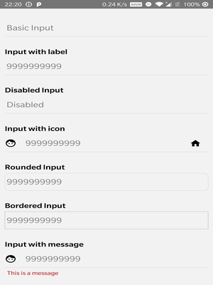
Different types of input with/without Icons can now be included with ease in your projects.
```javascript
import Input from "react-native-lights";
return (
<Input
placeholder="9999999999"
placeholderTextColor="#7d7d7d"
autoFocus={true}
maxLength={10}
keyboardType={"numeric"}
leftInputIcon={
<Icon
name="face"
size={25}
style={{ marginRight: 15 }}
/>
}
/>
);
};
```
<br />
### Example
To view complete documentation you can check out **[Lights documentation page](https://pipesort.github.io/1000lights-website/gettingStarted)**.
## How can I support Lights
+ Give us some :star2: stars
+ Follow us on [Twitter](https://twitter.com/pipesort)
+ Suggest new components, submit bugs and help us improve the library.
## Licence
ISC licence
## From Developers
Made with :heart: by Pipesort developers.