react-native-komect-uikit
Version:
React Native UI Toolkit
83 lines (71 loc) • 3.87 kB
Markdown
# `<TabView />` 标签页
TabView 组件定义一个标签页组件, 用于在一个页面上显示多个子页面, 通过页面底部的 TabBar 切换子页面。
## Props
| Prop | Type | Default | Note |
|---|---|---|---|
| [View props...](https://facebook.github.io/react-native/docs/view.html) | | | TabView 组件继承 View 组件的全部属性。
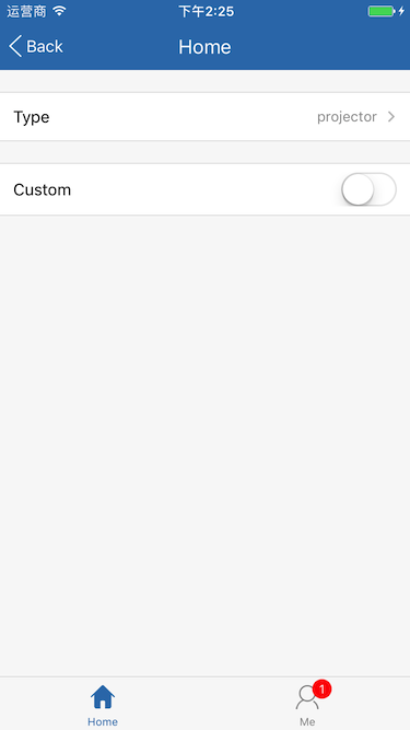
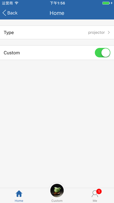
| type | string | 'projector' | 标签页类型。<br/>- projector: 幻灯机, 子页面使用[`<Projector />`](./Projector.md)组件渲染<br/>- carousel: 走马灯, 子页面使用[`<Carousel />`](./Carousel.md)组件渲染
| barStyle | 同View.style | | TabBar 工具条样式。
| activeIndex | number | 0 | 活动 Sheet 序号。
## Events
| Event Name | Returns | Notes |
|---|---|---|
| [View events...](https://facebook.github.io/react-native/docs/view.html) | | TabView 组件继承 View 组件的全部事件。
| onChange | index | 改变当前页面时调用, index 为当前 Sheet 序号。
## Static Props
| Prop | Type | Default | Note |
|---|---|---|---|
| [Sheet](#tabviewsheet--props) | class | | 标签页 Sheet 组件。
| [Button](#tabviewbutton--props) | class | | 标签页按钮组件。<br/>此组件由 Sheet 组件自动渲染, 无须代码显式声明, 但可以修改 TabView.Button 为自定义类以更改标签页按钮组件。
<!--
## Methods
None.
## Static Methods
None.
-->
## `<TabView.Sheet />` Props
| Prop | Type | Default | Note |
|---|---|---|---|
| type | string | 'sheet' | Sheet 类型。<br/>- sheet: 页面<br/>- button: 按钮
| title | string<br/>number<br/>element | | 标题, 可以是字符串、数字或 React Native 组件。
| icon | 同Image.source<br/>element | | 按钮图标, 可以是 Image.source 或 React Native 组件。
| activeIcon | 同Image.source<br/>element | | 激活状态按钮图标, 可以是 Image.source 或 React Native 组件。
| badge | string<br/>number<br/>element | | 徽章, 可以是字符串、数字或 React Native 组件, 为字符串、数字时使用 `<Badge />`组件渲染。
## `<TabView.Sheet />` Events
| Event Name | Returns | Notes |
|---|---|---|
| onPress | event | Sheet 按钮点击事件, 触摸结束时调用, 与 TouchableOpacity.onPress 一致。
## `<TabView.Button />` Props
| Prop | Type | Default | Note |
|---|---|---|---|
| [TouchableOpacity props...](https://facebook.github.io/react-native/docs/touchableopacity.html) | | | TabView.Button 组件继承 TouchableOpacity 组件的全部属性。
| title | string<br/>number<br/>element | | 标题, 可以是字符串、数字或 React Native 组件。
| titleStyle | 同Text.style | | 标题样式, 当 title 类型为 element 时无效。
| activeTitleStyle | 同Text.style | | 激活状态标题样式, 当 title 类型为 element 时无效。
| icon | 同Image.source<br/>element | | 按钮图标, 可以是 Image.source 或 React Native 组件。
| activeIcon | 同Image.source<br/>element | | 激活状态按钮图标, 可以是 Image.source 或 React Native 组件。
| badge | string<br/>number<br/>element | | 徽章, 可以是字符串、数字或 React Native 组件, 为字符串、数字时使用 [`<Badge />`](./Badge.md) 组件渲染。
| active | bool | false | 是否激活。
## Example
简单用法
```
<TabView style={{flex: 1}} type='projector'>
<TabView.Sheet
title='Home'
icon={require('../icons/home.png')}
activeIcon={require('../icons/home_active.png')}
>
<YourHomePage />
</TabView.Sheet>
<TabView.Sheet
title='Me'
icon={require('../icons/me.png')}
activeIcon={require('../icons/me_active.png')}
badge={1}
>
<YourMePage />
</TabView.Sheet>
</TabView>
```
## Screenshots