react-native-komect-uikit
Version:
React Native UI Toolkit
98 lines (84 loc) • 3.1 kB
Markdown
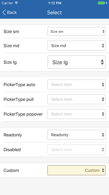
Select 组件定义一个选择框。
| Prop | Type | Default | Note |
|---|---|---|---|
| [TouchableOpacity props...](https://facebook.github.io/react-native/docs/touchableopacity.html) | | | Select 组件继承 TouchableOpacity 组件的全部属性。
| size | string | 'md' | 显示尺寸大小。<br/>- lg: 大<br/>- md: 中<br/>- sm: 小<br/>显示效果参见[Screenshots](
| value | any | | 当前选择的值, 可以是任何类型。
| valueStyle | 同Text.style | | 值显示样式。
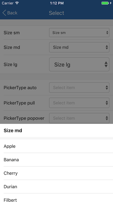
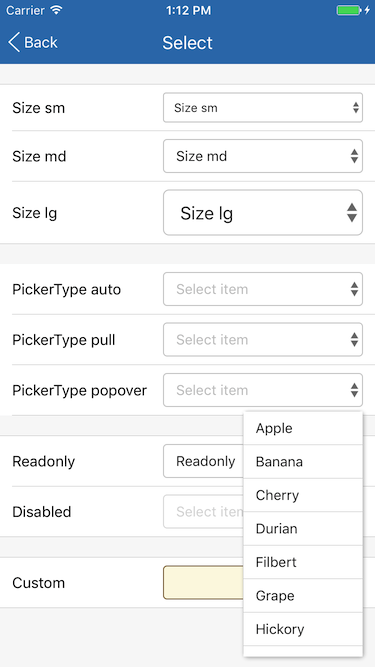
| items | array | | 可选择列表数组, 数组元素可以是任何类型。
| getItemValue | func | | 取 items 数组元素的 value 值, 传入参数为(item, index), item = items[index], 默认直接使用 item
| getItemText | func | | 取 items 数组元素的显示文本, 传入参数为(item, index), item = items[index], 默认直接使用 item
| pickerType | string | 'auto' | 选择器类型。<br/>- auto: 自动选择, 当设备为 Pad(宽和高均大于768)时使用 PopoverPicker, 否则使用 PullPicker<br/>- pull: PullPicker<br/>- popover: PopoverPicker
| pickerTitle | string | | PullPicker 选择器标题。
| editable | bool | true | 是否可编辑。
| iconTintColor | string | | 组件右侧指示图标颜色。
| placeholder | string | | 占位字符串, value 为空时显示此字符串。
| placeholderTextColor | string | | 占位字符串文本颜色。
| Event Name | Returns | Notes |
|---|---|---|
| [TouchableOpacity events...](https://facebook.github.io/react-native/docs/touchableopacity.html) | | Select 组件继承 TouchableOpacity 组件的全部事件。
| onSelected | (item, index) | 当选择器选择 items 数组某项时调用, item = items[index]。
<!--
None.
None.
None.
-->
简单用法
```
this.items = [
'Apple',
'Banana',
'Cherry',
'Durian',
'Filbert',
'Grape',
'Hickory',
'Lemon',
'Mango',
];
......
<Select
style={{width: 200}}
value={this.state.value}
items={this.items}
placeholder='Select item'
pickerTitle='Default'
onSelected={(item, index) => this.setState({value: item})}
/>
```
自定义
```
this.customItems = [
{
text: 'Long long long long long long long',
value: 1,
},
{
text: 'Short',
value: 2,
}
];
......
<Select
style={{width: 200, backgroundColor: '#fcf8e3', borderColor: '#8a6d3b'}}
value={this.state.valueCustom}
valueStyle={{flex: 1, color: '#8a6d3b', textAlign: 'right'}}
items={this.customItems}
getItemValue={(item, index) => item.value}
getItemText={(item, index) => item.text}
iconTintColor='#8a6d3b'
placeholder='Select item'
pickerTitle='Custom'
onSelected={(item, index) => this.setState({valueCustom: item.value})}
/>
```