react-native-komect-uikit
Version:
React Native UI Toolkit
33 lines (26 loc) • 1.72 kB
Markdown
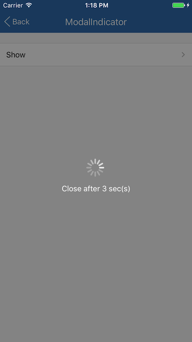
# `ModalIndicator{}` 模态指示器
ModalIndicator 为模态指示器静态类, 一般在需要阻止用户操作时使用, 比如提交数据等, 表现形式为一个覆盖全屏的模态指示器。<br/>ModalIndicator 基于 [Overlay{}](./Overlay.md) 实现。
## Static Methods
| Method | Params | Returns | Notes |
|---|---|---|---|
| [Overlay methods](./Overlay.md) | | | ModalIndicator 继承 Overlay 的全部静态方法。
| show | text | key | 显示一个弹出菜单, 重写 [Overlay{}](./Overlay.md) 中的同名函数, 输入参数 text 为模态指示器下显示的文本。<br/>返回唯一的浮层 key 值。
## Static Props
| Prop | Type | Default | Note |
|---|---|---|---|
| [IndicatorView](#modalindicatorindicatorview--props) | class | | ModalIndicator 内容显示组件。
## `<ModalIndicator.IndicatorView />` Props
| Prop | Type | Default | Note |
|---|---|---|---|
| [View props...](https://facebook.github.io/react-native/docs/view.html) | | | ModalIndicator.IndicatorView 组件继承 View 组件的全部属性。
| text | string<br/>number<br/>element | | 文本, 可以是字符串、数字或 React Native 组件。
| position | string | 'center' | 模态指示器显示位置。<br/>- top: 窗口靠上位置<br/>- bottom: 窗口靠下位置<br/>- center: 窗口中间位置<br/>top 、 bottom 位置可在 Theme 中设置。
| size | 同ActivityIndicator.size | 'large' | 模态指示器大小。
| color | 同ActivityIndicator.color | | 模态指示器颜色, 默认值在 Theme 中设置。
## Example
简单用法
```
ModalIndicator.show(`Modal indicator`);
```
## Screenshots