react-native-komect-uikit
Version:
React Native UI Toolkit
111 lines (94 loc) • 5.51 kB
Markdown
# `<ListRow />` 列表行
ListRow 组件用于显示一个列表行, 定义了一系列易于使用的元素属性, 使得可以快速开发出基于 ListView、ScrollView 的应用。
## Props
| Prop | Type | Default | Note |
|---|---|---|---|
| [TouchableOpacity props...](https://facebook.github.io/react-native/docs/touchableopacity.html) | | | ListRow 组件继承 TouchableOpacity 组件的全部属性。
| title | string<br/>number<br/>element | | 标题, 可以是字符串、数字或 React Native 组件。
| detail | string<br/>number<br/>element | | 详细内容, 可以是字符串、数字或 React Native 组件。
| titleStyle | 同Text.style | | 标题样式, 当 title 类型为 element 时无效。
| detailStyle | 同Text.style | | 详细内容样式, 当 detail 类型为 element 时无效。
| detailMultiLine | bool | | 详细内容是否支持多行,默认为 titlePlace = 'top' 时为 true, 否则为 false。
| icon | 同Image.source<br/>element | | 图标, 可以是 Image.source 或 React Native 组件, 如设置则显示在列表行左侧。
| accessory | string<br/>同Image.source<br/>element | 'auto' | 指示图标, 可以是 字符串、Image.source 或 React Native 组件, 如设置则显示在列表行右侧。<br/>- none: 无<br/>- auto: 自动, 当设置了 onPress 属性时为'indicator', 否则为'none'<br/>- empty: 空, 不显示指示图标, 但占用'check'或'indicator'大小的位置<br/>- check: 小勾图标, 一般用于表示该行已被选中<br/>- indicator: 大于号图标, 一般用于表示点击此行打开新页面<br>显示效果参见[Screenshots](#screenshots)。
| topSeparator | string<br/>element | 'none' | 上分隔线, 可以是字符串或 React Native 组件。<br/>- none: 无<br/>- full: 满行分隔线<br/>- indent: 缩进分隔线
| bottomSeparator | string<br/>element | 'indent' | 下分隔线, 可以是字符串或 React Native 组件。<br/>- none: 无<br/>- full: 满行分隔线<br/>- indent: 缩进分隔线
| titlePlace | string | 'left' | 标题位置。<br/>- none: 不显示标题<br/>- left: 标题显示在左侧<br/>- top: 标题显示在上侧<br>显示效果参见[Screenshots](#screenshots)。
| swipeActions | [element] | | 向左滑动时显示的操作按钮列表, 建议使用 [ListRow.SwipeActionButton](#listrowswipeactionbutton--props) 组件。
| activeOpacity | number | null | 继承自 TouchableOpacity 并修改默认值, 传入 onPress 时默认为 0.2, 否则为 1。
## Events
| Event Name | Returns | Notes |
|---|---|---|
| [TouchableOpacity events...](https://facebook.github.io/react-native/docs/touchableopacity.html) | | ListRow 组件继承 TouchableOpacity 组件的全部事件。
## Static Props
| Prop | Type | Default | Note |
|---|---|---|---|
| [SwipeActionButton](#listrowswipeactionbutton--props) | class | | 滑动按钮组件。
## `<ListRow.SwipeActionButton />` Props
| Prop | Type | Default | Note |
|---|---|---|---|
| [TouchableOpacity props...](https://facebook.github.io/react-native/docs/touchableopacity.html) | | | SwipeActionButton 组件继承 TouchableOpacity 组件的全部属性。
| type | string | 'default' | 显示样式类型。<br/>- default: 默认- danger: 危险
| title | string<br/>number<br/>element | | 标题, 可以是字符串、数字或 React Native 组件。
| titleStyle | 同Text.style | | 标题样式, 当 title 类型为 element 时无效。
## `<ListRow.SwipeActionButton />` Events
| Event Name | Returns | Notes |
|---|---|---|
| [TouchableOpacity events...](https://facebook.github.io/react-native/docs/touchableopacity.html) | | SwipeActionButton 组件继承 TouchableOpacity 组件的全部事件。
<!--
## Methods
None.
## Static Methods
None.
-->
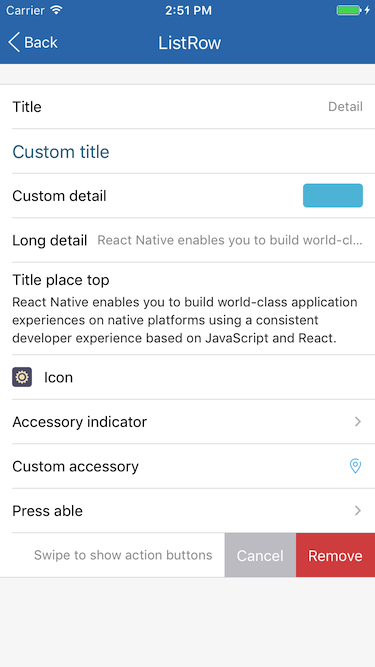
## Example
简单用法
```
<ListRow title='Title' detail='Detail' />
```
自定义 title
```
<ListRow title='Custom title' titleStyle={{fontSize: 18, color: '#31708f'}} />
<ListRow title={<Label style={{fontSize: 18, color: '#31708f'}} text='Custom title' />} />
```
自定义 detail
```
<ListRow title='Custom detail' detail='This is detail' detailStyle={{fontSize: 15, color: '#31708f'}} />
<ListRow title='Custom detail' detail={
<View style={{backgroundColor: '#5bc0de', width: 60, height: 24, borderRadius: 4}} />
} />
```
detail 长文本、标题显示在上侧
```
<ListRow title='Long detail' detail={
'React Native enables you to build world-class application experiences on native platforms using a consistent developer experience based on JavaScript and React.'
} />
<ListRow title='Title place top' detail={
'React Native enables you to build world-class application experiences on native platforms using a consistent developer experience based on JavaScript and React.'
} titlePlace='top' />
```
显示图标
```
<ListRow title='Icon' icon={require('../icons/config.png')} />
```
大于号指示图标、自定义指示图标
```
<ListRow title='Accessory indicator' accessory='indicator' />
<ListRow title='Custom accessory' accessory={<Image source={require('../icons/location.png')} />} />
```
可点击行
```
<ListRow title='Press able' onPress={() => alert('Press!')} />
```
滑动操作按钮
```
<ListRow
title='Swipe able'
swipeActions={[
<ListRow.SwipeActionButton title='Cancel' />,
<ListRow.SwipeActionButton title='Remove' type='danger' onPress={() => alert('Remove')}/>,
]}
/>
```
## Screenshots