react-native-komect-uikit
Version:
React Native UI Toolkit
76 lines (61 loc) • 2.14 kB
Markdown
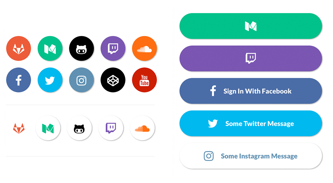
```js
import { SocialIcon } from 'react-native-elements'
// Icon
<SocialIcon
type='twitter'
/>
<SocialIcon
raised={false}
type='gitlab'
/>
<SocialIcon
light
type='medium'
/>
<SocialIcon
light
raised={false}
type='medium'
/>
// Button
<SocialIcon
title='Sign In With Facebook'
button
type='facebook'
/>
<SocialIcon
title='Some Twitter Message'
button
type='twitter'
/>
<SocialIcon
button
type='medium'
/>
<SocialIcon
button
light
type='instagram'
/>
```
#### SocialIcon props
| prop | default | type | description |
| ---- | ---- | ----| ---- |
| title | none | string | title if made into a button (optional) |
| type | none | social media type (facebook, twitter, google-plus-official, pinterest, linkedin, youtube, vimeo, tumblr, instagram, quora, foursquare, wordpress, stumbleupon, github, github-alt, twitch, medium, soundcloud, gitlab, angellist, codepen) | social media type (required) |
| raised | true | boolean | raised adds a drop shadow, set to false to remove |
| button | false | boolean | creates button (optional) |
| onPress | none | function | onPress method (optional) |
| onLongPress | none | function | onLongPress method (optional) |
| light | false | boolean | reverses icon color scheme, setting background to white and icon to primary color |
| iconStyle | none | object (style) | extra styling for icon component (optional) |
| style | none | object (style) | button styling (optional) |
| iconColor | white | string | icon color (optional) |
| iconSize | 24 | number | icon size (optional) |
| component | TouchableHighlight | React Native Component | type of button (optional) |
| fontFamily | System font bold (iOS), Sans Serif Black (android) | string | specify different font family (optional) |
| fontWeight | bold (ios), black(android) | string | specify font weight of title if set as a button with a title |
| fontStyle | none | object (style) | specify text styling (optional) |
| disabled | false | boolean | disable button (optional) |
| loading | false | boolean | shows loading indicator (optional) |