react-native-komect-uikit
Version:
React Native UI Toolkit
71 lines (61 loc) • 4.27 kB
Markdown
# `Toast{}` 轻提示
Toast 为轻提示静态类, 与 Android 的 Toast 作用类似, 使用纯 JS 编写, 在 iOS 与 Android 下有同样的显示效果。<br/>Toast 基于 [Overlay{}](./Overlay.md) 实现。
## Static Methods
| Method | Params | Returns | Notes |
|---|---|---|---|
| [Overlay methods](./Overlay.md) | | | Toast 继承 Overlay 的全部静态方法。
| show | options | key | 显示一个轻提示, 重写 [Overlay{}](./Overlay.md) 中的同名函数, 输入参数 options 为 duration 与 [ToastView](#toasttoastview--props) 的属性合集, 返回唯一的浮层 key 值。<br/>**一般不直接调用此函数**
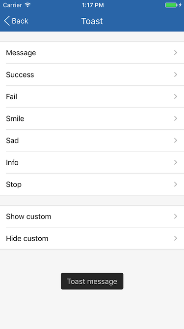
| message | text, duration, position | key | 显示一个纯文本轻提示框。<br/>duration 默认为 'short', position 默认为 'bottom' 。<br/>默认值可通过 Toast.messageDefaultDuration 、 Toast.messageDefaultPosition 修改。
| success | text, duration, position | key | 显示一个成功轻提示框, 提示框中有一个打勾图标。<br/>duration 默认为 'short', position 默认为 'center' 。<br/>默认值可通过 Toast.defaultDuration 、 Toast.defaultPosition 修改。<br/>**下同**
| fail | text, duration, position | key | 显示一个失败轻提示框, 提示框中有一个打叉图标。
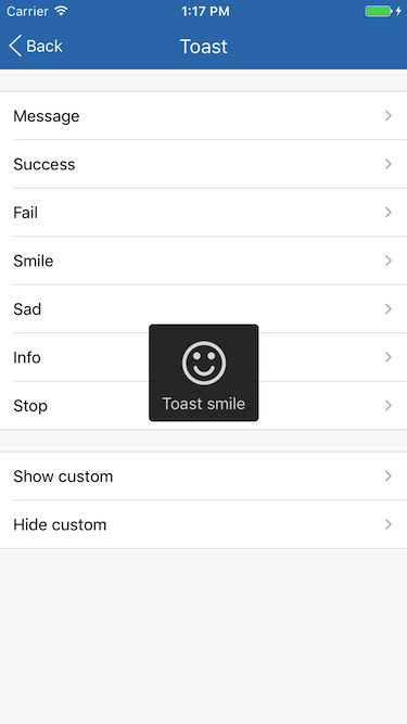
| smile | text, duration, position | key | 显示一个笑脸轻提示框, 提示框中有一个笑脸表情图标。
| sad | text, duration, position | key | 显示一个难过轻提示框, 提示框中有一个难过表情图标。
| info | text, duration, position | key | 显示一个信息轻提示框, 提示框中有一个 Info 图标。
| stop | text, duration, position | key | 显示一个停止轻提示框, 提示框中有一个图标。
## Static Props
| Prop | Type | Default | Note |
|---|---|---|---|
| [ToastView](#toasttoastview--props) | class | | Toast 内容显示组件。
| defaultDuration | string | 'short' | success, fail, smile, sad, info, stop 函数的 duration 参数默认值, 轻提示框显示时长。<br/>- short: 2000 毫秒<br/>- long: 3500毫秒
| defaultPosition | string | 'center' | success, fail, smile, sad, info, stop 函数的 position 参数默认值, 轻提示框显示位置。参见 [Toast.ToastView](#toasttoastview--props)。
| messageDefaultDuration | string | 'short' | message 函数的 duration 参数默认值。
| messageDefaultPosition | string | 'bottom' | message 函数的 position 参数默认值。
## `<Toast.ToastView />` Props
| Prop | Type | Default | Note |
|---|---|---|---|
| [View props...](https://facebook.github.io/react-native/docs/view.html) | | | Toast.ToastView 组件继承 View 组件的全部属性。
| text | string<br/>number<br/>element | | 轻提示文本, 可以是字符串、数字或 React Native 组件。
| icon | string<br/>同Image.source<br/>element | | 图标, 可以是 string 枚举、 Image.source 或 React Native 组件。<br/>- none: 无图标<br/>- success: 成功, 打勾图标<br/>- fail: 失败, 打叉图标<br/>- smile: 笑脸表情图标<br/>- sad: 难过表情图标<br/>- info: 信息, 圆圈里一个字母 "i"<br/>- stop: 停止, 圆圈里一个感叹号 "!"
| position | string | 'center' | 轻提示框显示位置。<br/>- top: 窗口靠上位置<br/>- bottom: 窗口靠下位置<br/>- center: 窗口中间位置<br/>top 、 bottom 位置可在 Theme 中设置。
## Example
简单用法
```
Toast.message('Toast message');
Toast.success('Toast success');
Toast.fail('Toast fail');
Toast.smile('Toast smile');
Toast.sad('Toast sad');
Toast.info('Toast info');
Toast.stop('Toast stop');
```
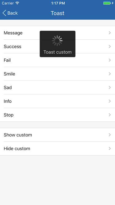
自定义
```
static customKey = null;
showCustom() {
if (ToastExample.customKey) return;
ToastExample.customKey = Toast.show({
text: 'Toast custom',
icon: <ActivityIndicator size='large' color={Theme.toastIconTintColor} />,
position: 'top',
duration: 1000000,
});
}
hideCustom() {
if (!ToastExample.customKey) return;
Toast.hide(ToastExample.customKey);
ToastExample.customKey = null;
}
```
## Screenshots