react-native-komect-uikit
Version:
React Native UI Toolkit
91 lines (80 loc) • 4.08 kB
Markdown
# `<SegmentedBar />` 分段工具条
SegmentedBar 组件定义一个分段工具条组件, 与 [`<Carousel />`](./Carousel.md) 或 [`<Projector />`](./Projector.md) 搭配使用可实现同一页面中多项内容分段显示。
## Props
| Prop | Type | Default | Note |
|---|---|---|---|
| [View props...](https://facebook.github.io/react-native/docs/view.html) | | | SegmentedBar 组件继承 View 组件的全部属性。
| justifyItem | string | 'fixed' | Item 排列模式。<br/>- fixed: 固定位置等宽排列<br/>- scrollable: 可滚动,Item 数量较多一屏显示不下时使用这种模式
| indicatorType | string | 'itemWidth' | 激活指示器类型。<br/>- none: 无<br/>- boxWidth: 等分区间宽度<br/>- itemWidth: Item 内容宽度
| indicatorPosition | string | 'bottom' | 激活指示器位置。<br/>- top: 上方<br/>- bottom: 下方
| indicatorLineColor | string | | 激活指示器颜色,默认值在 Theme 中设置。
| indicatorLineWidth | number | | 激活指示器线宽度,默认值在 Theme 中设置。
| indicatorPositionPadding | number | | 激活指示器与上边界或下边界的距离,默认值在 Theme 中设置。
| animated | bool | true | 改变激活 Item 时是否有动画效果。
| autoScroll | bool | true | 是否自动滚动激活 Item 到容器中间,仅 justifyItem 为 'scrollable' 时有效。
| activeIndex | number | | 激活 Item 序号。
## Events
| Event Name | Returns | Notes |
|---|---|---|
| [View events...](https://facebook.github.io/react-native/docs/view.html) | | SegmentedBar 组件继承 View 组件的全部事件。
| onChange | index | 改变激活 Item 时调用, index 为当前 Item 序号。
## Static Props
| Prop | Type | Default | Note |
|---|---|---|---|
| [Item](#segmentedbaritem--props) | class | | 分段工具条组件 Item 组件。
<!--
## Methods
None.
## Static Methods
None.
-->
## `<SegmentedBar.Item />` Props
| Prop | Type | Default | Note |
|---|---|---|---|
| [View props...](https://facebook.github.io/react-native/docs/view.html) | | | SegmentedBar.Item 组件继承 View 组件的全部属性。
| title | string<br/>number<br/>element | | 标题, 可以是字符串、数字或 React Native 组件。
| titleStyle | 同Text.style | | 标题样式, 当 title 类型为 element 时无效。
| activeTitleStyle | 同Text.style | | 激活状态标题样式, 当 title 类型为 element 时无效。
| badge | string<br/>number<br/>element | | 徽章, 可以是字符串、数字或 React Native 组件, 为字符串、数字时使用 [`<Badge />`](./Badge.md) 组件渲染。
| active | bool | false | 是否激活。
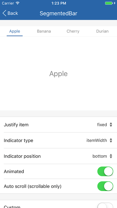
## Example
简单用法
```
<SegmentedBar>
<SegmentedBar.Item title='Apple' />
<SegmentedBar.Item title='Banana' />
<SegmentedBar.Item title='Cherry' />
<SegmentedBar.Item title='Durian' />
</SegmentedBar>
```
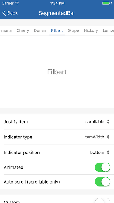
可滚动 Item 列表
```
<SegmentedBar justifyItem='scrollable'>
<SegmentedBar.Item title='Apple' />
<SegmentedBar.Item title='Banana' />
<SegmentedBar.Item title='Cherry' />
<SegmentedBar.Item title='Durian' />
<SegmentedBar.Item title='Filbert' />
<SegmentedBar.Item title='Grape' />
<SegmentedBar.Item title='Hickory' />
<SegmentedBar.Item title='Lemon' />
<SegmentedBar.Item title='Mango' />
</SegmentedBar>
```
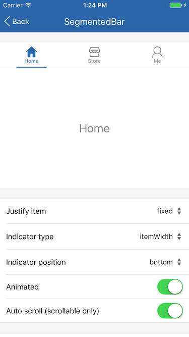
自定义 Item
```
<SegmentedBar justifyItem='scrollable'>
<View style={{padding: 8}} pointerEvents='none'>
<TabView.Button title='Home' icon={require('../icons/home.png')} />
</View>
<View style={{padding: 8}} pointerEvents='none'>
<TabView.Button title='Store' icon={require('../icons/store.png')} />
</View>
<View style={{padding: 8}} pointerEvents='none'>
<TabView.Button title='Me' icon={require('../icons/me.png')} />
</View>
</SegmentedBar>
```
## Screenshots