react-native-key-value-pair-view
Version:
Key Value Pair View for React Native
125 lines (81 loc) • 4.92 kB
Markdown
# Are you looking for "React" component?
[react-key-value-pair-view](https://www.npmjs.com/package/react-key-value-pair-view)
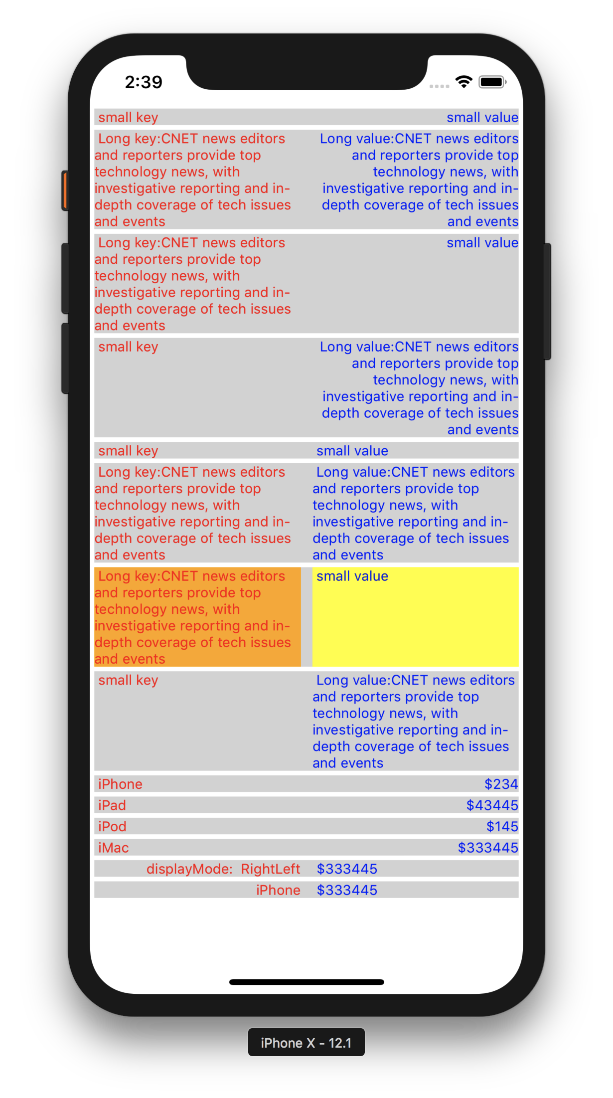
# React Native - Output
# Usage
## Global Config can be applied to the App.
*You could use the KeyValuePairView with the same UI appearance & style in the entire App. In that case you could just use this below global config, that will apply to all KeyValuePairView component. You could use the "isDebugging" for seeing the key,value boxes with background colors.*
import KeyValuePairView from 'react-native-key-value-pair-view'
// will apply the background color to see the key box, value box, container box. So that debugging is easy.
KeyValuePairView.isDebugging = true
// Available Display Modes
LeftRight,
LeftLeft,
RightLeft,
RightRight
// will set the default display mode
KeyValuePairView.defaultDisplayMode = KeyValuePairView.DisplayMode.LeftRight//LeftLeft//RightLeft//RightRight
// will set the default key value gap
KeyValuePairView.defaultKeyValueGap = 5
// will set the default vertical gap between 2 adjuscent KeyValuePairView
KeyValuePairView.defaultSiblingGapVertical = 2
// will set the default left right gap to KeyValuePairView
KeyValuePairView.defaultSiblingGapHorizontal = 4
// will set the default key box background color
KeyValuePairView.defaultKeyBoxBackgroundColor = "#d2d2d2"
// will set the default value box background color
KeyValuePairView.defaultValueBoxBackgroundColor = "#d2d2d2"
// will set the default root container/gap box background color
KeyValuePairView.defaultKeyValueBoxContainerBackgroundColor = "#d2d2d2"
// will set default styles for Key Text, should be an array
KeyValuePairView.defaultKeyStyles = [{ color: 'red', fontSize: 12 }]
// will set default styles for Value Text, should be an array
KeyValuePairView.defaultValueStyles = [{ color: 'blue', fontSize: 12 }]
----
----
## Key value displaying
<KeyValuePairView keyData="Email" valueData="Vijay.Apple.Dev@gmail.com"/>
<KeyValuePairView keyData="Phone" valueData="+91 9585185595"/>
<KeyValuePairView keyData="Full Stack Developer" valueData="http://fullstackdeveloper-vijay.blogspot.com"/>
<KeyValuePairView keyData="iOS Developer" valueData="http://vijay-apple-dev.blogspot.com"/>
## Handling Touch Event
<KeyValuePairView id="KeyValuePairView1" payload="extra payload string or object" onKeyValueBoxAction={this.keyValueBoxPressed} keyData="iOS Developer" valueData="http://vijay-apple-dev.blogspot.com"/>
// handling touch action in your component
keyValueBoxPressed = (data) => {
const { id, payload, keyData, valueData } = data;
// id = KeyValuePairView1
// payload = extra payload string or object
// keyData = iOS Developer
// valueData = http://vijay-apple-dev.blogspot.com
};
----
## Note on Style props
*All style props should be passed in Array format, refer the below "keyStyles", to an example.*
<KeyValuePairView keyData="iPhone" valueData="$343" displayMode="RightLeft" keyValueGap={40} keyStyles={[{color:"red"}]}/>
## Note on KeyValuePairView Parent
*"KeyValuePairView" Parent's & Ancestors style should have flex:1 to make KeyValuePairView as flexible*
## Pass My custom Key/Value component
<KeyValuePairView leftChild={<Text>iPhone</Text>} valueData="$343"/>
<KeyValuePairView keyData="iPhone" rightChild={<Text>$343</Text>}/>
*if you pass your custom component to either key or value, then you are having full control on it, like adding action, etc., Don't forget to style the "textAlign" based on your needs inside your custom component.*
## Available props
id, // specific id to this KeyValuePairView
payload, // extra data to receive while touch action, can be anything, string or object
keyBoxStyles = [],
valueBoxStyles = [],
keyStyles = [],
valueStyles = [],
keyValueBoxStyles = [],
keyData,// Key text
valueData, // Value text
leftChild, // Custom key component
rightChild, // Custom value component
keyValueGap = KeyValuePairView.defaultKeyValueGap,// Gap between Key & Value Boxes
siblingGapVertical = KeyValuePairView.defaultSiblingGapVertical//Top Bottom gap,
siblingGapHorizontal = KeyValuePairView.defaultSiblingGapHorizontal,// Left Right gap
keyBoxPercent = 50,// Key box space in percentage
valueBoxPercent = 50,// Value box space in percentage
displayMode = KeyValuePairView.defaultDisplayMode// Display mode "RightLeft","LeftRight",etc.,
onKeyValueBoxAction, // callback function to receive touch event
## Issues / Improvements
You could contact me at Vijay.Apple.Dev.com