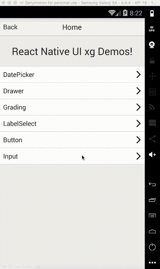
react-native-input-xg
Version:
react native input component for both Android and IOS, useing pure JavaScript
30 lines (24 loc) • 1.44 kB
Markdown
### The react-native-input-xg
* react native Input component for both Android and iOS based on pure JavaScript
### Main
* This component provide some more functions besides the basic input RN provided
### Properties
* Besides the basic properties RN provided, we also provide belows:
### Properties
| Prop | Default | Type | Description |
| :------------ |:---------------:| :---------------:| :-----|
| label | undefined | `string` | Specify the label of the input |
| defaultValue | undefined | `string` | Specify the default value of the input |
| editable | true | `bool` | if you can edit the input|
| multiline | false | `bool` | if the input support the multiline|
| error | false | `bool` | for you to judge if the content is wrong |
| required| false | `bool` | give you an indicate to show this one is a must |
| tips | undefined | `string` | give some more explanation |
| wrapperStyle | - | `style` | Specify the wrapper style |
| focusStyle | - | `style` | Specify the style when focus |
| disabledStyle | - | `style` | Specify the style when disabled|
| errorStyle | - | `style` | Specify the style when there's some error|
| labelStyle | - | `style` | Specify the label style|
| initJudge | true | `bool` | if judge error when init|
| readOnly | false | `bool` | you can only see but can not operate|