react-native-hook-form-view
Version:
React Native Form component that leverage on react-hook-form feature
664 lines (527 loc) • 19.1 kB
Markdown
# React Native Hook Form View
This component is high level component that leverage features of [react-hook-form](https://react-hook-form.com/). The objective of this component is to helps developer to create form in React Native/Web easily.
**Highlight**
1. Customizable style & view
2. Easy form validation (leverage on react-hook-form)
3. Support React Native Web
# Table of contents
- [Installation](#installation)
- [Getting Started](#getting-started)
- [Simple Usage](#simple-usage)
- [Advanced Usage](#advanced-usage)
- [Props](#props)
- [Future Roadmap](#future-roadmap)
- [Changelog](#changelog)
# Installation
```bash
# using yarn
yarn add react-native-hook-form-view
# using npm
npm install react-native-hook-form-view
```
# Getting Started
## Simple Usage
```TypeScript
import React, { useRef } from "react";
import { TextInput, Button } from "react-native";
import { Form, FormItem, FormRefProps, Submit } from "react-native-hook-form-view";
const Example: React.FC = () => {
// create ref
// NOTE: `formRef` previously used for form submission purpose,
// since v0.0.3 can use `Submit` component within `Form`
const formRef = useRef<FormRefProps>();
// =============== EVENTS
const onSubmit = (values: any) => {
// do something with `values`
}
// =============== VIEW
return (
<Form
// NOTE: `formRef` previously used for form submission purpose,
// since v0.0.3 can use `Submit` component within `Form`
ref={formRef}
onSubmit={onSubmit}
>
<FormItem
label="First Name"
name="firstName"
rules={{
required: "First name is required"
}}
caption="some caption to highlight"
render={({ field: { onChange, value } }) => (
<TextInput value={value} onChangeText={onChange} />
)}
/>
<FormItem
label="Custom Field"
name="custom"
rules={{
required: "Custom field is required"
}}
render={({ field: { onChange, value } }) => (
// render custom component to handle value, onChange, onBlur, etc manually
<TextInput value={value} onChangeText={onChange} />
)}
/>
{/* legacy usage, can use `Submit` component */}
<Button
title="Submit"
onPress={() => formRef.current?.submit()}
/>
{/* latest usage since v0.0.3 */}
<Submit
title="Custom Text"
/>
</Form>
);
};
```
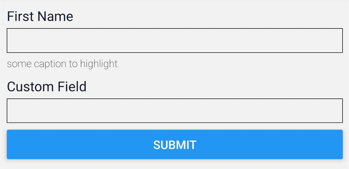
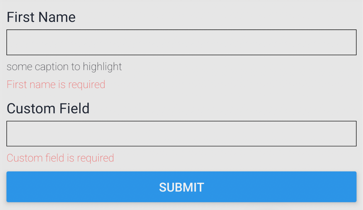
Below is the preview of above example
| Normal | Validated |
| ------------------------------------------------------------------------------------------------------------ | -------------------------------------------------------------------------------------------------------------------------- |
|  |  |
## Advanced Usage
- [Validation with `yup`](#validation-with-yup)
- [Custom Styling / View](#custom-styling--view-configuration)
- [Custom Styling](#custom-styling)
- [Custom View](#custom-view)
- [Custom View (render function)](#custom-view-render-function)
- [Access form instance](#access-form-instance)
### Validation with `yup`
Prerequisite: Install packages to your project with command below
```bash
# yarn
yarn add yup @hookform/resolvers
# npm
npm install yup @hookform/resolvers
```
Always refer to offical documentation for more advanced usage & details. The example below will just be showing minimal working example of how to validate your form with `yup`.
1. For `react-hook-form` resolvers, please refer to [offical github](https://github.com/react-hook-form/resolvers#quickstart)
2. For `yup` validation API please refer to [official github](https://github.com/jquense/yup#usage)
```TypeScript
import React from "react";
import * as yup from 'yup';
import { useForm } from "react-hook-form";
import { TextInput, View } from "react-native";
import { yupResolver } from '@hookform/resolvers/yup';
import { Form, FormItem, Submit } from "react-native-hook-form-view";
type InputPayload = {
email: string;
password: string;
}
// create your validation schema
const schema = yup.object().shape({
email: yup.string().required('Email is required').email("Invalid email address"),
password: yup.string().required('Password is required').min(8, "Minimum length is 8 charactors")
});
const SignInForm: React.FC = () => {
// =============== EVENTS
const onSubmit = (values: InputPayload) => {
// do somethoing with `values`
}
// =============== VIEW
return (
<Form<any, InputPayload>
options={{
resolver: yupResolver(schema)
}}
onSubmit={onSubmit}
>
<FormItem
label="Email Address"
name="email"
render={({ field: { onChange, value } }) => (
<TextInput value={value} onChangeText={onChange} />
)}
/>
<FormItem
label="Password"
name="password"
render={({ field: { onChange, value } }) => (
<TextInput secureTextEntry value={value} onChangeText={onChange} />
)}
/>
{/* latest usage since v0.0.3 */}
<Submit />
</Form>
);
};
```
### Custom Styling / View Configuration
The component has come with default styling but if you want to customize the styling or view you're able to do so.
Just wrapped your component with `NativeFormViewProvider` (usually put at entry file eg: app.tsx).
You may refer the section below for more information with examples
- [Custom Styling](#custom-styling)
- [Custom View](#custom-view)
- [Custom View (render function)](#custom-view-render-function)
Just for your information, the priority of how style being take place would be
```
Custom View (render function) > Custom Styling > Custom View
```
Note: Please refer the table below for description & style for each view
<table width="100%">
<tr><td> View </td> <td> Description </td><td> Style Type </td><td> Default Style </td><td>Release</td></tr>
<tr>
<td> container </td>
<td> Form container </td>
<td> ViewStyle </td>
<td>
```css
padding: 8px;
```
</td>
<td>
v0.0.0
</td>
</tr>
<tr>
<td> item </td>
<td> Form item container </td>
<td> ViewStyle </td>
<td>
```css
padding: 8px;
```
</td>
<td>
v0.0.0
</td>
</tr>
<tr>
<td> label </td>
<td> Form item label text view </td>
<td> TextStyle </td>
<td>
```css
color: #111827;
font-weight: 400;
font-size: 16px;
margin-bottom: 4px;
```
</td>
<td>
v0.0.0
</td>
</tr>
<tr>
<td> caption </td>
<td> Form item caption text view </td>
<td> TextStyle </td>
<td>
```css
color: #3f3f46;
font-weight: 200;
font-size: 12px;
margin-top: 4px;
```
</td>
<td>
v0.0.0
</td>
</tr>
<tr>
<td> error </td>
<td> Form item error text view </td>
<td> TextStyle </td>
<td>
```css
color: #f87171;
font-weight: 200;
font-size: 12px;
margin-top: 4px;
```
</td>
<td>
v0.0.0
</td>
</tr>
<tr>
<td> submit </td>
<td> Submit Button</td>
<td> ViewStyle </td>
<td>
```css
margin-top: 4px;
background-color: #0ea5e9;
padding-vertical: 12px;
padding-horizontal: 32px;
```
</td>
<td>
v0.0.3
</td>
</tr>
</table>
#### The layout structure
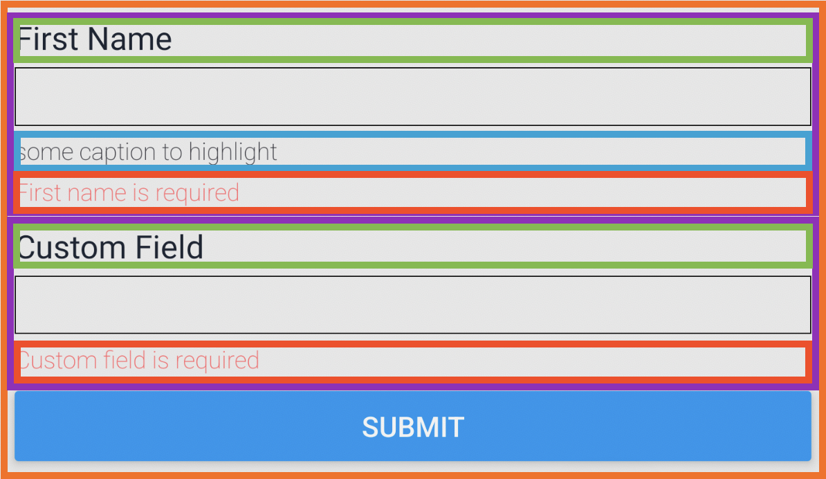
- Orange: `container` / `renderContainer`
- Purple: `item` / `renderItem`
- Green: `label` / `renderLabel`
- Cyan: `caption` / `renderCaption`
- Red: `error` / `renderError`
- Blue Button `submit` / `renderSubmit` (added on v0.0.3)
#### Custom styling
Please be aware that if you specified any style for particular view just like example below, it will actually overwrite its default styling.
```TypeScript
import { NativeFormViewProvider } from 'react-native-hook-form-view';
const YourApp: React.FC = () => {
return (
<NativeFormViewProvider
styles={{
container: {
backgroundColor: '#0ea5e9',
},
item: {
backgroundColor: '#38bdf8',
padding: 4,
},
label: {
backgroundColor: '#7dd3fc',
},
caption: {
backgroundColor: '#bae6fd',
},
error: {
backgroundColor: '#e0f2fe',
},
submit: { // added on v0.0.3
backgroundColor: '#ef4444',
}
}}
>
{/* YOUR COMPONENT*/}
</NativeFormViewProvider>
);
};
```
#### Custom View
You can have your preferred custom component for specific view. For example below I'll be using [styled-components](https://styled-components.com/docs/basics#react-native) as my custom component
```TypeScript
import styled from 'styled-components/native';
import { NativeFormViewProvider } from 'react-native-hook-form-view';
export const CustomFormContainer = styled.View`
padding: 8px;
background-color: grey;
margin-bottom: 8px;
`;
export const CustomFormItemWrapper = styled.View`
margin-bottom: 8px;
background-color: yellow;
`;
export const CustomFormItemLabel = styled.Text`
background-color: green;
font-weight: 600;
font-size: 16px;
margin-bottom: 4px;
`;
export const CustomFormItemCaption = styled.Text`
background-color: blue;
padding: 4px;
color: white;
font-weight: 200;
font-size: 12px;
`;
export const CustomFormItemError = styled.Text`
background-color: #dc2626;
padding: 4px
font-weight: 200;
font-size: 12px;
color: white;
`;
export const CustomSubmitButton = (props) => {
// please use `onPress` from `props` in order to trigger form submission
// or use `useNativeFormContext`, check out "Access form context" for more info
return (
<Pressable {...props} style={{ backgroundColor: "red", padding: 20 }}>
<Text>Submit</Text>
</Pressable>
);
};
const YourApp: React.FC = () => {
return (
<NativeFormViewProvider
container={CustomFormContainer}
item={CustomFormItemWrapper}
label={CustomFormItemLabel}
caption={CustomFormItemCaption}
error={CustomFormItemError}
submit={CustomSubmitButton} // added on v0.0.3
>
{/* YOUR COMPONENT*/}
</NativeFormViewProvider>
);
};
```
#### Custom View (render function)
In certain extends you might want to have custom view rendering whenever form/field state changes. For example: The field has red border when validation failed.
```TypeScript
import { NativeFormViewProvider } from 'react-native-hook-form-view';
const YourApp: React.FC = () => {
return (
<NativeFormViewProvider
renderContainer={({ props, formState }) => {
return (
<View style={{ backgroundColor: '#38bdf8' }}>
{props.children}
</View>
);
}}
renderItem={({ props, fieldState }) => {
return (
<View
style={{
borderWidth: fieldState.invalid ? 1 : undefined,
borderColor: fieldState.invalid ? 'red' : undefined,
marginBottom: 16,
}}
>
{props.children}
</View>
);
}}
renderLabel={({ props, fieldState }) => {
return (
<Text style={{ backgroundColor: '#bae6fd' }}>
{props.children}
</Text>
);
}}
renderCaption={({ props, fieldState }) => {
return (
<Text style={{ backgroundColor: '#e0f2fe' }}>
{props.children}
</Text>
);
}}
renderError={({ props, fieldState }) => {
return (
<Text style={{ backgroundColor: '#f0f9ff' }}>
{props.children}
</Text>
);
}}
renderSubmit={({ props, formState }) => { // added on v0.0.3
return (
<Button color="#dc2626" title="Submit" disabled={formState.isSubmitting} />
);
}}
>
{/* YOUR COMPONENT*/}
</NativeFormViewProvider>
);
};
```
### Access form context
In some case, you might want to access `form` context in certain extends. The usual way would be passing it as props to the component, but things get complicated & very hard to debug when it deep nested.
By `useNativeFormContext` hook, you're able to access it with ease.
```TypeScript
import { useForm } from "react-hook-form";
import { TextInput, View, Text } from "react-native";
const YourComponent: React.FC = () => {
const {
form, // current form context
submit, // added on v0.0.4, for form submission
} = useNativeFormContext();
// example to add form submission triggering
const triggerSubmitAnywhere = () => {
submit()
}
// do something with the variables above
return (
<View>
<Button title="Do submission from this component" onPress={triggerSubmitAnywhere}>
<View>
);
};
```
**Note:** By using `useNativeFormContext` hook, please make sure your component is wrapped under `Form` or `NativeFormContextProvider` else you will get error.
# Props
## Form
| Props | Type | Value | Description |
| ---------- | -------------------- | ----- | ----------------------------------------------------------------------- |
| `ref` | React Ref (optional) | - | Ref to control form |
| `options` | object (optional) | - | Form options (checkout [here](https://react-hook-form.com/api/useform)) |
| `onSubmit` | function (optional) | - | Callback function that return form values upon submit |
## FormItem
| Props | Type | Value | Description |
| ----------------------- | ---------------------------------------------------------------------------------- | ----- | ------------------------------------------------------------------------------------------------------------------------------- |
| `name` | string | - | The input name |
| `label` | string (optional) | - | The label name for the input |
| `caption` | string (optional) | - | Caption of the input |
| `control` | [Control](https://react-hook-form.com/api/usecontroller/controller#main)(optional) | - | This object contains methods for registering components into React Hook Form. |
| `rules` | object (optional) | - | Validation rules. Checkout [here](https://react-hook-form.com/api/useform/register#options) |
| `disabled` | boolean (optional) | false | To disabled input (only works if input component has `disabled` / `editable` props existed) |
| `initialValue` | unknown (optional) | - | initial value (take note on [`defaultValue`](https://react-hook-form.com/api/usecontroller) ) |
| `render` | function (optional) | - | A function that returns a React element (checkout `render` in [here](https://react-hook-form.com/api/usecontroller/controller)) |
| `constructErrorMessage` | function (optional) | - | function to contruct error message |
## NativeFormViewProvider
Checkout the example as it shown all available props
- [Custom Styling](#custom-styling)
- [Custom View](#custom-view)
- [Custom View (render function)](#custom-view-render-function)
# Future Roadmap
In near future, will support more preset input from React Native by default. Ideally just passing `type` as one of the props from `FormItem`.
```TypeScript
import { FormItem } from 'react-native-hook-form-view';
<FormItem type="input" name="firstName" />
<FormItem type="date" name="dob" />
<FormItem type="textarea" name="description" />
```
- [ ] TextInput
- [ ] DateInput
- [ ] Checkbox
- [ ] TextArea
- [ ] Switch
- [ ] Fields definition with Object
- etc
# Changelog
### 0.0.5
- upgrade from React 17 to React 18 & all dependencies
- add comments to code & update coding practices
### 0.0.4
- add custom inline style for `style`, `labelStyle`, `captionStyle`, `errorStyle` for `FormItem` component
- revised v0.0.3 form submission from `useNativeFormContext`, calling `submit` function will trigger for form submission. see below example:
```ts
// usage in v0.0.3
const { form, submitHandler } = useNativeFormContext();
form?.handleSubmit(submitHandler); // <-- changed this
// usage in v0.0.4
const { form, submit } = useNativeFormContext();
submit(); // <-- to this
```
- add `loading` indicator to `Submit` component, also enable loading indicator custom style with `loadingStyle` & `loadingColor`
### 0.0.3
- added `StyledPressable`, `StyleButtonSubmit` component as default component
- added `Submit` component to ease form submission (previously had to called `formRef.current?.submit()`)
```ts
import { Submit } from "react-native-hook-form-view"; // import
// usage
<Form onSubmit={onSubmit}>
<Submit />
</Form>;
```
- enable custom Submit button view & style customization on `NativeFormViewProvider`
- add `submitHandler` props to `useNativeFormContext` to provide alternative form submission with hooks
```ts
// usage with `useNativeFormContext`
const { form, submitHandler } = useNativeFormContext();
form?.handleSubmit(submitHandler); // call the submit function
```
### 0.0.2
- apply FieldValues types for `Form` & `FormItem` component
### 0.0.1
- Update docs
### 0.0.0
- initial release