react-native-gridview
Version:
A flexible grid view based on React Native's ListView component.
75 lines (61 loc) • 3.83 kB
Markdown
# react-native-gridview
A flexible grid view based on React Native's ListView component.
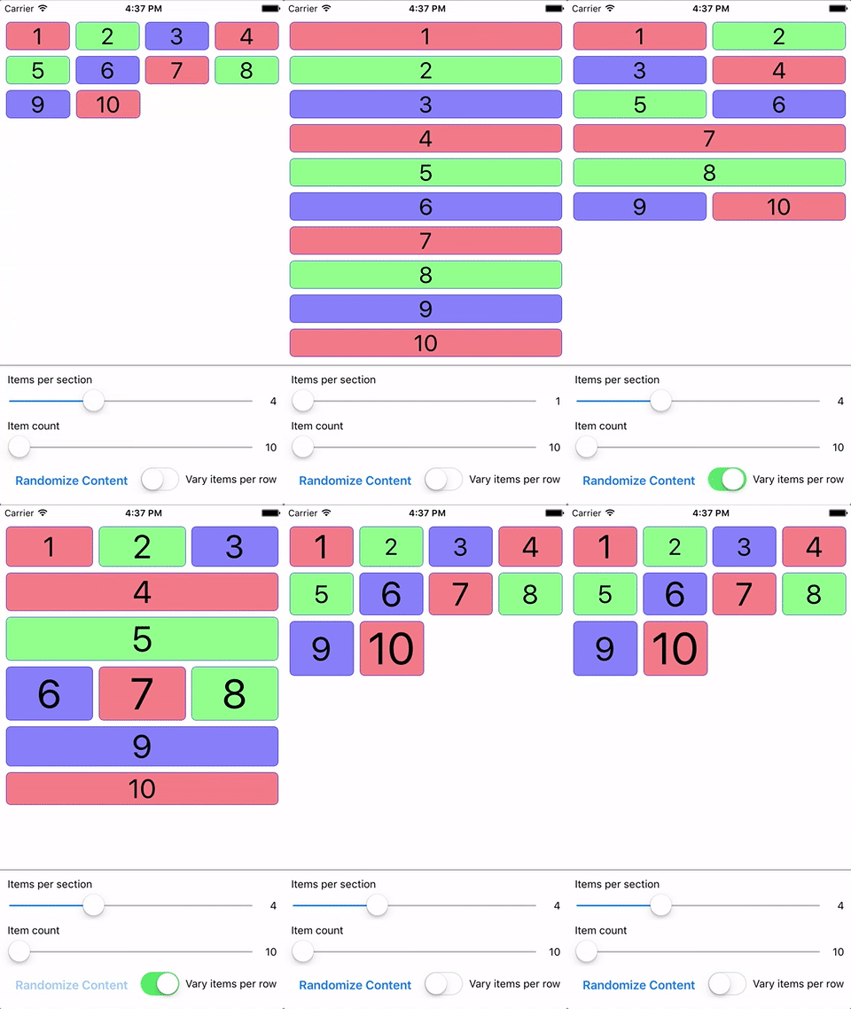
## Introduction
React Native's ListView can be customized to render in a grid layout, but suffers from some issues:
* Does not allow specifying a number of items per row, requiring fixing or calculating the width of your items for consistent row layouts
* If your items have variable heights, the item containers will not flex to match each other
`react-native-gridview` seeks to solve these issues, along with giving you some additional functionality
for grid-based layouts.
## Install
`npm install react-native-gridview --save`
## Basic Usage
```javascript
import React from 'react';
import { Text, View } from 'react-native';
import GridView from 'react-native-gridview';
const itemsPerRow = 3;
// Use data from an array...
const data = Array(20)
.fill(null)
.map((item, index) => index + 1);
// ...or create your own data source.
// This will randomly allocate 1-3 items per row, and will be used
// if the `randomizeRows` prop is `true`.
const randomData = [];
for (let i = 0; i < data.length; i) {
const endIndex = Math.max(Math.round(Math.random() * itemsPerRow), 1) + i;
randomData.push(data.slice(i, endIndex));
i = endIndex;
}
const dataSource = new GridView.DataSource({
rowHasChanged: (r1, r2) => r1 !== r2,
}).cloneWithRows(randomData);
export default function MyGrid(props) {
return (
<GridView
data={data}
dataSource={props.randomizeRows ? dataSource : null}
itemsPerRow={itemsPerRow}
renderItem={(item, sectionID, rowID, itemIndex, itemID) => {
return (
<View style={{ flex: 1, backgroundColor: '#8F8', borderWidth: 1 }}>
<Text>{`${item} (${sectionID}-${rowID}-${itemIndex}-${itemID})`}</Text>
</View>
);
}}
/>
);
}
```
Check out the `gridview` project in the examples folder for advanced usage.
## Properties
* **...ListView.props**
* **`data`** _(Array:Object)_ - The raw array or object (for sectioned grids) data source. The `GridView` will create and manage its own `GridView.DataSource`.
* **`dataSource`** _(GridView.DataSource)_ - A `GridView.DataSource` (wrapper for `ListView.DataSource`) can be provided in place of, or override, the `data` property. `itemsPerRow` does not apply to this data source, and the data structure must be `[[item1, ...], [item1, ...]]` or `{ 'Section 1': [item1, ...], 'Section 2': [item1, ...] }`. Since you control the data source structure, you can have a variable number of items per row by configuring your data source appropriately.
* **`fillMissingItems`** _(Boolean)_ - Fills in spots in the last row of your grid if there aren't enough items remaining. Setting to `true` will give uniform widths to grid items, while `false` will flex the items to fill the full row width. Defaults to `true`.
* **`itemsPerRow`** _(Integer)_ - The number of items to render per row.
* **`itemsPerRowLandscape/itemsPerRowPortrait`** _(Integer)_ - Provide one or both of these to override `itemsPerRow` in the specified orientation. If one or both are provided, when `GridView` fires the `onLayout` event it will determine the orientation (using height/width check based on `Dimensions.get('window')`) and rebind the `data` property to cause the grid content to re-render.
* **`itemStyle`** _(View.propTypes.style)_ - The style(s) applied to the item container after the default style of `{ flex: 1 }`.
* **`renderItem`** _(Function)_ - Render function called for each item in the data source.
* **`rowStyle`** _(View.propTypes.style)_ - The style(s) applied to the row container after the default style of `{ flexDirection: 'row' }`.