react-native-feather-toast
Version:
A lightweight, customizable toast notification library for React Native.
148 lines (109 loc) • 4.9 kB
Markdown
# 🍞 react-native-feather-toast
A lightweight, customizable toast notification library for React Native.



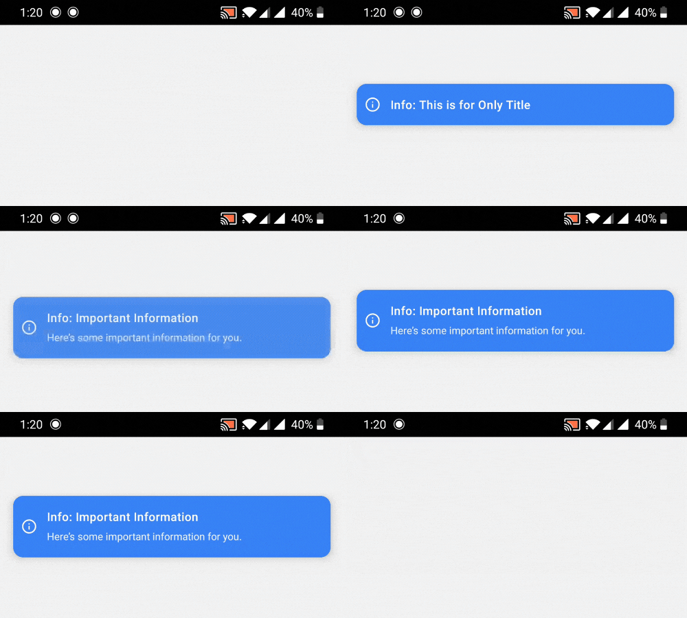
## 🎮 Preview
| Success Toast | Error Toast |
| :-------------------------------------------------------------------------------------------------------------------------: | :---------------------------------------------------------------------------------------------------------------------: |
|  |  |
| **Warning Toast** | **Info Toast** |
|  |  |
## ✨ Features
- 🪶 Lightweight with zero dependencies
- 📱 Native animations using React Native's Animated API
- 🎨 Beautiful, customizable UI
- 💪 Written in TypeScript
- 🔝 Support for top and bottom positions
- 📝 Optional description text
- ⚡ Simple imperative API
- ✋ User-dismissible toasts with smooth animations
- 🖼️ Works with modals (see Modal Usage section)
## 📦 Installation
```bash
npm install react-native-feather-toast
# or
yarn add react-native-feather-toast
```
## 📂 Repository
The code is open source and available at [GitHub](https://github.com/kazimshah39/react-native-feather-toast/).
Feel free to contribute by creating issues or submitting pull requests!
## 🚀 Basic Usage
1. Wrap your app with `ToastRoot`:
```jsx
import { ToastRoot } from "react-native-feather-toast";
export default function App() {
return (
<>
<YourApp />
<ToastRoot />
</>
);
}
```
2. Show toasts from anywhere in your app:
```jsx
import { showToast } from "react-native-feather-toast";
// Basic usage
showToast({
title: "Success!",
type: "success",
});
// With all options
showToast({
title: "File uploaded",
description: "Your file has been successfully uploaded to the cloud",
type: "success", // 'success' | 'error' | 'info' | 'warning'
duration: 3000,
position: "top", // 'top' | 'bottom'
});
```
## 🎨 Toast Types
The package includes four pre-styled toast types:
- `success` - Green with check circle icon
- `error` - Red with X circle icon
- `warning` - Orange with alert circle icon
- `info` - Blue with info icon
## 📋 API Reference
### ToastConfig
```typescript
interface ToastConfig {
title: string;
description?: string;
type?: "success" | "error" | "info" | "warning";
duration?: number; // default: 3000ms
position?: "top" | "bottom"; // default: 'top'
}
```
### Components
- `ToastRoot` - Root component that handles toast rendering
- `showToast(config: ToastConfig)` - Function to trigger toast display
## 🖼️ Using with Modals
When using toasts inside modals, you'll need to render `ToastRoot` inside the modal itself since modals create a new root view:
```jsx
import { Modal } from "react-native";
import { ToastRoot } from "react-native-feather-toast";
function ModalComponent() {
return (
<Modal>
<View>
{/* Your modal content */}
<ToastRoot />
</View>
</Modal>
);
}
```
**Important:** Toast notifications rendered inside a modal will only be visible within that modal's boundaries. This is due to how React Native handles modal rendering.
## 🎯 Best Practices
1. Place `ToastRoot` as high as possible in your component tree
2. For modals, add a separate `ToastRoot` inside the modal
3. Use appropriate toast types for different scenarios:
- `success` for successful operations
- `error` for errors and failures
- `warning` for important alerts
- `info` for general information
## 👥 Credits
This package is maintained by [ToolsForFree](https://toolsforfree.com/), your go-to platform for free tools.
## 📝 License
MIT © [ToolsForFree](https://toolsforfree.com/)