react-native-diff-viewer
Version:
A React Native component for viewing and comparing JSON configurations with side-by-side diff view
141 lines (111 loc) • 3.65 kB
Markdown
A React Native component for viewing and comparing JSON configurations with a side-by-side diff view.
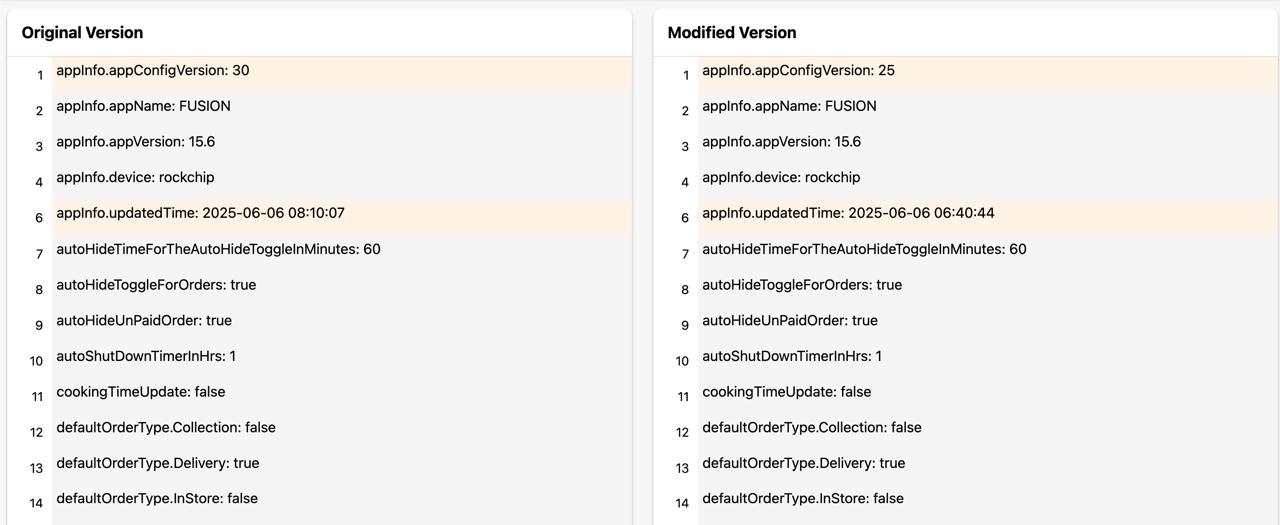
The screenshot above shows a side-by-side comparison of JSON configurations with:
- 🟢 Green background for added items
- 🔴 Red background for removed items
- 🟡 Orange background for changed items
- ⚪ Gray background for unchanged items
- Side-by-side JSON diff viewer
- Color-coded changes (added, removed, changed, unchanged)
- Performance optimized with React.memo and virtualized lists
- TypeScript support
- Fully customizable styling and titles
- Flattened view of nested objects using dot notation
- Web compatibility
## Installation
```bash
npm install react-native-diff-viewer
# or
yarn add react-native-diff-viewer
```
## Usage
```jsx
import DiffViewer from 'react-native-diff-viewer';
const App = () => {
const oldConfig = {
name: "John",
age: 30,
settings: {
theme: "dark",
notifications: {
email: true,
push: false
}
}
};
const newConfig = {
name: "John",
age: 31,
settings: {
theme: "light",
notifications: {
email: false,
push: true
}
}
};
return (
<DiffViewer
data1={newConfig}
data2={oldConfig}
oldVersionTitle="Previous Config"
newVersionTitle="Current Config"
theme={{
backgroundColor: '#FFFFFF',
textColor: '#000000',
diffAddedColor: '#E6FFE6',
diffRemovedColor: '#FFE6E6',
diffUnchangedColor: '#F5F5F5',
diffChangedColor: '#FFF3E6'
}}
/>
);
};
```
| Prop | Type | Required | Default | Description |
|------|------|----------|---------|-------------|
| data1 | unknown | Yes | - | The modified/new configuration to compare |
| data2 | unknown | Yes | - | The original/old configuration to compare against |
| theme | Theme | No | DefaultTheme | Custom theme options |
| oldVersionTitle | string | No | "Original Version" | Custom title for the left panel |
| newVersionTitle | string | No | "Modified Version" | Custom title for the right panel |
| Option | Type | Default | Description |
|--------|------|---------|-------------|
| backgroundColor | string | '#FFFFFF' | Background color of the viewer |
| textColor | string | '#000000' | Color of the text |
| diffAddedColor | string | '#E6FFE6' | Background color for added items |
| diffRemovedColor | string | '#FFE6E6' | Background color for removed items |
| diffUnchangedColor | string | '#F5F5F5' | Background color for unchanged items |
| diffChangedColor | string | '#FFF3E6' | Background color for changed items |
- 🟢 Green: Added items (only exists in new config)
- 🔴 Red: Removed items (only exists in old config)
- 🟡 Orange: Changed items (exists in both but value changed)
- ⚪ Gray: Unchanged items (exists in both with same value)
### Nested Object Handling
The component now flattens nested objects using dot notation for better readability:
```javascript
// Input object
{
settings: {
theme: {
color: "dark"
}
}
}
// Displayed as
"settings.theme.color: dark"
```
- React Native (iOS & Android): Uses FlatList for optimal performance
- React Native Web: Automatically adjusts rendering for web compatibility
## Contributing
Contributions are welcome! Please feel free to submit a Pull Request.
## License
MIT