react-native-dialog-input
Version:
Dialog with input for React Native on iOS and Android.
51 lines (41 loc) • 2.58 kB
Markdown
# react-native-dialog-input
Dialog with input for React Native on iOS and Android.
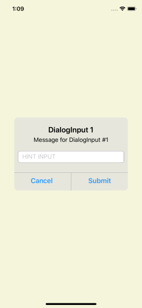
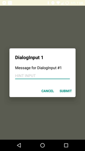
## Examples
## Setup
```bash
npm install --save react-native-dialog-input
```
## Usage
```javascript
import DialogInput from 'react-native-dialog-input';
...
<DialogInput isDialogVisible={this.state.isDialogVisible}
title={"DialogInput 1"}
message={"Message for DialogInput #1"}
hintInput ={"HINT INPUT"}
submitInput={ (inputText) => {this.sendInput(inputText)} }
closeDialog={ () => {this.showDialog(false)}}>
</DialogInput>
...
```
## Properties
name | description | type
:--------------------- |:------------------------------------------- | --------
isDialogVisible | Condition to show or hide the DialogInput | Boolean
title | Title to show in the DialogInput | String (OPTIONAL)
message | Message to show in the DialogInput | String (OPTIONAL)
hintInput | Text hint to show in the TextInput | String (OPTIONAL)
hintTextColor | Color of the text hint | String (OPTIONAL)
initValueTextInput | Default value for the TextInput | String (OPTIONAL)
textInputProps | Additional properties to add to the TextInput in the form:<BR> `textInputProps={{autoCorrect:false}}` Currently supports:<BR>autoCorrect<BR>autoCapitalize<BR>clearButtonMode<BR>clearTextOnFocus<BR>keyboardType<BR>secureTextEntry<BR>maxLength | Object (OPTIONAL)
modalStyle | Styles for the blocking view behind the DialogInput | Object (OPTIONAL)
dialogStyle | Styles for the DialogInput main view | Object (OPTIONAL)
cancelText | Replacement text for the Cancel button | String (OPTIONAL)
submitText | Replacement text for the Submit button | String (OPTIONAL)
## Methods
name | description | returns
:-------------- |:-------------------------------------------------- | -------:
submitInput() | Event fired when the user press the SUBMIT button | String
closeDialog() | Event fired when the user press the CLOSE button | -