react-native-custom-dropdown
Version:
A single or multiple, searchable item picker (dropdown) component for react native which supports both Android & iOS.
616 lines (465 loc) • 22.6 kB
Markdown
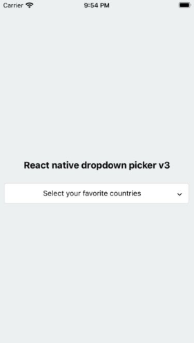
# React native dropdown picker v3
A single or multiple, searchable item picker (dropdown) component for react native which supports both Android & iOS.
## Caution (incompatibility)
**x < 3.0.0 Versions are incompatible with the current version.**
**It's required to follow the docs in order to upgrade the package to v3.x**
## Dependencies
Our package only requires `react-native-vector-icons` to be installed.
https://github.com/oblador/react-native-vector-icons
## Changelog
- Added multiple items feature.
- Added searchable items feature.
- Removed `defaultIndex` property.
- Removed `defaultNull` property.
- The `defaultValue` is state-friendly.
- Added `searchablePlaceholderTextColor` property.
- Added `selectedLabelStyle` property.
- Added `icon` property for items.
- The `searchableError` returns `jsx`.
- Changed `FlatList` to `ScrollView`.
- Added types file.
- Added `selectedLabelLength` property.
- Added `labelLength` property.
- Added `scrollViewProps` property.
- Added `controller` property.
- Added `autoScrollToDefaultValue` property.
- Added `searchTextInputProps` property.
- Some bug-fixes.
## Getting Started
### Installation
##### via NPM
```sh
npm install react-native-custom-dropdown --save
```
##### via Yarn
```sh
yarn add react-native-custom-dropdown
```
### Basic Usage
The first step is to import the package.
```javascript
import DropDownPicker from "react-native-custom-dropdown";
```
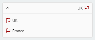
#### Single
Select a single item.
```javascript
import Icon from 'react-native-vector-icons/Feather';
this.state = {
country: 'uk'
}
<DropDownPicker
items={[
{label: 'UK', value: 'uk', icon: () => <Icon name="flag" size={18} color="#900" />},
{label: 'France', value: 'france', icon: () => <Icon name="flag" size={18} color="#900" />},
]}
defaultValue={this.state.country}
containerStyle={{height: 40}}
style={{backgroundColor: '#fafafa'}}
itemStyle={{
justifyContent: 'flex-start'
}}
dropDownStyle={{backgroundColor: '#fafafa'}}
onChangeItem={item => this.setState({
country: item.value
})}
/>
```
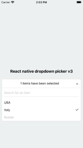
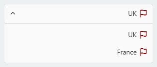
#### Multiple
Select multiple items.
```javascript
import Icon from 'react-native-vector-icons/Feather';
this.state = {
countries: ['uk']
}
<DropDownPicker
items={[
{label: 'UK', value: 'uk', icon: () => <Icon name="flag" size={18} color="#900" />},
{label: 'France', value: 'france', icon: () => <Icon name="flag" size={18} color="#900" />},
]}
multiple={true}
multipleText="%d items have been selected."
min={0}
max={10}
defaultValue={this.state.countries}
containerStyle={{height: 40}}
itemStyle={{
justifyContent: 'flex-start'
}}
onChangeItem={item => this.setState({
countries: item // an array of the selected items
})}
/>
```
### Searchable items
Search for specific items.
```javascript
searchable={true}
searchablePlaceholder="Search for an item"
searchablePlaceholderTextColor="gray"
seachableStyle={{}}
searchableError={() => <Text>Not Found</Text>}
```
### Default item
You may want to select one of the items as default.
**Use one of these ways:**
1. Add `selected: true` to the object. **(This method is not state-friendly!)**
```javascript
items={[
{label: 'Item 1', value: 'item1'},
{label: 'Item 2', value: 'item2', selected: true, disabled: true},
]}
```
2. The `defaultValue` property.
```javascript
defaultValue = "uk"; // Single
defaultValue = ["uk"]; // Multiple
```
### Placeholder
You may want to have a placeholder while the default value is null or an empty array.
Add the following properties to the component.
```javascript
this.state = {
data: null, // Single
data: [] // Multiple
}
...
defaultValue={this.state.data}
placeholder="Select an item"
...
```
### Controller
The `controller` property gives you full access to the DropDownPicker methods and properties.
#### Usage
##### Class Components
```javascript
constructor(props) {
this.state = {
value: null,
items: []
}
this.controller;
}
<DropDownPicker
items={this.state.items}
controller={instance => this.controller = instance}
onChangeList={(items, callback) => {
this.setState({
items // items: items
}, callback);
}}
defaultValue={this.state.value}
onChangeItem={item => this.setState({
value: item.value
})}
/>
```
##### Functional Components
```javascript
const [value, setValue] = useState(null);
const [items, setItems] = useState([ {...}, ... ]);
let controller;
<DropDownPicker
items={items}
controller={instance => controller = instance}
onChangeList={(items, callback) => {
new Promise((resolve, reject) => resolve(setItems(items)))
.then(() => callback())
.catch(() => {});
}}
defaultValue={value}
onChangeItem={item => setValue(item.value)}
/>
```
in Class components you can call methods using `this.controller.METHOD_NAME()` and `controller.METHOD_NAME()` in Functional components.
1. Reset the state.
You may want to reset the state of your picker.
```javascript
this.controller.reset();
```
2. Reset items.
The second argument is your default value. (Optional)
```javascript
this.controller.resetItems([{}, {}, ...]);
this.controller.resetItems([{}, {}, ...], 'uk'); // Single
this.controller.resetItems([{}, {}, ...], ['uk', ...]); // Multiple
```
3. Select an item manually.
You may want to select an item manually.
```javascript
// Single
this.controller.selectItem("uk");
// Multiple
this.controller.selectItem(["uk", "france"]);
```
4. Add items manually.
There are two methods to help you add items manually.
```javascript
this.controller.addItem({
label: "UK",
value: "uk",
icon: () => {},
});
this.controller.addItems([
{
label: "UK",
value: "uk",
icon: () => {},
},
]);
```
5. Remove items
```javascript
this.controller.removeItem("uk", {
changeDefaultValue: true, // Unselect if the removed item is the selected item
});
```
6. Check if the dropdown is open
```javascript
this.controller.isOpen(); // boolean
```
7. Open, close or toggle.
```javascript
this.controller.open();
this.controller.close();
this.controller.toggle();
```
### Styling the component
You have 12 options to style the component.
1. The `style` property.
Use this to adjust the inner part of the picker.
```javacript
style={{paddingVertical: 10}}
```
2. The `dropDownStyle` property.
Additional styles for the dropdown box.
```javacript
dropDownStyle={{backgroundColor: '#fafafa'}}
```
3. The `containerStyle` property.
Use this to adjust the outer part of the picker such as `margin`, `width`, `height`, `flex`, ...
```javacript
containerStyle={{width: 150, height: 70}}
```
4. The `itemStyle` property.
If you want the labels on the `left` and `right` side or to centerize them:
```javacript
itemStyle={{justifyContent: 'flex-start|flex-end|center'}}
```
5. The `labelStyle` property.
This property gives full control over the label.
```javacript
labelStyle={{
fontSize: 14,
textAlign: 'left',
color: '#000'
}}
```
6. The `selectedLabelStyle` property.
Changes the style of the selected item label.
```javacript
selectedtLabelStyle={{
color: '#39739d'
}}
```
7. The `placeholderStyle` property.
It is possible to style the placeholder text with this property.
```javacript
placeholderStyle={{
fontWeight: 'bold',
textAlign: 'center'
}}
```
8. The `activeItemStyle` property.
This property allows you to style the active item.
```javacript
activeItemStyle={{justifyContent: 'center'}}
```
9. The `activeLabelStyle` property.
This property allows you to style the active label.
```javacript
activeLabelStyle={{color: 'red'}}
```
10. The `arrowStyle` property.
Adds your additional styles to the `View` element of the arrow.
```javacript
arrowStyle={{marginRight: 10}}
```
11. The `searchableStyle` property.
Additional styles for the `TextInput`
```javacript
searchableStyle={{backgroundColor: '#dfdfdf'}}
```
12. The `searchablePlaceholderTextColor` property.
Assigns a new color to the placeholder text.
```javacript
searchablePlaceholderTextColor="silver"
```
### RTL Support
1. The selected item
```javascript
style={{
flexDirection: 'row-reverse',
}}
labelStyle={{
textAlign: 'right',
}}
```
2. The dropdown items
```javascript
itemStyle={{
flexDirection: 'row-reverse',
justifyContent: 'flex-start',
}}
```
### FAQ
#### Multiple pickers and the open dropdown issue
Clicking on another picker doesn't close the other pickers?
This can be fixed with the help of state.
```javascript
this.state = {
itemA: null,
isVisibleA: false,
itemB: null,
isVisibleB: false
}
changeVisibility(state) {
this.setState({
isVisibleA: false,
isVisibleB: false,
...state
});
}
// Picker A
<DropDownPicker
items={[
{label: 'UK', value: 'uk'},
{label: 'France', value: 'france'},
]}
defaultValue={this.state.itemA}
containerStyle={{height: 40}}
isVisible={this.state.isVisibleA}
onOpen={() => this.changeVisibility({
isVisibleA: true
})}
onClose={() => this.setState({
isVisibleA: false
})}
onChangeItem={item => this.setState({
itemA: item.value
})}
/>
// Picker B
<DropDownPicker
items={[
{label: 'UK', value: 'uk'},
{label: 'France', value: 'france'},
]}
defaultValue={this.state.itemB}
containerStyle={{height: 40}}
isVisible={this.state.isVisibleB}
onOpen={() => this.changeVisibility({
isVisibleB: true
})}
onClose={() => this.setState({
isVisibleB: false
})}
onChangeItem={item => this.setState({
itemB: item.value
})}
/>
```
#### borderRadius
The only thing you have to avoid is `borderRadius`. All the corners must be set separately.
```javascript
style={{
borderTopLeftRadius: 10, borderTopRightRadius: 10,
borderBottomLeftRadius: 10, borderBottomRightRadius: 10
}}
dropDownStyle={{
borderBottomLeftRadius: 20, borderBottomRightRadius: 20
}}
```
#### zIndex conflicts (Untouchable Items, Overlapping pickers)
1. Using the `containerStyle` property to style the picker results in unexpected behaviors like untouchable items.
> The `style` and `dropDownStyle` properties must be used instead.
> Use the `containerStyle` prop to adjust the outer part of the picker such as `margin`, `width`, `height`, `flex`, ...
2. Nested Views
> You have to add `zIndex` to the nested views which contain the picker.
> **Note!** `zIndex` locks the picker on Android, The solution is to use the `Platform.OS`
```javascript
import { Platform } from 'react-native';
<View
style={{
...(Platform.OS !== 'android' && {
zIndex: 10
})
}}
>
<DropDownPicker ... />
</View>
```
Demo: https://snack.expo.io/@hossein-zare/823437
3. DropDownPicker wrapped by `<View style={{backgroundColor: ..., border[...]: ..., elevation: ...}}>`
These props will make your dropdown untouchable.
Remove all the `backgroundColor`, `border[...]`, `elevation`, ... style properties from the parent element.
https://github.com/hossein-zare/react-native-dropdown-picker/issues/40#issuecomment-651744446
4. Multiple Pickers
```javascript
<DropDownPicker zIndex={5000} />
<DropDownPicker zIndex={4000} />
<DropDownPicker zIndex={3000} />
```
#### Dropdown Overflow
Adding borders to the component will separate or overflow elements. to solve this issue you just need to add `marginTop` to the `dropDownStyle` and specify the value which fits your component well.
```javascript
dropDownStyle={{marginTop: 2}}
```
### Props
| Name | Description | Type | Default | Required |
| -------------------------------- | ---------------------------------------------------------------------------------------------------------------- | ------------------------- | ------------------------------ | -------- |
| **`items`** | The items for the component. | `array` | | Yes |
| `defaultValue` | The value of the default item. (If `multiple={true}`, it takes an array of pre-selected values: `['uk']`) | `any` | | No |
| `placeholder` | Default text to be shown to the user when `defaultValue={null}` or `defaultValue={[]}` | `string` | 'Select an item' | No |
| `dropDownMaxHeight` | Height of the dropdown box. | `number` | `150` | No |
| `style` | Additional styles for the picker. | `object` | `{}` | No |
| `dropDownStyle` | Additional styles for the dropdown box. | `object` | `{}` | No |
| `containerStyle` | Additional styles for the container view. | `object` | `{}` | No |
| `itemStyle` | Additional styles for the items. | `object` | `{}` | No |
| `labelStyle` | Additional styles for the labels. | `object` | `{}` | No |
| `selectedLabelStyle` | Additional styles for the selected label. | `object` | `{}` | No |
| `placeholderStyle` | Additional styles for the placeholder text. | `object` | `{}` | No |
| `activeItemStyle` | Additional styles for the active item. | `object` | `{}` | No |
| `activeLabelStyle` | Additional styles for the active label. | `object` | `{}` | No |
| `arrowStyle` | Additional styles for the arrow. | `object` | `{}` | No |
| `arrowColor` | The color of arrow icons | `string` | `#000` | No |
| `arrowSize` | The size of the arrow. | `number` | `15` | No |
| `showArrow` | An option to show/hide the arrow. | `bool` | `true` | No |
| `customArrowUp` | Customize the arrow-up. | `func` | `(size, color) => ...` | No |
| `customArrowDown` | Customize the arrow-down. | `func` | `(size, color) => ...` | No |
| `customTickIcon` | Customize the tick icon for multiple item picker. | `func` | `() => ...` | No |
| `zIndex` | This property specifies the stack order of the component. | `number` | `5000` | No |
| `disabled` | Disables the component. | `bool` | `false` | No |
| `isVisible` | Open or close the dropdown box. | `bool` | `false` | No |
| `autoScrollToDefaultValue` | If true, automatically scroll to `defaultValue`/first `defaultValue` (multiple) during first render of dropdown | `bool` | `false` | No |
| `multiple` | If set to true selecting multiple items is possible. | `bool` | `false` | No |
| `multipleText` | a Text to inform the user how many items have been selected. | `string` | `%d items have been selected` | No |
| `min` | Minimum number of items. | `number` | `0` | No |
| `max` | Maximum number of items. | `number` | `10000000` | No |
| `searchable` | Shows a `TextInput` to search for specific items. | `bool` | `false` | No |
| `searchablePlaceholder` | Default text to be shown to the user. | `string` | `Search for an item` | No |
| `searchablePlaceholderTextColor` | TextInput placeholder text color. | `string` | `gray` | No |
| `searchableStyle` | Additional styles for the `TextInput` | `object` | `{}` | No |
| `searchableError` | Shows a jsx element when nothing found. | `func` | `() => <Text>Not Found</Text>` | No |
| `selectedLabelLength` | Specify length for the selected label. | `number` | `1000` | No |
| `labelLength` | Specify length for the labels. | `number` | `1000` | No |
| `scrollViewProps` | Add props to the `ScrollView` | `object` | `{}` | No |
| `searchTextInputProps` | Add props to the search `TextInput` | `object` | `{}` | No |
| `controller` | Gives you access to the methods and properties. | `func` | `(instance) => {}` | No |
| `onOpen` | Fires when you open the picker. | `func` | `() => {}` | No |
| `onClose` | Fires when you close the picker. | `func` | `() => {}` | No |
| `onChangeItem` | Callback which returns `item` and `index`. The `item` is the selected object or an array of the selected values. | `func` | `(item, index) => {}` | No |
| `onChangeList` | Changes the list of items. | `(items, callback) => {}` | No |