react-native-android-slidingtabstrip
Version:
React Native sliding tab strip implementation for Android
99 lines (78 loc) • 6.42 kB
Markdown

# Install
Install the node module:
npm install --save react-native-android-slidingtabstrip
Then link the native code into your Android project:
react-native link
# Usage
This library provides two views that can be used together with any native Android ViewPager, typically you'll just use the official React Native provided `ViewPagerAndroid`.
## SlidingTabViewPagerAndroid
This is a wrapper view. You must place inside it a single ViewPager (e.g. `ViewPagerAndroid`) and a single `SlidingTabStripAndroid`.
This view doesn't do any rendering of its own, it exists purely to create an association between the tab strip and the view pager.
## SlidingTabStripAndroid
This is your container for your tabs. You can place any views you like within it as children and they will be rendered with a selected tab indicator and tab dividers, both of which can be customised or disabled.
__NOTE__: `SlidingTabStripAndroid` must have the same number of children as the associated view pager.
### Properties
| Property | Type | Description |
| --------------------- | ------- | ----------------------------------------------------------------------------------------------------------------------------------------------------------------------------------------------------------------------------------------------------------------------------------------------------------------------------------------------------- |
| removeClippedSubviews | boolean | Experimental: When true, offscreen child views (whose `overflow` value is `hidden`) are removed from their native backing superview when offscreen. This can improve scrolling performance on long lists. The default value is true. __Note__: Inherited behaviour from ScrollView. |
| endFillColor | color | Sometimes a sliding tab strip takes up more space than its content fills. When this is the case, this prop will fill the rest of the tab strip with a color to avoid setting a background and creating unnecessary overdraw. This is an advanced optimization that is not needed in the general case. __Note__: Inherited behaviour from ScrollView. |
| scrollOffset | number | Instead of scrolling exactly to the start of the selected tab, offset the our scroll X by this amount (rounded to the nearest pixel). |
| indicatorHeight | number | Height of the selected tab indicator. |
| dividerInset | number | Inset the tab dividers from the top and bottom of the view by this amount. |
| dividerWidth | number | Width of the tab dividers. |
| indicatorColor | color | Color of the selected tab indicator. |
| dividerColor | color | Color of the tab dividers. |
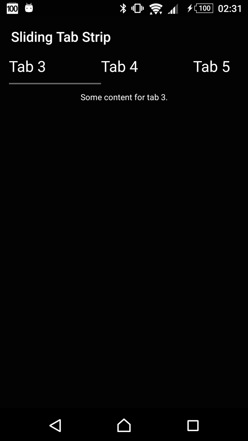
# Example Usage
```
render() {
let tabs = [
{
title: 'Tab 1',
content: 'Hello, World!'
},
{
title: 'Tab 2',
content: 'This is a straight-forward sliding tab strip implementation for Android.'
},
{
title: 'Tab 3',
content: 'Some content for tab 3.'
},
{
title: 'Tab 4',
content: 'Some content for tab 4.'
},
{
title: 'Tab 5',
content: 'Some content for tab 5.'
},
{
title: 'Tab 6',
content: 'Some content for tab 6.'
}
]
return (
<SlidingTabViewPagerAndroid style={{flex: 1}}>
<SlidingTabStripAndroid>
{tabs.map((tab, index) =>
<Text key={index} style={{color: '#fff', paddingVertical: 6, paddingHorizontal: 40, fontSize: 22}}>
{tab.title}
</Text>
)}
</SlidingTabStripAndroid>
<ViewPagerAndroid style={{flex: 1}}>
{tabs.map((tab, index) =>
<View style={{flex: 1, justifyContent: 'center', alignItems: 'stretch'}} key={index}>
<Text key={index} style={{flex: 1, color: '#fff', fontSize: 12, textAlign: 'center', margin: 10}}>
{tab.content}
</Text>
</View>
)}
</ViewPagerAndroid>
</SlidingTabViewPagerAndroid>
)
}
```
### Screenshot