react-native-accordion-wrapper
Version:
A handy wrapper of accordion behavior for react native components
94 lines (67 loc) • 4.67 kB
Markdown
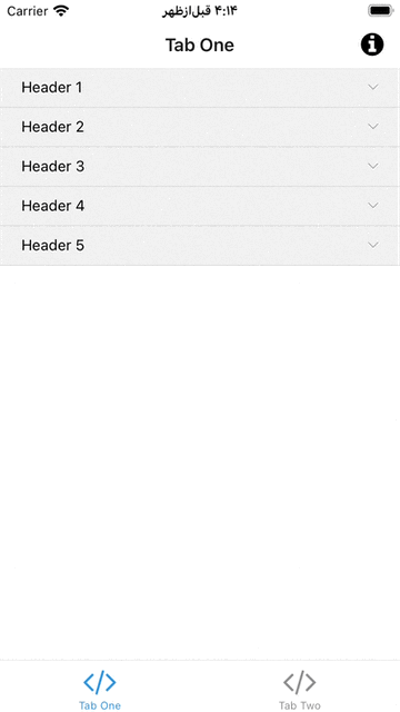
# React Native Accordion Wrapper
An 🪗 accordion component for react native written in [TypeScript](https://www.typescriptlang.org/) in order to handle the accordion behavior for any react native components.
## Installing
For the latest stable version:
using npm:
```bash
npm install --save react-native-accordion-wrapper
```
using yarn:
```bash
yarn add react-native-accordion-wrapper
```
## Usage
```tsx
import React, { Component } from 'react';
import Accordion from 'react-native-accordion-wrapper';
const Example = () => {
return (
<Accordion
dataSource={[{
title: 'first title',
child: <View><Text>This is the child view</Text></View>
}, {
title: 'second title',
child: <View><Text>This is the child view</Text></View>
}]}/>
);
}
```
## `AccordionItem`
The `Accordion` component is a wrapper of another component named `AccordionItem` which has a tappable header with a child view on the bottom of it. Whenever the header is tapped so the visibility of child view is getting toggled. it's very handy if you don't need an accordion but you need this behavior.
```tsx
import React, { Component } from 'react';
import { AccordionItem } from 'react-native-accordion-wrapper';
const Example = () => {
return (
<AccordionItem title="Tap me!">
{/** any react native component */}
</AccordionItem>
);
}
```
## Documentation
here is the properties and the descriptions of it:
### Accordion component properties
| Props Name | Type | Default | Description |
| :--: | :----- | :--: | :------------------------- |
| dataSource | <sub> { <br/>  title: string, <br/>  child: JSX.Element, <br/>  onPress?: () => void, <br/>  nonExpandable?: boolean <br/> }[] </sub> | **required input** | The datasource is an array of objects containing `title` (which can also be called header) and `child` (will be presented after tapping each header) and `onPress`: an optional callback for tapping each header and `nonExpandable` an optional boolean to mention if an accordion item is expandable or not. (by default it's false) |
| initialActiveIndex | `number` | `undefined` | initial accordion item index for being expanded, the component would also listen to the changes of this param, and react to it |
| useFlatList | `boolean` | false | if the component is not inside another scrollview, you can use this feature to enhance the performance by sending `true` |
| headerItemsStyle | `ViewStyle` | `undefined` | You can change the header items style (e.g. change backgroundColor of it) |
| rightChevronIcon | JSX.Element | undefined | You can pass any JSX element as chevron (at the right position of the header items), it would be rotated 180 degrees (by animation) when the accordion item gets opened. |
| headerTitleLabelStyle | `TextStyle` | undefined | you can change the text style of the header items |
| shouldSelectOneItemAtATime | `boolean` | true | if only one item must be opened at a time, set it as `true`, and if all of the accordion items can be opened independentely, set it as `true` |
| listHeaderComponent | React.ReactElement | `undefined` | it would be useful whenever you set the `useFlatList` to be `true`, so it's just like the `ListHeaderComponent` of `FlatList`|
### AccordionItem component properties
| Props Name | Type | Default | Description |
| :--: | :----- | :--: | :------------------------- |
| title | `string` | **required input** | The title which would be tapped in order to expande or collapse the `child` view |
| titleStyle | `TextStyle` | `undefined` | optional text style for the title header |
| headerStyle | `ViewStyle` | `undefined` | optional header view style |
| rightChevronIcon | JSX.Element | `undefined` | You can pass any JSX element as chevron (at the right position of the header items), it would be rotated 180 degrees (by animation) when the accordion item gets opened. |
| onExpandStateChange | `(isExpanded: boolean) => void` | `undefined` | a callback closure in order to inform outside of the component about collapse state of it. |
| onPress | `() => void` | `undefined` | a callback closure which will be called whenever the accordion item gets tapped (can be usefull for tracking) |
| children | React.ReactNode | `undefined` | the child component which would be collapsed or expanded by tapping the header title |
| initialExpandedState | `boolean` | `undefined` | you can choose the initla expanded state, and if you change it the component would react to it! |