react-liquid-glass-view
Version:
A beautiful glass morphism effect component for React applications
108 lines (87 loc) • 2.95 kB
Markdown
A beautiful glass morphism effect component for React applications. This component creates a stunning liquid glass effect that can be animated and interacted with.
[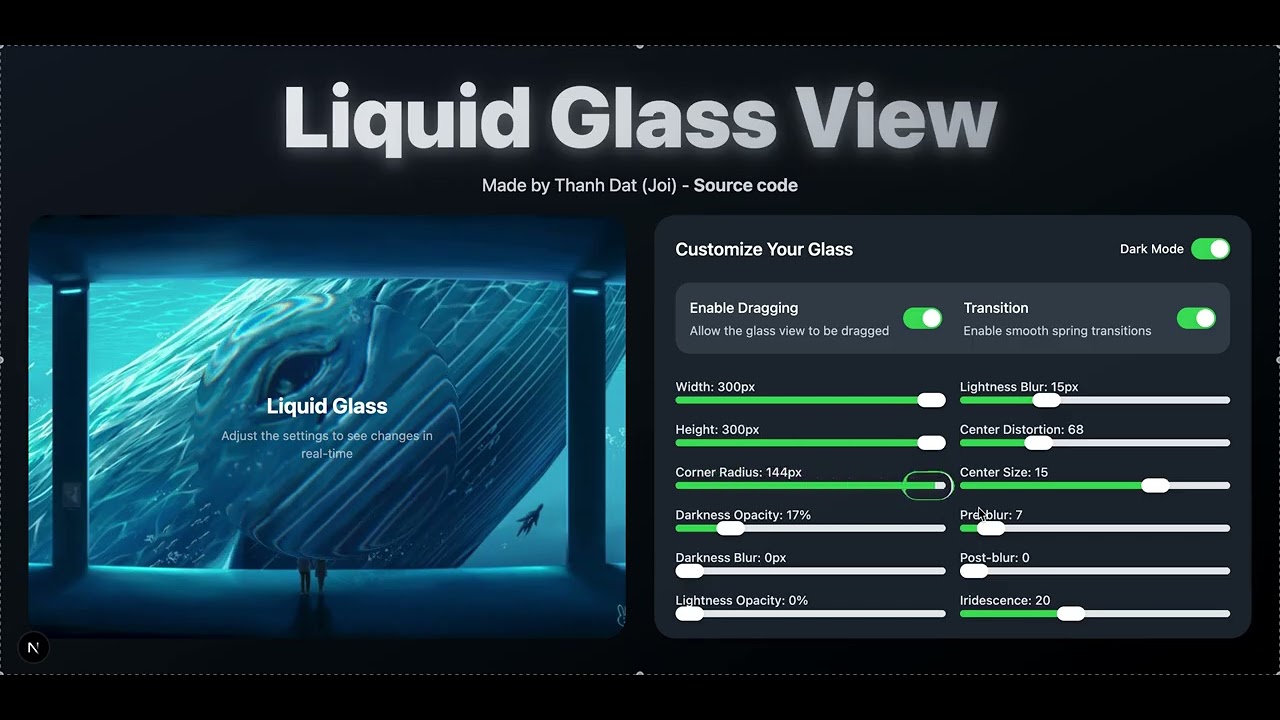](https://www.youtube.com/watch?v=LEJ2JOk6kts)
🔗 [Live Demo Website](https://tdliquidglassv2.netlify.app/)
📦 [NPM Package](https://www.npmjs.com/package/react-liquid-glass-view)
- 🎨 Beautiful glass morphism effect
- 🎭 Smooth animations
- 🖱️ Draggable support
- 📱 Responsive design
- 🎯 Highly customizable
- 🔧 Easy to use
- 🎪 Spring animations support
```bash
npm install react-liquid-glass-view
yarn add react-liquid-glass-view
pnpm add react-liquid-glass-view
```
```jsx
import { LiquidGlassView } from 'react-liquid-glass-view';
function App() {
return (
<LiquidGlassView
width={300}
height={200}
cornerRadius={25}
draggable={true}
transitionAnimationSpring={true}
>
<h1>Hello World!</h1>
</LiquidGlassView>
);
}
```
| Prop | Type | Default | Description |
|------|------|---------|-------------|
| width | number | 100 | Width of the component |
| height | number | 100 | Height of the component |
| cornerRadius | number | 25 | Border radius of the component |
| darknessOpacity | number | 17 | Opacity of the dark overlay |
| darknessBlur | number | 5 | Blur amount of the dark overlay |
| lightnessOpacity | number | 17 | Opacity of the light overlay |
| lightnessBlur | number | 15 | Blur amount of the light overlay |
| centerDistortion | number | 68 | Amount of center distortion |
| centerSize | number | 15 | Size of the center effect |
| preBlur | number | 7 | Pre-effect blur amount |
| postBlur | number | 0 | Post-effect blur amount |
| iridescence | number | 20 | Amount of iridescence effect |
| className | string | "" | Additional CSS classes |
| style | object | {} | Additional inline styles |
| draggable | boolean | false | Whether the component can be dragged |
| dragAnimation | boolean | true | Whether to animate while dragging |
| transitionAnimationSpring | boolean | false | Whether to use spring animations for transitions |
```jsx
import { LiquidGlassView } from 'react-liquid-glass-view';
function Card() {
return (
<LiquidGlassView
width={400}
height={300}
cornerRadius={30}
darknessOpacity={20}
lightnessOpacity={20}
iridescence={25}
draggable={true}
transitionAnimationSpring={true}
style={{ margin: '20px' }}
>
<div style={{ color: 'white', textAlign: 'center' }}>
<h2>Glass Card</h2>
<p>This is a beautiful glass effect card that you can drag around!</p>
</div>
</LiquidGlassView>
);
}
```
- React 16.8.0 or later
MIT © [Thanh Dat (Joi)]