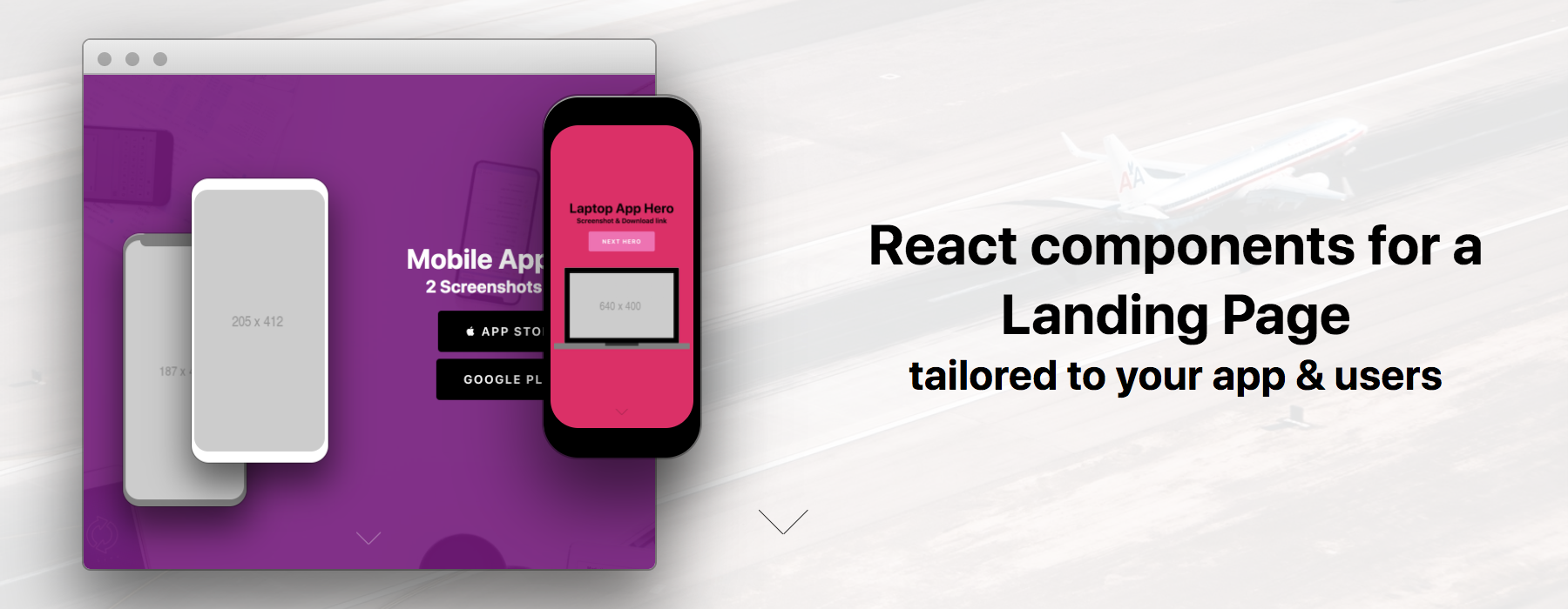
react-landing-page
Version:
[](https://hermanya.github.io/react-landing-page/)
71 lines (54 loc) • 1.67 kB
Markdown
# Getting Started
```sh
npm i react-landing-page@next
```
```jsx
import React from 'react'
import { Provider, Heading, Subhead } from 'rebass'
import {
Hero, CallToAction, ScrollDownIndicator
} from 'react-landing-page'
const App = props => (
<Provider>
<Hero
color="black"
bg="white"
backgroundImage="https://source.unsplash.com/jxaj-UrzQbc/1600x900"
>
<Heading>Name of your app</Heading>
<Subhead>a couple more words</Subhead>
<CallToAction href="/getting-started" mt={3}>Get Started</CallToAction>
<ScrollDownIndicator/>
</Hero>
</Provider>
)
```
## Provider
Use provider if you have a styleguide you would like to follow. Convert your style guide into a [styled-system] schema, and pass it in. Rebass has a great default theme, to enable it, use `Provider`, but don't pass a theme.
```.jsx
<Provider>
<CallToAction>Say Hello</CallToAction>
</Provider>
```
You might also want to set some global styles in your application.
The [grid-styled][grid-styled] `Box` and `Flex` components depend on setting `box-sizing: border-box` to work as expected.
```jsx
import { injectGlobal } from 'styled-components'
injectGlobal`
* { box-sizing: border-box; }
body { margin: 0; }
`
```
Use react-landing-page components as the starting point for custom UI components.
```jsx
import styled from 'styled-components'
import { CallToAction } from 'react-landing-page'
const CallToAction = styled(CallToAction)`
&:hover {
background-color: ${props => props.theme.colors.navy};
}
`
export default CallToAction
```
[theming]: theming.md
[grid-styled]: https://github.com/jxnblk/grid-styled