react-key-value-pair-view
Version:
Key Value Pair View for React
182 lines (126 loc) • 7.8 kB
Markdown
# Are you looking for "React Native" component?
Here is the React Native Twin baby:
[react-native-key-value-pair-view](https://www.npmjs.com/package/react-native-key-value-pair-view)
# React Output
----
# Usage
## Global Config can be applied to the App.
*You could use the KeyValuePairView with the same UI appearance & style in the entire App. In that case you could just use this below global config, that will apply to all KeyValuePairView component. You could use the "isDebugging" for seeing the key,value boxes with background colors for easy debugging. All global config here below can be changed instance wise individually as well through its Props.*
import KeyValuePairView from 'react-key-value-pair-view'
// will apply the background color to see the key box, value box, container box. So that debugging is easy.
KeyValuePairView.isDebugging = true
// Available Display Modes
LeftRight,
LeftLeft,
RightLeft,
RightRight,
CenterCenter,
CenterLeft,
CenterRight,
LeftCenter,
RightCenter,
// will set the default display mode
KeyValuePairView.defaultDisplayMode = KeyValuePairView.DisplayMode.LeftRight
// will set default Key & Value Box spaces in the container, make sure to have (keyBoxSpace+valueBoxSpace==100), should be an Object.
// MUST provide both keyBoxSpace,valueBoxSpace percentages, if you provide custom one. Don't leave either one.
KeyValuePairView.defaultKeyValueBoxPercent = {keyBoxSpace:50,valueBoxSpace:50} // keyBoxSpace+valueBoxSpace==100
// will set the default key value gap
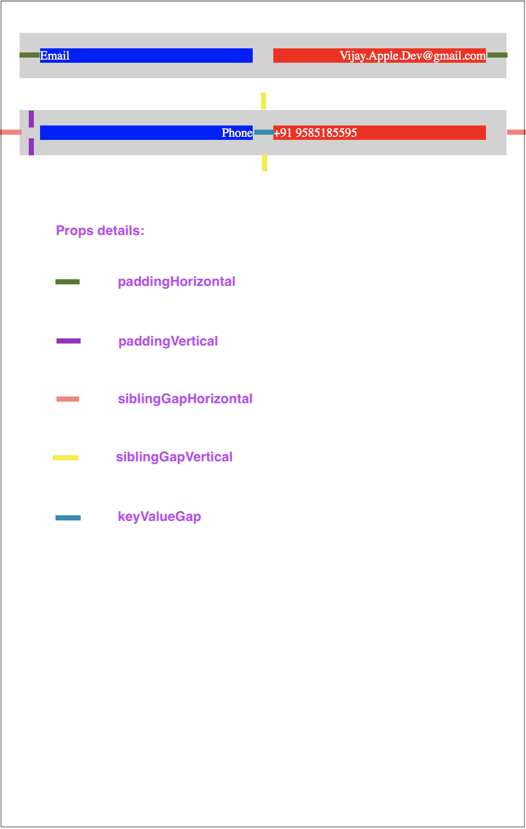
KeyValuePairView.defaultKeyValueGap = 5
// will set the default vertical gap between 2 adjuscent KeyValuePairView
KeyValuePairView.defaultSiblingGapVertical = 23
// will set the default left right gap to KeyValuePairView
KeyValuePairView.defaultSiblingGapHorizontal = 4
// will set the default padding for Left and Right
KeyValuePairView.defaultPaddingHorizontal = 20
// will set the default padding for Top and Bottom
KeyValuePairView.defaultPaddingVertical = 10
// will set the default value for isVerticallyCentered prop
KeyValuePairView.defaultIsVerticallyCentered = false
// will set the default key box background color
KeyValuePairView.defaultKeyBoxBackgroundColor = "#d2d2d2"
// will set the default value box background color
KeyValuePairView.defaultValueBoxBackgroundColor = "#d2d2d2"
// will set the default root container/gap box background color
KeyValuePairView.defaultKeyValueBoxContainerBackgroundColor = "#d2d2d2"
// will set default styles for Key Text, should be an Object
KeyValuePairView.defaultKeyStyles = { color: 'red', fontSize: 12 }
// will set default styles for Value Text, should be an Object
KeyValuePairView.defaultValueStyles = { color: 'blue', fontSize: 12 }
----
----
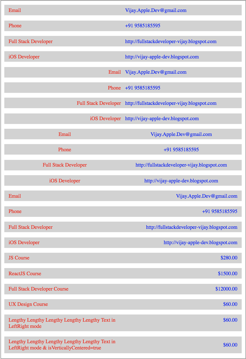
## Key value displaying
<KeyValuePairView keyData="Email" valueData="Vijay.Apple.Dev@gmail.com"/>
<KeyValuePairView keyData="Phone" valueData="+91 9585185595"/>
<KeyValuePairView keyData="Full Stack Developer" valueData="http://fullstackdeveloper-vijay.blogspot.com"/>
<KeyValuePairView keyData="iOS Developer" valueData="http://vijay-apple-dev.blogspot.com"/>
## Handling Touch Event
<KeyValuePairView id="KeyValuePairView1" payload="extra payload string or object" onKeyValueBoxAction={this.keyValueBoxPressed} onKeyBoxAction={this.keyBoxPressed} onValueBoxAction={this.valueBoxPressed} keyData="iOS Developer" valueData="http://vijay-apple-dev.blogspot.com"/>
// handling touch action in your component
keyValueBoxPressed = (data) => {
const { id, payload, keyData, valueData } = data;
// id = KeyValuePairView1
// payload = extra payload string or object
// keyData = iOS Developer
// valueData = http://vijay-apple-dev.blogspot.com
};
// handling touch action in your component
keyBoxPressed = (data) => {
const { id, payload, keyData, valueData } = data;
// id = KeyValuePairView1
// payload = extra payload string or object
// keyData = iOS Developer
// valueData = http://vijay-apple-dev.blogspot.com
};
// handling touch action in your component
valueBoxPressed = (data) => {
const { id, payload, keyData, valueData } = data;
// id = KeyValuePairView1
// payload = extra payload string or object
// keyData = iOS Developer
// valueData = http://vijay-apple-dev.blogspot.com
};
----
## Note on Style props
*All style props should be passed in Object format, refer the below "keyStyles", to an example. This component won't support the className prop.*
The style attribute accepts a JavaScript object with camelCased properties rather than a CSS string. This is consistent with the DOM style JavaScript property, is more efficient, and prevents XSS security holes. For example:
const divStyle = {
color: 'blue',
backgroundImage: 'url(' + imgUrl + ')',
};
function HelloWorldComponent() {
return <div style={divStyle}>Hello World!</div>;
}
Reference:
[ReactJS Style Documentation](https://reactjs.org/docs/dom-elements.html#style)
<KeyValuePairView keyData="iPhone" valueData="$343" displayMode="RightLeft" keyValueGap={40} keyStyles={{color:"yellow"}}/>
## Pass My custom Key/Value component
<KeyValuePairView leftChild={<div>iPhone</div>} valueData="$343"/>
<KeyValuePairView keyData="iPhone" rightChild={<div>$343</div>}/>
*if you pass your custom component to either key or value, then you are having full control on it, like adding action, etc., Don't forget to style the "textAlign" based on your needs inside your custom component.*
## Available props
id, // specific id to this KeyValuePairView
payload, // extra data to receive while touch action, can be anything, string or object
keyBoxStyles = {},// style for Key Box, not for Key Text
valueBoxStyles = {},// style for Value Box, not for Value Text
keyStyles = {},// style for Key Text
valueStyles = {},// style for Value Text
keyValueBoxStyles = {},// style for Container/Parent box of Key & Value boxes
keyData,// Key text
valueData, // Value text
leftChild, // Custom Key component
rightChild, // Custom Value component
keyValueGap = KeyValuePairView.defaultKeyValueGap,// Gap between Key & Value Boxes
siblingGapVertical = KeyValuePairView.defaultSiblingGapVertical//Top Bottom gap,
siblingGapHorizontal = KeyValuePairView.defaultSiblingGapHorizontal,// Left Right gap
keyValueBoxPercent = KeyValuePairView.defaultKeyValueBoxPercent,//{keyBoxSpace:50,valueBoxSpace:50} // keyBoxSpace+valueBoxSpace==100
displayMode = KeyValuePairView.defaultDisplayMode// Display mode "RightLeft","LeftRight",etc.,
onKeyValueBoxAction, // callback function to receive touch event on Container box
onKeyBoxAction, // callback function to receive touch event on Key box
onValueBoxAction, // callback function to receive touch event on Value box
paddingHorizontal = KeyValuePairView.defaultPaddingHorizontal,// Padding for Left and Right
paddingVertical = KeyValuePairView.defaultPaddingVertical,// Padding for Top and Bottom
isVerticallyCentered = KeyValuePairView.defaultIsVerticallyCentered,// should vertically center
## Issues / Improvements
You could contact me at Vijay.Apple.Dev.com