react-jalali-picker
Version:
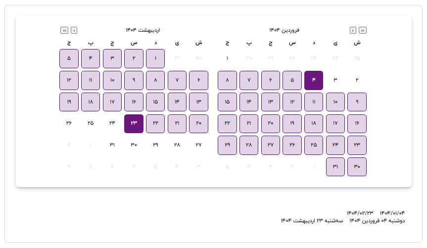
A React component library for selecting dates, featuring both a DatePicker and a RangePicker that support Jalali (Persian) and Gregorian calendars.
88 lines (63 loc) • 4.15 kB
Markdown
# React Jalali (Date or Range) Picker
A React component library for selecting dates, featuring both a DatePicker and a RangePicker that support Jalali and Gregorian calendars.
## 🚀 Live Demo
[](https://behzadbakhshayesh.github.io/react-jalali-picker-doc/)
## Installation
To install the `react-jalali-picker` package, use npm or yarn:
```bash
npm install react-jalali-picker
# or
yarn add react-jalali-picker
```
## DatePicker Usage
```jsx
import React, { useState } from "react";
import { DatePicker } from "react-jalali-picker";
import "react-jalali-picker/dist/styles.css";
const App = () => {
const [selectedDate, setSelectedDate] = useState(null);
return (
<div>
<DatePicker value={selectedDate} onChange={(date)=>setSelectedDate(date)} />
</div>
);
};
export default App;
```
## DatePicker Props
| Prop name | Type | Required | Default Value | Description |
| ------------ | --------------------------------------------------------------- | -------- | ------------- | --------------------------------------------------------------- |
| value | `Dayjs \| null` | Yes | `null` | The currently selected date range as a Dayjs object. |
| onChange | `(range: { start: Dayjs \| null; end: Dayjs \| null }) => void` | Yes | `undefined` | Callback function called when the date range is updated. |
| locale | `"fa"` or `"en"` | No | `"fa"` | Sets the locale for displaying dates; defaults to Persian (fa). |
| calendarType | `"jalali"` or `"gregory"` | No | `"jalali"` | Determines which calendar system to use for date selection. |
| direction | `"rtl"` or `"ltr"` | No | `"rtl"` | Specifies the text direction; defaults to right-to-left (rtl). |
## RangePicker Usage
```jsx
import React, { useState } from "react";
import { RangePicker } from "react-jalali-picker";
import "react-jalali-picker/dist/styles.css";
const App = () => {
const [dateRange, setDateRange] = useState({
start: null,
end: null,
});
return (
<div>
<RangePicker value={dateRange} onChange={(range)=>setDateRange(range)} />
</div>
);
};
export default App;
```
## RangePicker Props
| Prop | Type | Required | Default Value | Description |
| ------------ | ---------------------------------------------------------------- | -------- | ------------- | --------------------------------------------------------------- |
| value | `{ start: Dayjs \| null; end: Dayjs \| null; }` | Yes | `null` | The currently selected date range. |
| onChange | `(range: { start: Dayjs \| null; end: Dayjs \| null; }) => void` | Yes | `undefined` | Callback function that is called when the date range changes. |
| locale | `"fa"` or `"en"` | No | `"fa"` | Sets the locale for displaying dates; defaults to Persian (fa). |
| calendarType | `"jalali"` or `"gregory"` | No | `"jalali"` | Determines which calendar system to use for date selection. |
| direction | `"rtl"` or `"ltr"` | No | `"rtl"` | Specifies the text direction; defaults to right-to-left (rtl). |
## Author
- [Behzad Bakhshayesh](https://github.com/behzadbakhshayesh)