react-img-timeline
Version:
[](https://circleci.com/gh/aaron9000/react-image-timeline/tree/master)
194 lines (145 loc) • 6.19 kB
Markdown
[](https://circleci.com/gh/aaron9000/react-image-timeline/tree/master)
# React Image Timeline
An image-centric timeline component for React.js. View chronological events in a pleasant way.
[View Sample Timeline](http://aaron9000.github.io/react-image-timeline/)
### Features:
- Responsive layout
- Graceful handling of non-uniform content
- Customizable (use your own CSS and components)
- Memoized, pure, & typed (Typescript definitions included)
- Only 32kb
- ***Zero*** extra dependencies
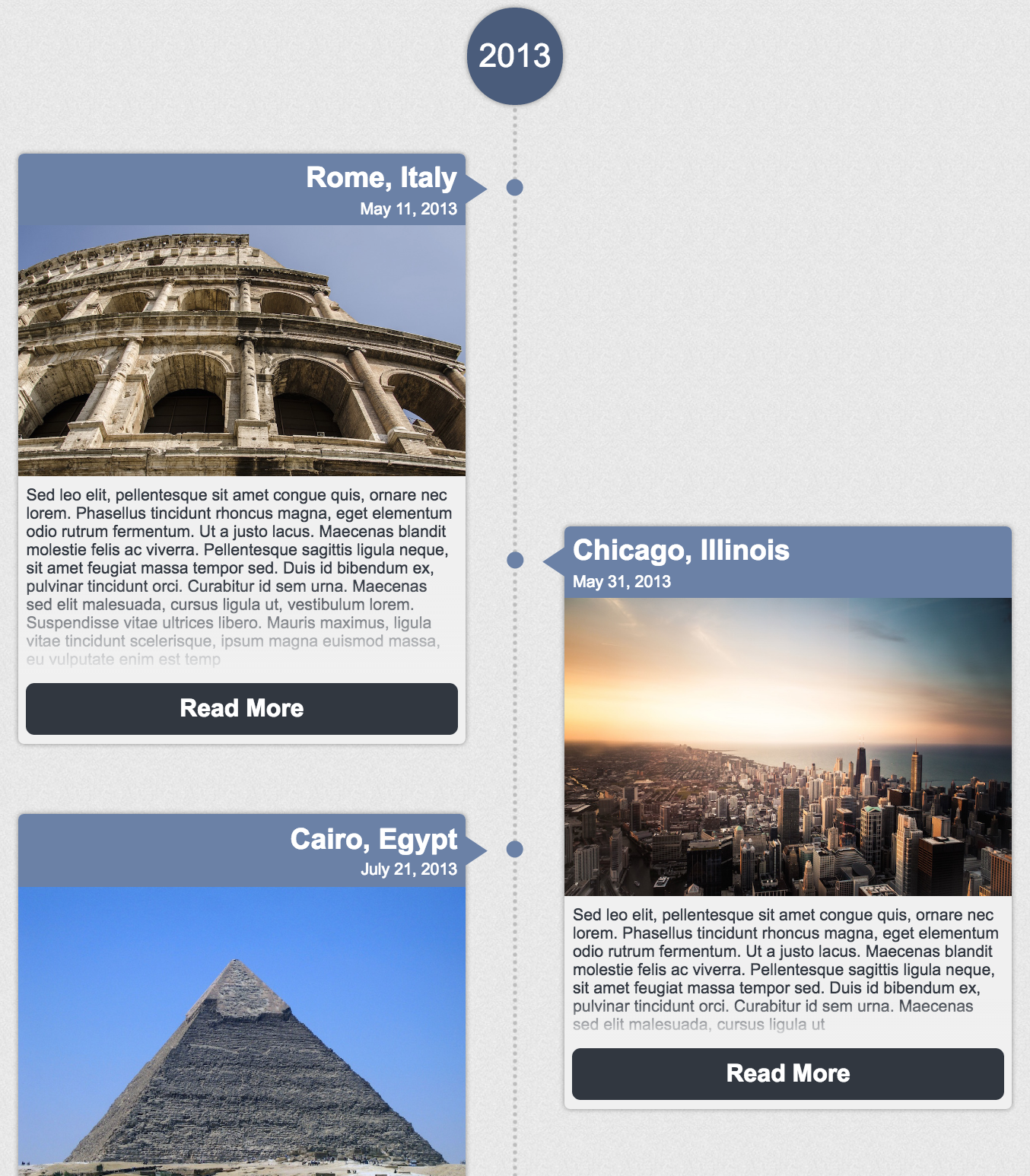
## How to Use
`npm install react-image-timeline --save`
```js
import React from 'react';
import ReactDOM from 'react-dom';
import Timeline from 'react-image-timeline';
require('react-image-timeline/dist/timeline.css'); // .scss also available
const events = [
{
date: new Date(2013, 9, 27),
text: "Sed leo elit, pellentesque sit amet congue quis, ornare nec lorem.",
title: "Cairo, Egypt",
buttonText: 'Click Me',
imageUrl: "http://github.com/aaron9000/react-image-timeline/blob/master/src/assets/cairo.jpg?raw=true",
onClick: console.log,
}
];
ReactDOM.render(<Timeline events={events} />, document.getElementById('root'));
```
## Customization
#### Custom Styles
To customize the timeline, add your own CSS to override the [default styles](https://github.com/aaron9000/react-image-timeline/blob/master/src/lib/timeline.scss/).
#### Event Metadata
To pass extra data into custom components, use `extras` on `TimelineEvent`.
#### Custom Dot Pattern
The dots are defined in CSS using a [base64-encoded image](https://www.base64-image.de/). Encode a new image and override the corresponding CSS class.
#### Custom Components
For more advanced customization, you can pass in custom components to replace the defaults. Custom components will be passed a `TimelineEvent` model in props.
```js
const CustomHeader = (props) => {
const {title, extras} = props.event;
const {customField} = extras;
return <div className="custom-header">
<h1>{title}</h1>
<p>{customField}</p>
</div>;
};
ReactDOM.render(<Timeline events={events} customComponents={{header: CustomHeader}}/>, document.getElementById('root'));
```
#### Run Example Project (you will need `create-react-app` to run)
```
*install create-react-app*
*clone repository*
yarn
yarn --debug
yarn start
```
#### Run Tests
```
*clone repository*
yarn test
```
## TypeScript & Models
Typescript definitions are included in the library.
#### Importing TypeScript Definitions
```js
import {
TimelineProps,
TimelineEventProps,
TimelineEvent,
TimelineCustomComponents
} from 'react-image-timeline';
```
#### TimelineProps
```js
export interface TimelineProps {
customComponents?: TimelineCustomComponents | null;
events: Array<TimelineEvent>;
reverseOrder?: boolean;
denseLayout?: boolean;
}
```
| Key | Type | Required?
|--------------------------|--------------------------|--------------------------|
| events | Array<TimelineEvent> | Yes |
| customComponents |TimelineCustomComponents | |
| reverseOrder | boolean | |
| denseLayout | boolean | |
#### TimelineCustomComponents
```js
export interface TimelineCustomComponents {
topLabel?: React.PureComponent<TimelineEventProps> | React.ReactNode | null;
bottomLabel?: React.PureComponent<TimelineEventProps> | React.ReactNode | null;
header?: React.PureComponent<TimelineEventProps> | React.ReactNode | null;
imageBody?: React.PureComponent<TimelineEventProps> | React.ReactNode | null;
textBody?: React.PureComponent<TimelineEventProps> | React.ReactNode | null;
footer?: React.PureComponent<TimelineEventProps> | React.ReactNode | null;
}
```
| Key | Type | Required?
|--------------------------|--------------------------|--------------------------|
| topLabel | component | |
| bottomLabel | component | |
| header | component | |
| imageBody | component | |
| textBody | component | |
| footer | component | |
#### TimelineEventProps
```js
export interface TimelineEventProps {
event: TimelineEvent;
}
```
| Key | Type | Required?
|--------------------------|--------------------------|--------------------------|
| event | TimelineEvent | Yes |
#### TimelineEvent
```js
export interface TimelineEvent {
date: Date;
title: string;
imageUrl: string;
text: string;
onClick?: TimelineEventClickHandler | null;
buttonText?: string | null;
extras?: object | null;
}
```
| Key | Type | Required?
|--------------------------|--------------------------|--------------------------|
| date | date | Yes |
| title | string | Yes |
| imageUrl | string | Yes |
| text | string | Yes |
| onClick | function | |
| buttonText | string | |
| extras | object | |