react-hook-roulette
Version:
Minimal roulette wheel component. built with React Hooks.
178 lines (159 loc) • 7.16 kB
Markdown
# React Hook Roulette
Minimal roulette wheel component. built with React Hooks.
## Features
- Easy Setup: Seamlessly integrates into React apps using React Hooks, simplifying embedding and state management.
- Canvas-Based Rendering: Uses HTML Canvas for high-performance rendering.
- Simple API: easy-to-use API for customization.
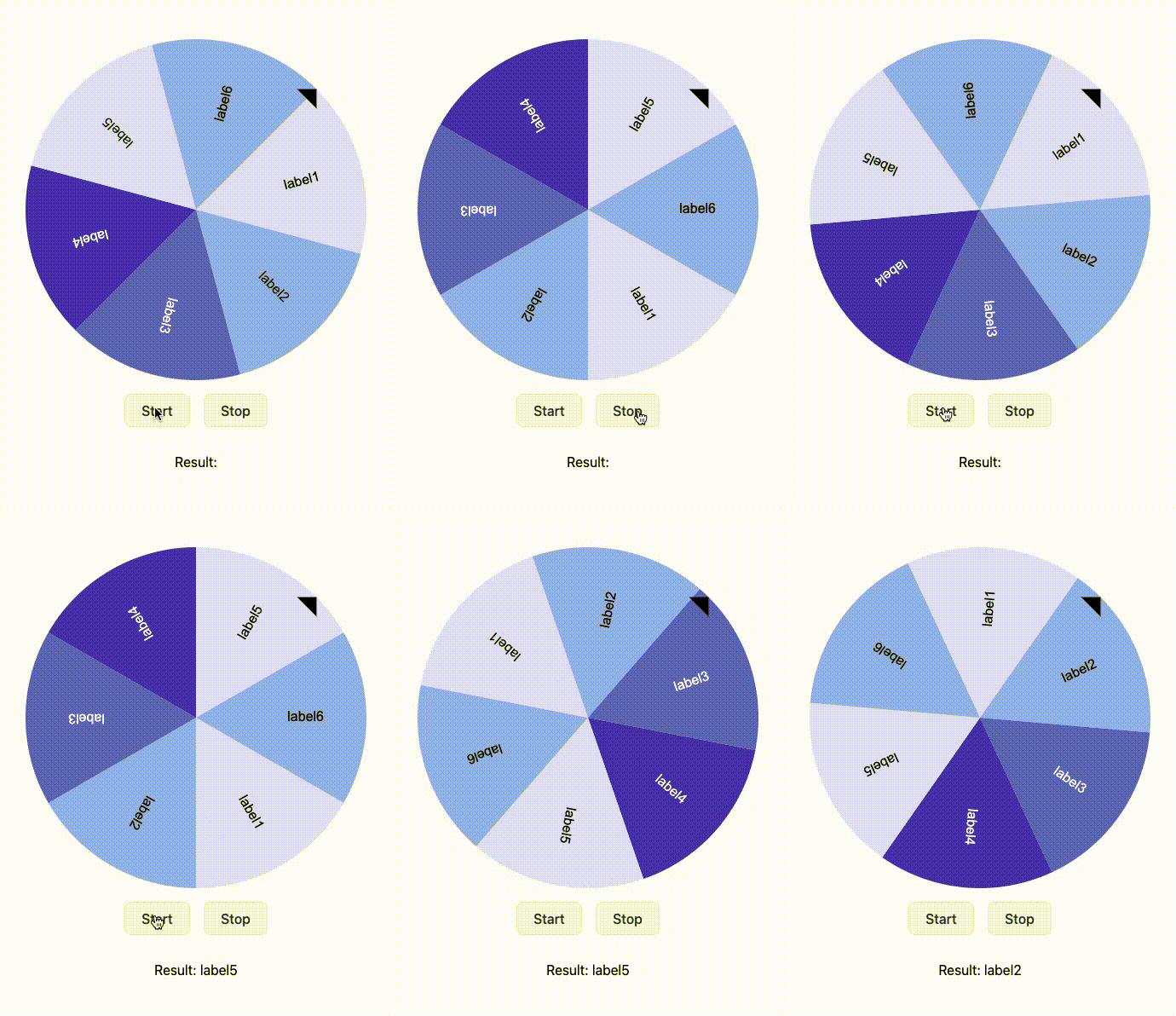
## Demo
live demo available on [stackblitz](https://stackblitz.com/edit/react-hook-roulette-demo)
## Setup
### npm
```sh
npm install react-hook-roulette
```
### pnpm
```sh
pnpm add react-hook-roulette
```
### yarn
```sh
yarn add react-hook-roulette
```
### Code Example
```tsx
import { Roulette, useRoulette } from 'react-hook-roulette';
const App = () => {
const items = [
{ name: "label1" },
{ name: "label2" },
{ name: "label3" },
{ name: "label4" },
{ name: "label5" },
{ name: "label6" },
];
const { roulette, onStart, onStop, result } = useRoulette({ items });
return (
<div>
<Roulette roulette={roulette} />
<button type="button" onClick={onStart}>Start</button>
<button type="button" onClick={onStop}>Stop</button>
{result && <p>Result: {result}</p>}
</div>
);
};
```
## API References
### `RouletteItem`
| Property | Type | Description |
|-----------|-----------|---------------------------------------------------|
| `name` | `string` | Label for the roulette segment. |
| `bg` | `string?` | Background color of the roulette segment. |
| `color` | `string?` | Text color for the segment label. |
| `weight` | `number?` | Determines the segment's size relative to others. |
If you want to set styling globally, please refer to the StyleOption section. (If both are specified, the one specified in rouletteItem takes precedence.)
### `useRoulette` Hook
#### Props
| Property | Type | Description |
|-------------|-----------------------------|---------------------------------------------------------|
| `items` | `RouletteItem[]` | Array of items to display on the roulette wheel. |
| `onSpinUp` | `() => void` | Optional callback executed when the roulette starts spinning. |
| `onSpinDown`| `() => void` | Optional callback executed when the roulette starts slowing down. |
| `onSpinEnd`| `(result: string) => void` | Optional callback executed when the roulette stops, returning the result. |
| `options` | `Partial<RouletteOptions>` | Optional settings to customize the roulette wheel. |
#### Return Values
| Property | Type | Description |
|-------------|------------------|----------------------------------------|
| `roulette` | `RouletteCanvas` | Contains the size of the roulette and a ref to the canvas element. |
| `result` | `string` | The result after the wheel stops spinning. |
| `onStart` | `() => void` | Function to start the wheel spinning. |
| `onStop` | `() => void` | Function to stop the wheel spinning. |
#### Options
| Property | Type | Default Value | Description |
|---------------------|----------------------|---------------|--------------------------------------------------|
| `size` | `number` | `400` | Diameter of the roulette wheel. |
| `initialAngle` | `number` | `0` | Starting angle of the wheel. |
| `rotationDirection` | `RotationDirection` | `"clockwise"` | Rotation direction. |
| `maxSpeed` | `number` | `100` | Maximum rotation speed. |
| `acceleration` | `number` | `1` | Acceleration rate until reaching max speed. |
| `deceleration` | `number` | `1` | Deceleration rate after stopping. |
| `determineAngle` | `number` | `45` | Angle for determining the selected item. |
| `showArrow` | `boolean` | `true` | Controls visibility of the selection arrow. |
| `style` | `StyleOption` | | Customize roulette stylings. |
#### StyleOption
##### CanvasStyle
| Property | Type | Description |
|-----------------|---------------------|---------------------------------------------------|
| `bg` | `string` | Background color of the canvas. |
##### PieStyle
| Property | Type | Description |
|-----------------|---------------------|---------------------------------------------------|
| `border` | `boolean` | if set `true`, set border for each pie segment |
| `borderColor` | `string` | |
| `borderWidth` | `number` | |
| `theme` | `PieTheme[]` | Array of theme options for the pie segments. |
##### LabelStyle
| Property | Type | Description |
|-----------------|---------------------|---------------------------------------------------|
| `font` | `string` | Font style and size for the label text. |
| `defaultColor` | `string` | Default text color for the label. |
| `align` | `CanvasTextAlign` | Horizontal alignment of the label text. |
| `baseline` | `CanvasTextBaseline`| Vertical alignment of the label text. |
| `offset` | `number` | Position offset of the label from the center. |
##### ArrowStyle
| Property | Type | Description |
|-----------------|---------------------|---------------------------------------------------|
| `bg` | `string` | Background color of the arrow. |
| `size` | `number` | Size of the arrow. |
#### Default config
```ts
const option = {
size: 400,
maxSpeed: 100,
rotationDirection: "clockwise",
acceleration: 1,
deceleration: 1,
initialAngle: 0,
determineAngle: 45,
showArrow: true,
style: {
canvas: {
bg: "#fff",
},
arrow: {
bg: "#000",
size: 16,
},
label: {
font: "16px Arial",
align: "right",
baseline: "middle",
offset: 0.75,
defaultColor: "#000",
},
pie: {
border: false,
borderColor: '#000',
borderWidth: 2,
theme: [
{
bg: "#e0e7ff",
},
{
bg: "#a5b4fc",
},
{
bg: "#6366f1",
color: "#fff",
},
{
bg: "#4338ca",
color: "#fff",
},
],
},
},
}
```
### License
MIT