react-hijri-calendar
Version:
A pluggable React calendar component supporting Hijri and Gregorian dates, theming, and custom rendering.
262 lines (218 loc) • 9.34 kB
Markdown
# React Hijri and Gregorian Calendar
A pluggable React calendar component supporting both Hijri and Gregorian dates, theming, and custom rendering.
## Features
- Hijri and Gregorian Calendar
- RTL/LTR and Arabic/English support
- Theming and style overrides
- Custom day cell rendering
- TypeScript support
## Installation
```bash
npm install react-hijri-calendar
```
## Usage
### Example 1: Basic Calendar (Default)
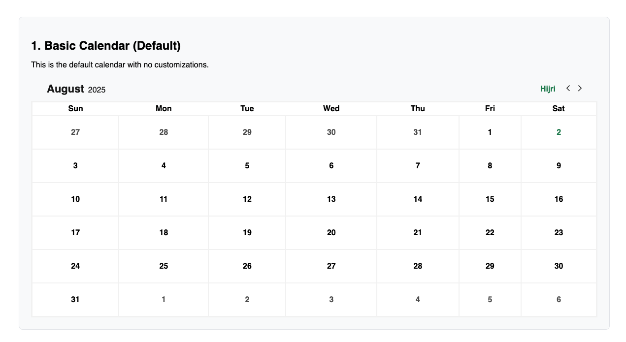
```tsx
import { Calendar } from 'react-hijri-calendar';
function Example1() {
return <Calendar />;
}
```
### Example 2: Calendar with Custom Available Dates & Language Toggle
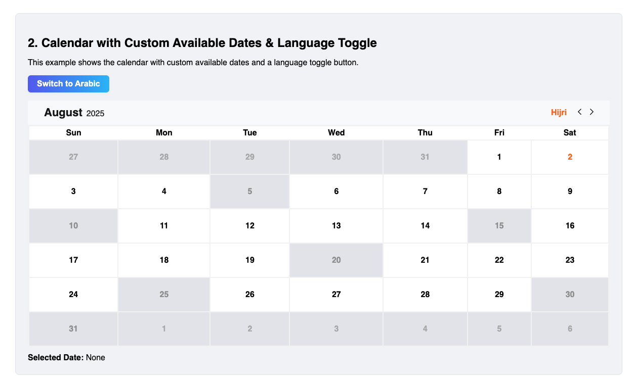
```tsx
import { Calendar } from 'react-hijri-calendar';
import { useState } from 'react';
function Example2() {
const [selectedDate, setSelectedDate] = useState<Date | null>(null);
const [lang, setLang] = useState<'en' | 'ar'>('en');
const availableDatesInfo = [
{ date: '20250801', isAvailable: true, leaveStatement: '' },
// ...
];
return (
<>
<button onClick={() => setLang(lang === 'en' ? 'ar' : 'en')}>
{lang === 'en' ? 'Switch to Arabic' : 'التبديل إلى الإنجليزية'}
</button>
<Calendar
availableDatesInfo={availableDatesInfo}
initialSelectedDate={selectedDate}
lang={lang}
mode="customAvailable"
primaryColor="#ff6600"
setSelectedDate={setSelectedDate}
unavailableColor="#999999"
/>
</>
);
}
```
### Example 3: Calendar with Custom Day Cell Rendering
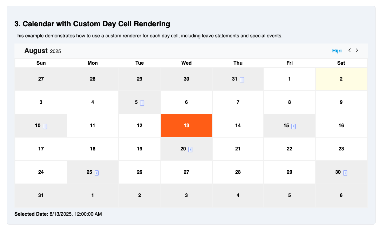
```tsx
import { Calendar } from 'react-hijri-calendar';
import { useState } from 'react';
function Example3() {
const [selectedDate, setSelectedDate] = useState<Date | null>(null);
const availableDatesInfo = [
{ date: '20250801', isAvailable: true, leaveStatement: '' },
// ...
];
return (
<Calendar
availableDatesInfo={availableDatesInfo}
initialSelectedDate={selectedDate}
lang="en"
mode="customAvailable"
primaryColor="#0ea5e9"
renderDayCell={({
date,
isSelected,
isAvailable,
isCurrentDay,
availableCellData,
}) => (
<div
style={{
backgroundColor: isSelected
? '#0ea5e9'
: isCurrentDay
? '#fffde7'
: isAvailable
? '#fff'
: '#f0f0f0',
color: isSelected ? '#fff' : '#000',
padding: '28px 4px',
cursor: isAvailable ? 'pointer' : 'not-allowed',
}}
>
<span>{date.getDate()}</span>
{availableCellData?.leaveStatement && (
<span
style={{
background: 'linear-gradient(90deg, #f8fafc 0%, #e0e7ff 100%)',
color: '#3b82f6',
border: '1px solid #a5b4fc',
borderRadius: '2px',
padding: '0.2rem 0.3rem',
marginLeft: '0.5rem',
fontWeight: 500,
fontSize: '0.5em',
boxShadow: '0 1px 3px rgba(59,130,246,0.07)',
cursor: 'pointer',
}}
title="Leave Statement for national holidays"
>
i
</span>
)}
</div>
)}
setSelectedDate={setSelectedDate}
unavailableColor="#e5e7eb"
/>
);
}
```
### Example 4: Calendar in Arabic (RTL) Mode
```tsx
import { Calendar } from 'react-hijri-calendar';
import { useState } from 'react';
function Example4() {
const [selectedDate, setSelectedDate] = useState<Date | null>(null);
const availableDatesInfo = [
{ date: '20250801', isAvailable: true, leaveStatement: '' },
// ...
];
return (
<Calendar
availableDatesInfo={availableDatesInfo}
initialSelectedDate={selectedDate}
lang="ar"
mode="customAvailable"
primaryColor="#16a34a"
setSelectedDate={setSelectedDate}
unavailableColor="#d1d5db"
/>
);
}
```
## Props
| Prop | Type | Description |
| ------------------- | ------------------------------------- | ------------------------------------------------------------------------------------------------------------------------- |
| initialSelectedDate | `Date \| null` | Initial selected date (Date object or null) |
| setSelectedDate | `(date: Date) => void` | Callback to update selected date. |
| availableDatesInfo | `AvailableDateInfo[]` | Array of date info objects (required for `customAvailable` mode) |
| mode | `'allAvailable' \| 'customAvailable'` | Calendar selection mode. `'allAvailable'` = all days selectable (default), `'customAvailable'` = only availableDatesInfo. |
| lang | `'en' \| 'ar'` | Language for labels |
| calendarType | `'hijri' \| 'gregorian'` | Force calendar type. If not provided, falls back to `lang` (`'ar'` = Hijri, `'en'` = Gregorian). |
| renderDayCell | `function` | Custom day cell renderer |
| className | `string` | Custom class for main container |
| style | `React.CSSProperties` | Inline styles for main container (supports CSS variables for theming) |
| dayCellStyle | `React.CSSProperties` | Inline styles for day cells |
| dayCellClassName | `string` | Custom class for day cells |
| primaryColor | `string` | Primary color (overrides default) |
| unavailableColor | `string` | Unavailable color (overrides default) |
## Calendar Type
The `calendarType` prop allows you to explicitly set the calendar system:
- `calendarType="hijri"` — Always use the Hijri calendar
- `calendarType="gregorian"` — Always use the Gregorian calendar
- If not provided, the calendar type falls back to the `lang` prop (`'ar'` = Hijri, `'en'` = Gregorian)
This makes it easy to control the calendar system independently of the language/labels.
## Modes
The `mode` prop controls which days are selectable:
- `allAvailable` (default): All days are available for selection. The `availableDatesInfo` prop is ignored.
- `customAvailable`: Only dates in the `availableDatesInfo` array with `isAvailable: true` are selectable. All other days are disabled.
If `mode` is `customAvailable` and `availableDatesInfo` is missing or empty, all days will be disabled and a warning will be shown in development.
## Theming & Styling
Override colors and styles using the `primaryColor`, `unavailableColor`, `className`, `dayCellStyle`, and `dayCellClassName` props:
```tsx
<Calendar
primaryColor="#ff6600"
unavailableColor="#999"
className="my-calendar"
dayCellStyle={{ borderRadius: 8 }}
dayCellClassName="my-day-cell"
// ...
/>
```
## Custom Day Cell Rendering
```tsx
<Calendar
renderDayCell={({
date,
isSelected,
isAvailable,
isCurrentDay,
availableCellData,
}) => (
<div style={{ background: isSelected ? 'gold' : undefined }}>
{date.getDate()}
{availableCellData?.leaveStatement && (
<span>{availableCellData.leaveStatement}</span>
)}
</div>
)}
// ...
/>
```
## Types
All types are exported from the package:
```ts
import type {
AvailableDateInfo,
SetSelectedDateFunc,
} from 'react-hijri-calendar';
export type AvailableDateInfo = {
date: string; // 'YYYYMMDD' format
isAvailable: boolean;
leaveStatement?: string;
isHalfDay?: boolean;
note?: string;
};
```
## License
ISC