react-heatmap-grid
Version:
React component for heatmap on grid layout
125 lines (96 loc) • 6.46 kB
Markdown
Created a [new version](https://github.com/arunghosh/react-grid-heatmap) of this having smaller size and a better interface. Check it out.
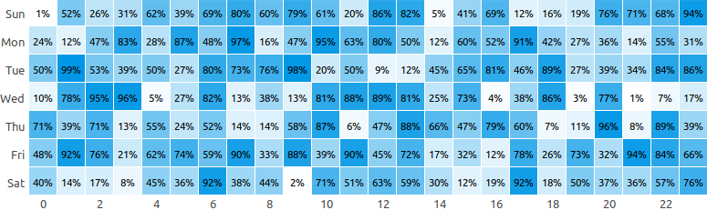
A React component for heatmap in grid layout using `div`.
**Live example [here](https://codesandbox.io/s/r4rvwkl3yn)**.
```
yarn add react-heatmap-grid
```
or
```
npm install react-heatmap-grid --save
```
**Mandatory fields**
| Name | Type | Sample |
| --------- | -------------------------------------------------------------------------- | ----------------------- |
| `xLabels` | Array of string | `['1am', '2am', '3am']` |
| `yLabels` | Array of string | `['Sun', 'Mon']` |
| `data` | 2D Array of numbers having `yLabels.length` rows and `xLabels.length` rows | `[[2,3,5][5,6,9]]` |
```javascript
const xLabels = new Array(24).fill(0).map((_, i) => `${i}`);
const yLabels = ["Sun", "Mon", "Tue"];
const data = new Array(yLabels.length)
.fill(0)
.map(() =>
new Array(xLabels.length).fill(0).map(() => Math.floor(Math.random() * 100))
);
ReactDOM.render(
<HeatMap xLabels={xLabels} yLabels={yLabels} data={data} />,
document.getElementById("app")
);
```
**Configuration**
| Name | Type | Description | Default Value |
| ----------------- | ----------- | ----------------------------------------------------------------------------------------------------------------------------------------------------------------------------- | ------------------ |
| background | string | The base color for the heatmap | `"#329fff"` |
| height | number | Height of each cell of the heatmap in px | `30` |
| onClick | function | Adds an handler to cell click | `undefined` |
| squares | boolean | If set to `true` will render cells as square | `false` |
| xLabelWidth | number | Width of the x label area in pixel | `60` |
| yLabelWidth | number | Width of the y label area in pixel | `40` |
| yLabelTextAlign | string | Text alignment of the yLabels | `"right"` |
| xLabelsLocation | string | Location of y labels. It can be top or bottom | `"top"` |
| xLabelsVisibility | `[boolean]` | Array of bool conveying which x labels to display. For ex: `[true, false, true, false]` means the 1st and the 3rd labels will be displayed and the 2nd and 4th will be hidden | |
| unit | string | Unit to display next to the value on hover | |
| cellRender | function | Render custom content in cell | `() => null` |
| cellStyle | function | To set custom cell style. It is useful for using own colour scheme | |
| title | function | To render custom title in each cell | `${value} ${unit}` |
Example
```javascript
const xLabels = new Array(24).fill(0).map((_, i) => `${i}`);
// Display only even labels
const xLabelsVisibility = new Array(24)
.fill(0)
.map((_, i) => (i % 2 === 0 ? true : false));
const yLabels = ["Sun", "Mon", "Tue"];
const data = new Array(yLabels.length)
.fill(0)
.map(() =>
new Array(xLabels.length).fill(0).map(() => Math.floor(Math.random() * 100))
);
ReactDOM.render(
<HeatMap
xLabels={xLabels}
yLabels={yLabels}
xLabelsLocation={"bottom"}
xLabelsVisibility={xLabelsVisibility}
xLabelWidth={50}
data={data}
squares
onClick={(x, y) => alert(`Clicked ${x}, ${y}`)}
cellStyle={(background, value, min, max, data, x, y) => ({
background: `rgba(66, 86, 244, ${1 - (max - value) / (max - min)})`,
fontSize: "11px",
})}
cellRender={(value) => value && `${value}%`}
title={(value, unit) => `${value}`}
/>,
document.getElementById("app")
);
```
**New build**
```
npm run build
```
**Run dev server**
```
npm run dev
```
**Run test**
```
npm run test
```
<a href="https://www.buymeacoffee.com/arunghosh" target="_blank"><img src="https://www.buymeacoffee.com/assets/img/custom_images/orange_img.png" alt="Buy Me A Coffee" style="height: 41px !important;width: 174px !important;box-shadow: 0px 3px 2px 0px rgba(190, 190, 190, 0.5) !important;-webkit-box-shadow: 0px 3px 2px 0px rgba(190, 190, 190, 0.5) !important;" ></a>