react-filter-checkbox-component
Version:
React component for building complex checkbox filtering
104 lines (79 loc) • 2.54 kB
Markdown
A React component for creating checkbox filters
Installation: `npm install react-filter-checkbox-component`
Import the package into your app:
`import { FilterComponent } from "react-filter-checkbox-component"`;
To setup the component in the parent, this requires two things.
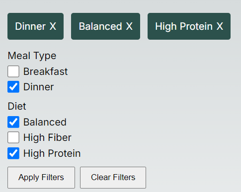
- Filters as an object like the following.
`
const Filters = {
"Meal Type": [
{
label: 'Breakfast',
param: '&mealType=breakfast'
},
{
label: 'Dinner',
param: '&mealType=Dinner'
}
],
"Diet": [
{
label: 'Balanced',
param: '&diet=balanced'
},
{
label: 'High Fiber',
param: '&diet=high-fiber'
},
{
label: 'High Protein',
param: '&diet=high-protein'
}
]
}
`
- A function to handle what happens on submit, for example.
`
function onSubmit(result) {
console.log(result);
}
`
Component options:
```
<FilterComponent
filters={Filters}
onSubmit={onSubmit}
applyButtonText={'Apply Filters'}
clearButtonText={'Clear Filters'}
selectedFilterRemoveIcon={'X'}
selectedFilterBackgroundColour={'blue'}
selectedFilterTextColour={'#fff'}
/>
- filters={Filters}
Filters must follow this format:
filters: {
[]: Array<{
label: string;
param: string;
}>
};
- onSubmit={onSubmit}
Callback function to return the selected filters on submit.
- applyButtonText={'Apply Filters'}
Text for Apply button.
- clearButtonText={'Clear Filters'}
Text for clear button.
- selectedFilterRemoveIcon={'X'}
Remove filter icon, accepts string or react component.
- selectedFilterBackgroundColour={'blue'}
Set background colour of selected filters.
- selectedFilterTextColour={'#fff'}
Set text colour for selected filters.
```