react-fa-icon-picker-alen
Version:
An icon picker for font-awesome icons
109 lines (78 loc) • 4.87 kB
Markdown
# React Font Awesome Icon Picker
## Overview
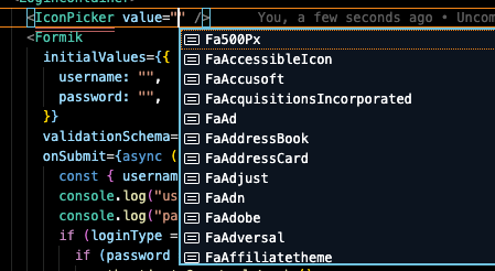
react-fa-icon-picker is a strongly typed React icon picker for font-awesome icons.
react-fa-icon-picker-alen is a fork from react-fa-icon-picker to add new updates.
It contains both a picker component and an icon renderer.

The icons are also strongly typed.
## Motivation
I feel like an icon picker is a pretty common requirement so I was surprised to find a lack of sufficient icon pickers in the React Ecosystem. The existing ones I found were not that great. As a result, I decided to roll my own.
## Installation
Install via npm
```cli
npm install drlalensoftware/react-fa-icon-picker-alen
```
or yarn
```cli
yarn add drlalensoftware/react-fa-icon-picker-alen
```
## Usage
The IconPicker component is just like any other picker component. The value prop is the icon that is displayed on the picker. When a new icon is selected, the onChange handler is fired.
```react
import * as React from 'react'
import { IconPicker } from 'react-fa-icon-picker-alen'
export default () => {
const [value, setValue] = useState("")
return (
<IconPicker value={value} onChange={(v) => setValue(v)} />
)
}
```
You can also use the IconPickerItem component to render the icon. This uses react-icons under the hood.
```react
import * as React from 'react'
import { IconPickerItem } from 'react-fa-icon-picker-alen'
export default () => (
<IconPickerItem icon="FaAdobe" size={24} color="#000" onClick={onClick} />
)
```
## All valid configurations/props of the package
PickerList
| Prop | Type | Required | Description |
| ----------------- | ------------------- | -------- | -------------------------------------------------------------- |
| value | string | true | The current font awesome icon displayed on the picker. |
| onChange | (v: string) => void | true | A change handler that is executed when a new icon is selected. |
| hideSearch | boolean | false | If true, the search input is not displayed. Default is false. |
| containerStyles | CSSProperties | false | Styles for the picker container |
| buttonStyles | CSSProperties | false | Styles for the picker button |
| buttonIconStyles | CSSProperties | false | Styles for the picker button icon |
| pickerIconStyles | CSSProperties | false | Styles for the icons inside of the picker |
| searchInputStyles | CSSProperties | false | Styles for the search input inside of the picker |
| hideBranchIcons | boolean | false | If true, hide the branch icons from list . Default is false. |
| hideSolidIcons | boolean | false | If true, hide the solid icons from list . Default is false. |
| hideRegularIcons | boolean | false | If true, hide the regular icons from list . Default is false. |
| className | string | false | Allow add custom classNames |
| placeholder | string | false | Allow add custom placeholder text |
PickerListItem
| Prop | Type | Required | Description |
| ---- | --- | --- | ---
| icon | string | true | The name of the icon to render. Example: "FaAdobe" |
| size | number | false |The size of the icon. Default: 24 |
| color | string | false | The color of the icon. Default: "#000" |
| onClick | (v: string) => void | false | An onClick handler for the icon. |
| containerStyles | CSSProperties | false | An onClick handler for the icon. |
| className | string | false | Allow add custom classNames |
## Last updates
v1.0.6
* Allow adding custom placeholder
* Allow adding custom className
* If icon does not exist, appears a question mark instead break
* Split icon list in 'Branch', 'Solid' and 'Regular'. Allowing hide any of them
* Update icon list to Font Awesome v5.15.4
v1.0.5
* Add css class to IconPickerItem and IconPicker
v1.0.4
* Allow any React versions over 16.13.1, works with React 17 not checked with React 18
## Contribution Guide
If you are interested in contributing, please submit a PR.