react-doc-helper
Version:
A React component library for building interactive documentation layouts with code examples, tables, tags, and automatic table of contents support.
111 lines (87 loc) • 3.39 kB
Markdown
# react-doc-helper
A React component library for building interactive documentation layouts with code examples, tables, tags, and automatic table of contents support.
<p align="center">
<a href="https://opensource.org/licenses/MIT">
<img src="https://img.shields.io/npm/l/react-doc-helper?color=%238ab4f8" alt="License: MIT">
</a>
<a href="https://www.npmjs.com/package/react-doc-helper">
<img src="https://img.shields.io/npm/v/react-doc-helper.svg?color=%23c1a8e2" alt="NPM Version">
</a>
<!-- <a href="https://github.com/santushnath/react-doc-helper/actions?query=workflow%3A%22Continuous+Integration%22"> -->
<!-- <img src="https://img.shields.io/github/actions/workflow/status/santushnath/react-doc-helper/cd.yml?color=%238ab4f8" alt="Build Status"> -->
<!-- </a> -->
<a href="https://prettier.io">
<img src="https://img.shields.io/badge/code_style-prettier-ff69b4.svg?color=%23c1a8e2" alt="Code Style: Prettier">
</a>
<a href="https://bundlephobia.com/result?p=react-doc-helper@latest">
<img src="https://img.shields.io/bundlephobia/minzip/react-doc-helper?color=%238ab4f8&label=gzip%20size" alt="Gzip Size">
</a>
</p>
[](https://codesandbox.io/p/sandbox/9vt5r7)
## Live Demo
- [Sandbox Demo](https://codesandbox.io/p/sandbox/9vt5r7)
## Features
- **Table of Contents:** Automatically generates a table of contents based on your items.
- **Code Blocks:** Display code snippets with syntax highlighting.
- **Tables & Tags:** Easily render documentation tables and tag elements.
- **Scroll-to Behavior:** Smooth scrolling to sections.
- **Flexible Layout:** Fully customizable components and props.
## Installation
```bash
npm install react-doc-helper
# or
yarn add react-doc-helper
```
## Peer Dependencies
This library requires React 16–18 and React DOM 16.8–18:
```json
"peerDependencies": {
"react": ">=16 <=18",
"react-dom": ">=16.8 <=18"
}
```
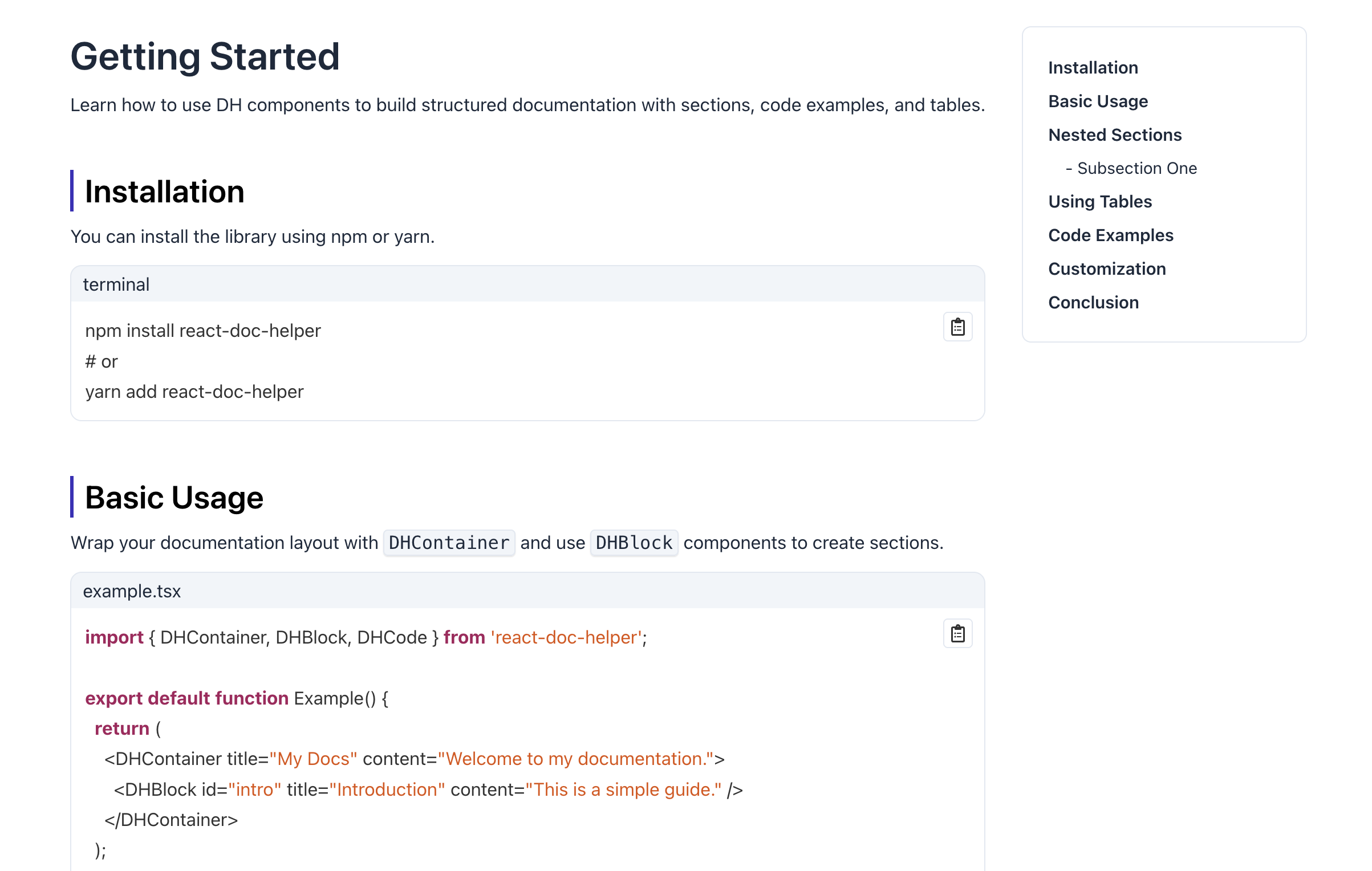
## Usage
### Import CSS
Before using the components, make sure to import the compiled CSS:
```tsx
import 'react-doc-helper/dist/css/style.css';
```
### Basic Example
```tsx
import React from 'react';
import {
DHProvider,
DHContainer,
DHBlock,
DHCode,
} from 'react-doc-helper';
export default function App() {
return (
<DHProvider
settings={{
offsetTop: '2rem',
codeBlockTheme: 'dracula',
}}
>
<DHContainer title="Documentation Example">
<DHBlock id="section1" title="Introduction" content="This is the introduction section.">
<DHCode
code={`console.log("Hello World");`}
lang="javascript"
/>
</DHBlock>
<DHBlock id="section2" title="Usage" content="Here's how to use the package." />
</DH>
</DHProvider>
);
}
```
### Components
- **DHContainer** – Main container for documentation layout.
- **DHBlock** – A content block that includes a title and optional content, and can contain nested child blocks for building structured sections.
- **DHCode** – Syntax-highlighted code block.
- **DHTable** – Documentation tables.
- **DHTags** – Tags for labeling content.
- **DHTabs** – Tabbed content layout.
- **DHScrollTo** – Smooth scrolling utility.
- **DHProvider** – Context provider for global settings.