react-dnd-crop
Version:
React custom Drag and drop with Cropper
578 lines (449 loc) • 12.4 kB
Markdown
[](https://codesandbox.io/s/keen-maxwell-oo7lw)
1. Features
2. Installation
3. Usage
4. Example
5. Props
6. Quick Example
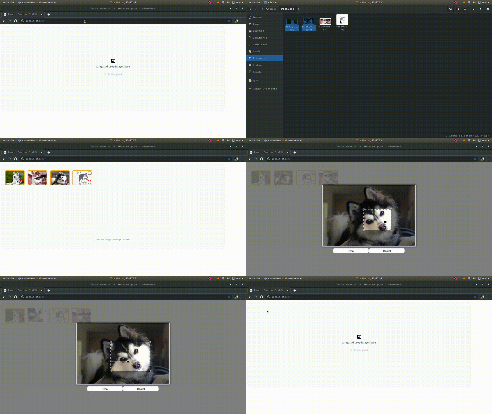
1. Responsive (you can use pixels or percentages).
2. Upload / Browse images.
3. Crop with custom crop size and can be disabled.
4. Free Crop is also avilable.
5. No Document Manipulation.
6. Standard image formats are accepted.
7. Images with Errors are highlighted with different color.
8. Drag and Drop can be done both row and colomn wise.
9. Customizable images and buttons.
```js
npm i react-custom-dnd --save
```
```js
import Dnd from "react-custom-dnd";
```
```js
function DndDemo() {
const callback = payload => {
if (payload.error) return console.log(payload.error);
console.log(payload);
};
return <Dnd callback={callback} />;
}
```
Except Callback all the props are optional
Callback is invoked when `onMouseOut` React Event occur on the Dnd.
```js
const callback = payload => {
if (payload.error) return console.log(payload.error);
console.log(payload);
};
```
After all the required validation (like crop ratio,image type etc,.) are done the payload will contain
```js
payload: {
fileObject: [],//contains file object of the images uploaded,
imageUrls:[],//contains the data url of the image uploaded
}
```
```js
payload: {
error: ""; // Error like crop ratio,image type, etc,.
}
```
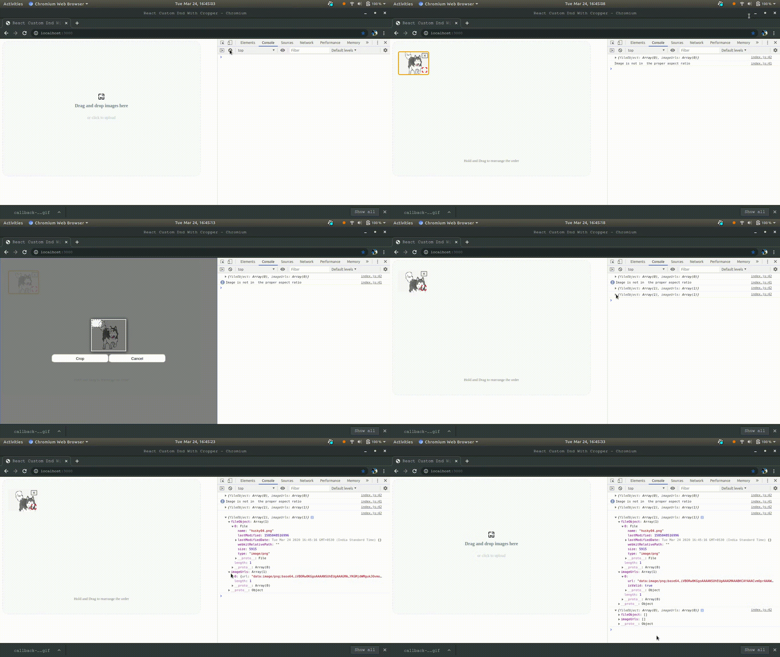
To enable Crop use crop props, by default `false`
```js
<Dnd crop />
```
or
```js
<Dnd crop = true />
```
you can disable it by passing props `crop = false`
```js
<Dnd crop = false />
```
or
```js
<Dnd />
```
Crop ratio helps to crop the image in a required aspect ratio.
```js
const cropRatio = {
unit: "%",
width: 30,
aspect: 5 / 3 //aspect ratio is 5/3
};
/*
Default value involves
unit: "%"
width: 30
aspect: 4 / 3
*/
<Dnd cropRatio={cropRatio} />;
```
It works fine even unit and width is not mentioned.
```js
const cropRatio = {
unit: "%",
width: 30
};
```
If aspect ratio is not given default will be 4:3
If `freeCrop` is enabled, you can crop in any ratio but crop validation is not done. By default `false`
```js
<Dnd freeCrop={true}>
```

By default Crop is initiated
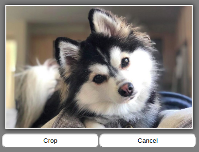
You have to initiate the crop here.
Maximum images that can be uploaded. Default value is 12.
```js
<Dnd maxImageUpload = 12 />
```
The MimeTypes can be mentioned with seperator `/` like `jpeg/png`.
By default it supports `jpeg/jpg/gif/png`
```js
<Dnd mimeType="png/jpeg/jpg/gif" />
```
```js
<Dnd mimeType="png" /> //If you want to upload only png
<Dnd mimeType="png/jpg" /> //If you want to upload png and jpg
//like so...
```
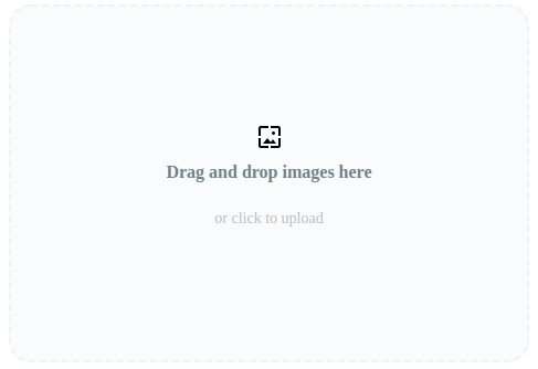
Default Label is `Drag and drop images here`.
```js
<Dnd label="Drag and drop images here" subLabel="or click to upload" />
```
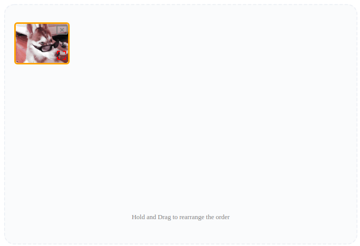
Default Message is `Hold and Drag to rearrange the order`.
```js
<Dnd message="Hold and Drag to rearrange the order" />
```
Error Messages includes
```js
const errorMessages = {
maxImageUpload: "You Cant Upload More than 3 images",
imageFormat: "This image Format is not Supported",
aspectRatio: "Image is not in the proper aspect ratio"
};
/*
Default Error Messages
maxImageUpload: "You Cant Upload More than 12 Files"
imageFormat: "Only Jpeg/Jpg/Png/Gif Allowed"
aspectRatio: "Image is not in the proper aspect ratio"
*/
<Dnd errorMessages={errorMessages} />;
```
these messages will return in payload.
You can change label,cancel and crop icons
```js
const icons = {
labelIcon: , // Your icon goes here
cancelIcon: , // Your icon goes here
cropIcon: // Your icon goes here
};
<Dnd icons={icons} />;
```

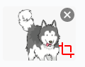
Button values includes `Crop` and `Cancel` by default.You can change that by using `buttonvalues` props.
```js
const buttonvalue = {
cancelButton: "Cancel", //optionl
cropButton: "Confrim" // required
};
/*
cancelButton: "Cancel",
cropButton: "Crop"
*/
<Dnd buttonvalue={buttonvalue} />;
```
;
```js
const buttonvalue = {
cropButton: "Confrim"
};
/*
cancelButton: "Cancel",
cropButton: "Crop"
*/
<Dnd buttonvalue={buttonvalue} />;
```
;
```js
const style = {
//styles
}
<Dnd style={style} />
```
You can only change width and height
```js
DRAG_AND_DROP_AREA: {
width: "60%", // width of the drag and drop area
height: "300px" // height of the drag and drop area
}
```
You can only change top, fontsize, color
```js
DRAG_AND_DROP_MESSAGE: {
top: "400px",
fontSize: "small", //font size of the message
color: "grey" // color of the message
}
```

You can add any styles, they are not fixed
Note : The styles you provide here may affect the Crop Modal
```js
CROP_BUTTON: {
background: "green", // background of the crop button
color: "white", // color of the crop button
width: "200px" // width of the crop button
},
CANCEL_BUTTON: {
background: "red", //background of the cancel button
color: "white", //color of the cancel button
width: "200px" //width of the cancel button
},
```

You can only change these properties.
```js
DRAG_AND_DROP_AREA_ITEM_CANCEL_ICON: {
color: "grey",
float: " right",
top: "",
bottom: "",
left: "",
right: "",
cursor: "pointer",
position:"relative"
},
DRAG_AND_DROP_AREA_ITEM_CROP_ICON: {
color: "red",
float: " right",
top: "50px",
bottom: "",
left: "23px",
right: "",
cursor: "pointer",
position:"relative"
},
```

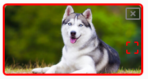
You can only change these properties. The red border around it refers that the image is not in the proper aspect ratio
```js
DRAG_AND_DROP_AREA_ITEM: {
width: "200px",
height: "100px",
margin: "8px",
textAlign: "center",
borderRadius: "6px"
}
DRAG_AND_DROP_AREA_ITEM_ERROR: {
border: "3px solid red" // If image is not in the proper aspect ratio the border will change to given color
}
```
You can change the styles, otherwise the default styles will appear.
```js
const style = {
DRAG_AND_DROP_AREA: {
width: "90%", // width of the drag and drop area
height: "450px" // height of the drag and drop area
},
DRAG_AND_DROP_MESSAGE: {
top: "400px",
fontSize: "small", //font size of the message
color: "grey" // color of the message
},
CROP_BUTTON: {
background: "green", // background of the crop button
color: "white", // color of the crop button
width: "200px" // width of the crop button
},
CANCEL_BUTTON: {
background: "red", //background of the cancel button
color: "white", //color of the cancel button
width: "200px" //width of the cancel button
},
DRAG_AND_DROP_AREA_ITEM_CANCEL_ICON: {
color: "grey",
float: " right",
top: "",
bottom: "",
left: "",
right: "",
cursor: "pointer"
},
DRAG_AND_DROP_AREA_ITEM_CROP_ICON: {
color: "red",
float: " right",
top: "50px",
bottom: "",
left: "23px",
right: "",
cursor: "pointer"
},
DRAG_AND_DROP_AREA_ITEM: {
width: "103px",
height: "77px",
margin: "8px",
textAlign: "center",
borderRadius: "6px"
},
DRAG_AND_DROP_AREA_ITEM_ERROR: {
border: "3px solid red" // If image is not in the proper aspect ratio the border will change to given color
}
};
```
In the following Example, Material UI Icons are used.
```js
import React from "react";
import { render } from "react-dom";
import Dnd from "../src";
import CancelPresentationIcon from "@material-ui/icons/CancelPresentation";
import WallpaperIcon from "@material-ui/icons/Wallpaper";
import CropFreeIcon from "@material-ui/icons/CropFree";
const DemoComponent = () => {
const callback = payload => {
if (payload.error) return console.log(payload.error);
console.log(payload);
};
const cropRatio = {
unit: "%",
width: 30,
aspect: 4 / 3
};
const maxImageUpload = 20;
const buttonvalue = {
cancelButton: "Cancel",
cropButton: "Crop"
};
const style = {
DRAG_AND_DROP_AREA: {
width: "60%",
height: "300px"
},
DRAG_AND_DROP_MESSAGE: {
top: "250px",
fontSize: "small",
color: "grey"
},
CROP_BUTTON: {
background: "green",
color: "white",
width: "200px"
},
CANCEL_BUTTON: {
background: "red",
color: "white",
width: "200px"
},
DRAG_AND_DROP_AREA_ITEM_CANCEL_ICON: {
color: "grey",
float: " right",
top: "",
bottom: "",
left: "",
right: "",
cursor: "pointer"
},
DRAG_AND_DROP_AREA_ITEM_CROP_ICON: {
color: "red",
float: " right",
top: "50px",
bottom: "",
left: "23px",
right: "",
cursor: "pointer"
},
DRAG_AND_DROP_AREA_ITEM: {
width: "200px",
height: "100px",
margin: "8px",
textAlign: "center",
borderRadius: "6px"
},
DRAG_AND_DROP_AREA_ITEM_ERROR: {
border: "3px solid red"
}
};
const errorMessage = {
maxImageUpload: "You Cant Upload More than 3 images",
imageFormat: "This image Format is not Supported",
aspectRatio: "Image is not in the proper aspect ratio"
};
const icons = {
labelIcon: <WallpaperIcon />,
cancelIcon: <CancelPresentationIcon />,
cropIcon: <CropFreeIcon />
};
return (
<Dnd
callback={callback}
maxImageUpload={maxImageUpload}
mimeType="png/jpeg/jpg/gif"
label="Drag and drop images here"
subLabel="or click to upload"
message="Hold and Drag to rearrange the order"
errorMessages={errorMessage}
crop
cropRatio={cropRatio}
icons={icons}
buttonvalue={buttonvalue}
style={style}
/>
);
};
export default DemoComponent;
```