react-dialogify
Version:
Simple, Fast and Easy to use Dialog Modal component for React
132 lines (111 loc) • 4.07 kB
Markdown
# React Dialogify
[]()
[]()
[]()
[]()
React-Dialogify allows you to add dialogs to your app, fast and easy.
## Features
* Super fast setup - Plug & Play.
* Customizable - Use with predefined styles or use your own.
* Programmatically controlled - With a couple of functions you can make it show/close from anywhere in your app.
* No Redux/State required - Don't need to set Actions or States in your App to control it.
## Installation
```
$ yarn add react-dialogify
or
$ npm install --save react-dialogify
```
## Usage
Add the `DialogContainer` at the root level of your App, or as children of any specific container in your App. But remember to **add it only once in your App**.
```
import React, { Component } from 'react';
import { DialogContainer, dialog } from 'react-dialogify';
class App extends Component {
showDialog = () => {
dialog.show({
title: 'Hello World!'
text: 'This is your text in the dialog'
});
}
render() {
return (
<div>
<button onClick={this.showDialog}> Show Dialog </button>
<DialogContainer />
</div>
);
}
}
```
## Using default dialog with predefined types
### Methods
|Method| Description|
|--- |--- |
|success| Display default dialog with the success context (color green)|
|error| Display default dialog with the error context (color red)|
|warning| Display default dialog with the warning context (color gold)|
|pending| Display default dialog with the pending context (color light blue)|
|info| Display default dialog with the info context (color blue)|
|close| Close the dialog|
**Example:**
```
dialog.info({
title: 'News! Some tips!',
text: 'Read this! This dialog shows you some useful info!',
btnText: 'Close me now!',
btnOnClick() { dialog.close(); },
});
```
### Required options
|Name| Type| Description|
|--- |--- |--- |
|title| String | Displayed as title in the dialog|
|text| String | Displayed as content in the dialog|
|btnText| String | Displayed as text in the dialog's button|
|btnOnClick| function | Method called in the onClick event of the dialog's button|
## Using a custom dialog component
You are able to use your own Dialog React Component, you just need to make sure your component takes the options as props. There are two ways:
### 1. Passing the Component to DialogContainer as a Prop
When you setup the `DialogContainer` in your App, you can pass to it the prop `template` to use a custom Dialog Component.
**Example:**
```
// App.js
import MyComponent from './my-component';
// ..... //
render() {
return (
<div>
<button onClick={this.showDialog}> Show Dialog </button>
<DialogContainer template={MyComponent} />
</div>
);
}
```
### 2. Passing the Component Argument
The `show` method takes as a second argument a React Component, the `DialogContainer` will pass the options argument as props to your Component, this way you can change the Dialog component on the fly!
Your component can take any props you decide :)
**Example:**
```
// App.js
import MyComponent from './my-component';
// ..... //
showDialog = () => {
dialog.show({
headline: 'Custom prop',
content: 'Custom prop',
cancelBtnText: 'Custom prop',
submitBtnText: 'Custom prop'
}, MyComponent);
}
render() {
return (
<div>
<button onClick={this.showDialog}> Show Dialog </button>
<DialogContainer />
</div>
);
}
```
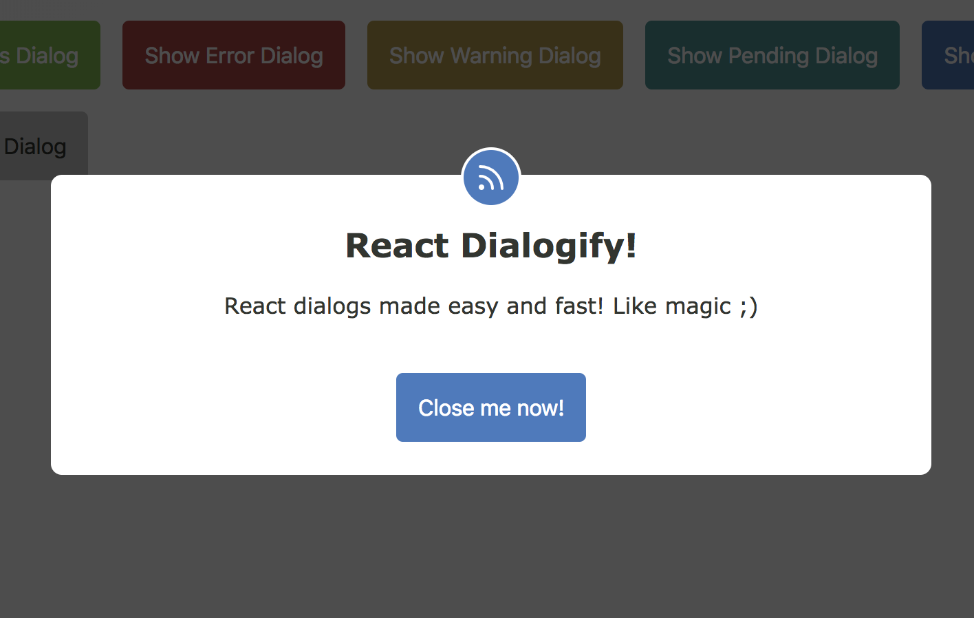
# Demo
You want to see some examples? Go to [Online Demo](https://iamgutz.github.io/react-dialogify/)