react-coverflow-isomorphic
Version:
Carousel of coverflow-isomorphic effect
169 lines (128 loc) • 5.02 kB
Markdown
React Coverflow
===
[](http://badge.fury.io/js/react-coverflow)
[](https://nodei.co/npm/react-coverflow/)
---
NB: The same as andyyou's coverflow, just with string classname, so that you can provide the styling via a separate css file, for server rendering.
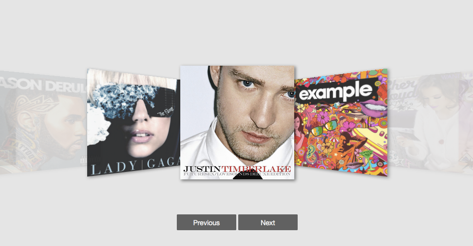
React Coverflow is a React component for building cover flow style carousel in a convenient way.
Features of `react-coverflow`
* Flexbox styles of CSS 3.
* Support scroll in the component.
* Support navigation buttons optional
* Using css-module
* Support mobile
## Getting started
Install `react-coverflow` using npm.
```
$ npm install react-coverflow
```
The required stylesheet using `css-module` and include in package(js file), so you don't need include other stylesheet.
## Usage
```
var React = require('react');
var ReactDOM = require('react-dom');
var Coverflow = require('react-coverflow');
ReactDOM.render(
<Coverflow width="960" height="500"
displayQuantityOfSide={2}
navigation={false}
enableScroll={true}
>
<img src='image/path' alt='title or description' url="http://andyyou.github.io/react-coverflow/" />
<img src='image/path' alt='title or description' url="http://andyyou.github.io/react-coverflow/"/>
<img src='image/path' alt='title or description' url="http://andyyou.github.io/react-coverflow/"/>
</Coverflow>,
document.querySelector('.content')
);
```
#### Options
* displayQuantityOfSide [number]: The number of display image from center to the one side end.
* navigation [boolean]: Enable navigation buttons (prev, next). (defalut: false)
* enableHeading [boolean]: Show or hide the heading form img tag alt. (defalut: true)
* enableScroll [boolean]: Enable scrolling feature.
* media [object]: To support media query, if you want responsive with parent element you can ignore `width` and `height` props or set it to `auto`.
```
media={{
'@media (max-width: 900px)': {
width: '600px',
height: '300px'
},
'@media (min-width: 900px)': {
width: '960px',
height: '600px'
}
}}
```
#### Responsive
Now, you can use `media` props to support responsive design. The syntax part is come form [Radium](http://projects.formidablelabs.com/radium/)
You can reference to this [doc](https://github.com/FormidableLabs/radium/tree/master/docs/guides#media-queries).
```
ReactDOM.render(
<Coverflow
displayQuantityOfSide={2}
navigation={true}
enableHeading={true}
media={{
'@media (max-width: 900px)': {
width: '600px',
height: '300px'
},
'@media (min-width: 900px)': {
width: '960px',
height: '600px'
}
}}
>
<img src='images/album-1.png' alt='Album one' url="https://facebook.github.io/react/"/>
<img src='images/album-2.png' alt='Album two' url="http://passer.cc"/>
<img src='images/album-3.png' alt='Album three' url="https://doce.cc/"/>
<img src='images/album-4.png' alt='Album four' url="http://tw.yahoo.com"/>
</Coverflow>
,
document.querySelector('.example_2')
);
```
## Contributors
* [andyyou](https://github.com/andyyou)
* [Calvert Yang](https://github.com/CalvertYang)
Use [Github issues](https://github.com/andyyou/react-coverflow/issues) for requests
`react-coverflow` is a community project and wouldn't be what it is without contributions! We encourage and support contributions. The `react-coverflow` source code is released under the MIT License.
Feel free to fork and improve/enhance `react-coverflow` any way you want. If you feel that `react-coverflow` will benefit from your changes, please open a pull request.
## Development
If you want to custom the component there are some commands that can help you.
```
# Compile component to dist/
$ npm run build-npm
# Build source of site
$ npm run build-site
# Clean
$ npm run clean
# Development Server
$ npm run dev
```
## Release History
* 2015-12-12 Fix React 0.14.3 two copies issue
* 2015-12-10 Update React version.
* 2015-11-13
- v0.1.9 Support responsive props.
- Update eslint with babel-eslint.
* 2015-11-11
- v0.1.8 Fix some issues and add option to enable/disable scroll ability.
- Add displayName to fix react-devtool show t tag.
* 2015-11-10
- v0.1.6 Support react 0.14.2
* 2015-10-09
- v0.1.4 Add propTypes and enableHeading options for mobile.
- Add example of responsive.
* 2015-10-07 v0.1.3 Support even number of images, Fix bugs
* 2015-09-22 v0.1.0
## Issues
* If you get the errors as follow
```
Warning: Any use of a keyed object should be wrapped in React.addons.createFragment(object) before being passed as a child. Warning: t(...): React component classes must extend React.Component.
```
That because of React 0.14.2 got some change and the component not update before.
## Todo
* Imporve performance in Mobile(Touch events part)
* Write test case