react-coming
Version:
React component rendering a simple page with a countdown timer.
77 lines (51 loc) • 3.09 kB
Markdown
[](https://www.npmjs.com/package/react-coming)
[](https://www.npmjs.com/package/react-coming)
# react-coming
React component rendering a simple page with a countdown timer.
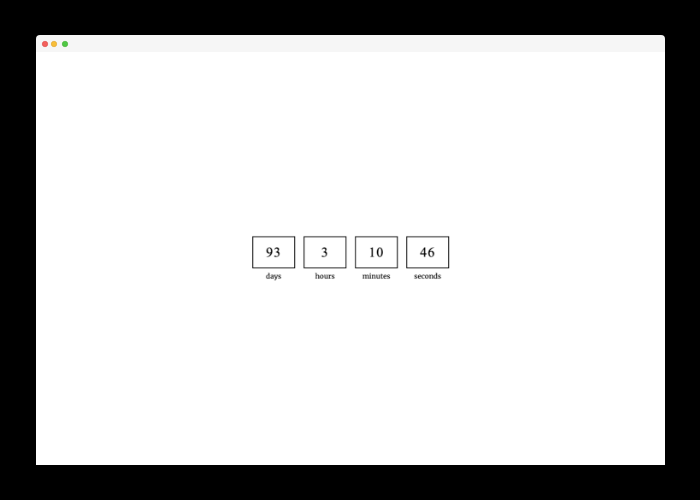
## Preview
## Motivation
Sometimes, when we are working on a website or web application, we want to do deploy and show something to our users as quickly as possible. The `react-coming` library allows you to quickly render a view with a future date countdown. You can set this component to be enabled and rendered only for the production build, for example.
## Installation
To install the hook you can use npm:
```shell
npm i react-coming
```
or Yarn if you prefer:
```shell
yarn add react-coming
```
## Usage
All you need is simple import the component:
```tsx
import { Coming } from 'react-coming';
```
And render the component:
```tsx
import { render } from 'react-dom';
import { Coming } from 'react-coming';
render(
<Coming enabled={process.env.NODE_ENV === 'production'} toDate="YYYY-MM-DD">
<App />
</Coming>,
document.getElementById('app')
);
```
**When the countdown is over (0 seconds left) then the `children` prop will be rendered.**
> Children will also be rendered if you give a wrong date format.
## Custom render component
If you want, you can pass `customComponent` prop to the Coming component to render your own component instead of the default countdown page.
Passed component will receive countdown data as props:
`days`, `hours`, `minutes`, `seconds`.
You can use the countdown data to display inside your own component.
## Available Props
| Name | Type | Description | Default value |
| --------------- | --------- | ---------------------------------------------------------------------- | ----------------------- |
| enabled | boolean | Prop that indicates whether the Coming component should be rendered. | true |
| toDate | string | Date in the format `YYYY-MM-DD` to which the component will countdown. | Current date + 3 months |
| toTime | string | Time in `HH:MM` format to which the component will countdown. | 00:00 |
| daysLabel | string | Label text for days. | days |
| hoursLabel | string | Label text for hours. | hours |
| minutesLabel | string | Label text for minutes. | minutes |
| secondsLabel | string | Label text for seconds. | seconds |
| customComponent | ReactNode | Custom React node to render instead of default Coming countdown page | - |