react-bootstrap-dialog
Version:
The modal-dialog React component with React Bootstrap, alternates `window.confirm` and `window.alert`.
320 lines (221 loc) • 8.24 kB
Markdown
# React Bootstrap Dialog
[](https://badge.fury.io/js/react-bootstrap-dialog)
[](https://travis-ci.org/akiroom/react-bootstrap-dialog)
The React component library for an **alert or dialog** based on **[react-bootstrap](https://react-bootstrap.github.io/)'s `<Modal />`**.
Configurable and easy use instead of `window.alert`, `window.confirm`, or `window.prompt` in your React application.
[](https://gyazo.com/d9c073c6c7d66c05e5398f386345f452)
You can use with react-bootstrap v3 or v4.
(v4 since react-bootstrap-dialog v0.11.0)
Index:
- [Screenshots](#screenshots)
- [Demo and Sample](#demo-and-sample)
- [Usage](#usage)
- [Documents](#documents)
## Screenshots
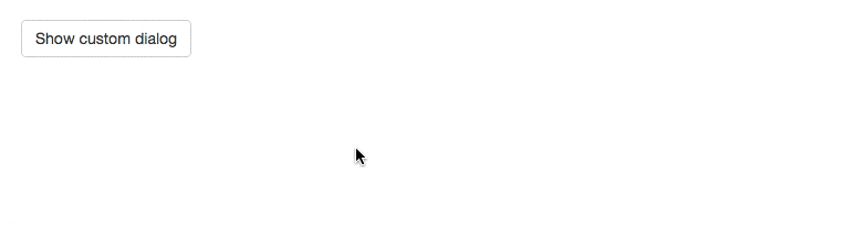
| Default Alert | Default Dialog |
|---------------|----------------|
| Alternative for `window.alert` | Alternative for `window.confirm` |
| [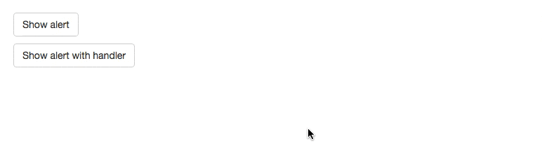](https://gyazo.com/84e315aca42ac4dbe39e51ce3451bb53) | [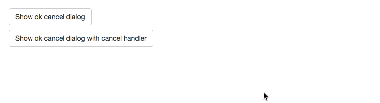](https://gyazo.com/f8e8bfd41d9c652a55ed06a0828dc57e) |
| Text Prompt | Password Prompt |
|--------|---------------|
| Alternative for `window.prompt` | Easy password input |
| [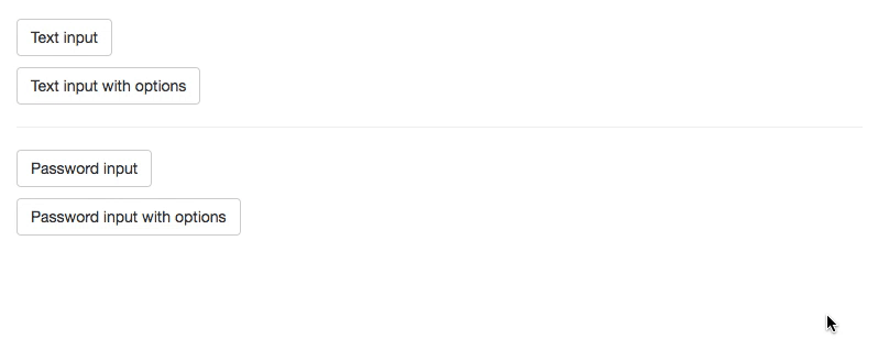](https://gyazo.com/e621e62d17037ab0d1e40fda721ecbb2) | [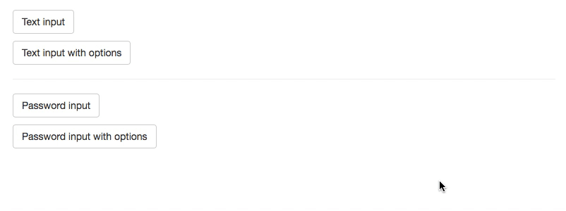](https://gyazo.com/b249233c97a4519f565a6885902befc3) |
## Demo and Sample
- See [Demos on storybook](https://akiroom.github.io/react-bootstrap-dialog/)
- The sample codes are in [/src/stories/samples](https://github.com/akiroom/react-bootstrap-dialog/tree/master/src/stories/samples)
## Usage
### Install
```sh
npm i react-bootstrap-dialog --save
```
or
```sh
yarn add react-bootstrap-dialog
```
### Quick start
Step 1. Import package.
```js
import Dialog from 'react-bootstrap-dialog'
```
Step 2. Write jsx in `render` method.
```html
<Dialog ref={(el) => { this.dialog = el }} />
```
Step 3. Call `showAlert` method or `show` method.
```js
this.dialog.showAlert('Hello Dialog!')
```
Full sample:
```js
import React from 'react'
import {Button} from 'react-bootstrap'
import Dialog from 'react-bootstrap-dialog'
export default class SampleCode extends React.Component {
constructor () {
super()
this.onClick = this.onClick.bind(this)
}
onClick () {
this.dialog.showAlert('Hello Dialog!')
}
render () {
return (
<div>
<Button onClick={this.onClick}>Show alert</Button>
<Dialog ref={(component) => { this.dialog = component }} />
</div>
)
}
}
```
## Documents
Index:
- [`Dialog`](#dialog)
- [`<Dialog />`](#dialog-)
- [`DialogAction` generators](#dialogaction-generators)
- [`DialogPrompt` generators](#dialogprompt-generators)
### `Dialog`
#### setOptions(options)
Set default options for applying to all dialogs
- `options`: [Object] The parameters for default options.
- `defaultOkLabel`: [String, Node] The default label for OK button. Default is `'OK'`.
- `defaultCancelLabel`: [String, Node] The default label for Cancel button. Default is `'Cancel'`.
- `primaryClassName`: [String] The class name for primary button. Default is `'btn-primary'`
- `defaultButtonClassName`: [String] The class name for ordinary button. Default is `'btn-default btn-outline-secondary'`
- Notice: The default value includes v3 and v4 classes.
##### Example
```js
Dialog.setOptions({
defaultOkLabel: 'Yes! Yes! Yes!',
defaultCancelLabel: 'Noooooooo!!',
primaryClassName: 'btn-success',
defaultButtonClassName: 'btn-link'
})
```
#### resetOptions()
Reset default options to presets.
##### Example
```js
Dialog.resetOptions()
```
### `<Dialog />`
#### show(options)
Show dialog with choices. This is similar to `window.confirm`.
- `options`: [Object] The parameters for options.
- `title`: [String, Node] The title of dialog.
- `body`: [String, Node] The body of message.
- `actions`: [Array[DialogAction]] The choices for presenting to user. See [DialogAction generators](#dialogaction-generators).
- `bsSize`: [String] The width size for dialog.
- with react-bootstrap v3: You can choose from [null, 'medium', 'large', 'small'].
- with react-bootstrap v4: You can choose from [null, 'medium', 'lg', 'sm'].
- `onHide`: [Function] The method to call when the dialog was closed by clicking background.
- `prompt`: [DialogPrompt] The prompt to get user input. See [DialogPrompt generators](#dialogprompt-generators).
##### Example
```js
this.dialog.show({
title: 'Greedings',
body: 'How are you?',
actions: [
Dialog.CancelAction(),
Dialog.OKAction()
],
bsSize: 'small',
onHide: (dialog) => {
dialog.hide()
console.log('closed by clicking background.')
}
})
```
#### showAlert(body, bsSize = undefined)
Show message dialog This is similar to `window.alert`.
- `body`: [String, Node] The body of message.
- `bsSize`: [String] The width size for dialog. You can choose in [null, 'medium', 'large', 'small'].
##### Example
```js
this.dialog.showAlert('Hello world!')
```
#### hide()
Hide this dialog.
##### Example
```js
this.dialog.hide()
```
### `DialogAction` generators
#### Dialog.Action(label, func, className)
The customized choice for `options.actions` in `dialog.show`.
- `label`: [String, Node] The label for the button.
- `func`: [Function] The method to call when the button is clicked.
- `className`: The class name for the button.
##### Example
```js
Dialog.Action(
'Hello',
() => console.log('Hello!'),
'btn-info'
)
```
#### Dialog.DefaultAction(label, func, className)
The default choice for `options.actions` in `dialog.show`.
- `label`: [String, Node] The label for the button.
- `func`: [Function] The method to call when the button is clicked.
- `className`: The class name for the button. (Default is `'btn-primary'`)
##### Example
```js
Dialog.DefaultAction(
'Remove',
() => {
console.log('Remove action will be executed!')
},
'btn-danger'
)
```
#### Dialog.OKAction(func)
The OK choice for `options.actions` in `dialog.show`.
It uses default ok label (`'OK'`) and default primary class (`'btn-primary'`).
- `func`: [Function] The method to call when the button is clicked.
##### Example
```js
Dialog.OKAction(() => {
console.log('OK was clicked!')
})
```
#### Dialog.CancelAction(func)
The Cancel choice for `options.actions` in `dialog.show`.
It uses default cancel label (`'Cancel'`).
- `func`: [Function] The method to call when the button is clicked.
##### Example 1
```js
Dialog.CancelAction(() => {
console.log('Cancel was clicked!')
})
```
##### Example 2
```js
// Do nothing.
Dialog.CancelAction()
```
### `DialogPrompt` generators
#### Dialog.TextPrompt(options = {})
The prompt settings to show text input for `options.prompt` in `dialog.show`.
- `options`: [Object] The parameters for options.
- `initialValue`: [String] The initial value for the prompt.
- `placeholder`: [String] The placeholder for the prompt.
- `required`: [Boolean] If true, prevent to close dialog without input text value.
##### Example
```js
Dialog.TextPrompt()
// or
Dialog.TextPrompt({initialValue: 'me@example.com', placeholder: 'your email'})
```
#### Dialog.PasswordPrompt(options = {})
The prompt settings to show password input for `options.prompt` in `dialog.show`.
- `options`: [Object] The parameters for options.
- `initialValue`: [String] The initial value for the prompt.
- `placeholder`: [String] The placeholder for the prompt.
- `required`: [Boolean] If true, prevent to close dialog without input password value.
##### Example
```js
Dialog.PasswordPrompt()
// or
Dialog.PasswordPrompt({initialValue: 'previous~pa$sw0rd', placeholder: 'your password'})
```