react-animated-list
Version:
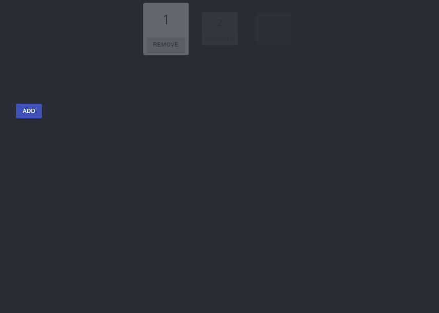
Simple way of animating when components are added or removed from an array
42 lines (28 loc) • 2.45 kB
Markdown
React animated list is a simple way you can have any of your array-based elements be automatically animated. This applies to when they are both rendered, and removed.
[](https://codesandbox.io/s/nifty-platform-dj1iz?fontsize=14&hidenavigation=1&theme=dark)
`yarn add react-animated-list`
`react-animated-list` exports a named component `AnimatedList`. Importing this will allow you to wrap a list of other components you want animated as follows:
```
import { AnimatedList } from 'react-animated-list';
import { MyOtherComponent } from './MyOtherComponent';
const MyComponent = ({myData}) => (
<AnimatedList animation={"grow"}>
{otherComponents.map((c) => (
<MyOtherComponent key={c.id} />
))}
</AnimatedList>
)
```
**Note that the `key` property is required on the child components, this is used to determine which elements to animate in/out**
The `AnimatedListComponent` can be configured with the following properties:
| Name | Type | Default | Description |
| :----------------------- | :------------------------------------------ | :------ | :-------------------------------------------------------------------------------------------------------------------------------------------------------- |
| animation | `grow`, `fade`, `slide`, `zoom`, `collapse` | `grow` | The type of animation to use |
| animationProps | | none | The props that should be passed to the Material UI component that handles the rendering. See https://material-ui.com/api/grow/#grow-api for more examples |
| initialAnimationDuration | number | 750 | How long the `enter` animation for the list should take on the initial render |