react-agenda
Version:
An advanced agenda / organizer built with react
284 lines (224 loc) • 12.8 kB
Markdown
[](https://badge.fury.io/js/react-agenda)
# React-agenda
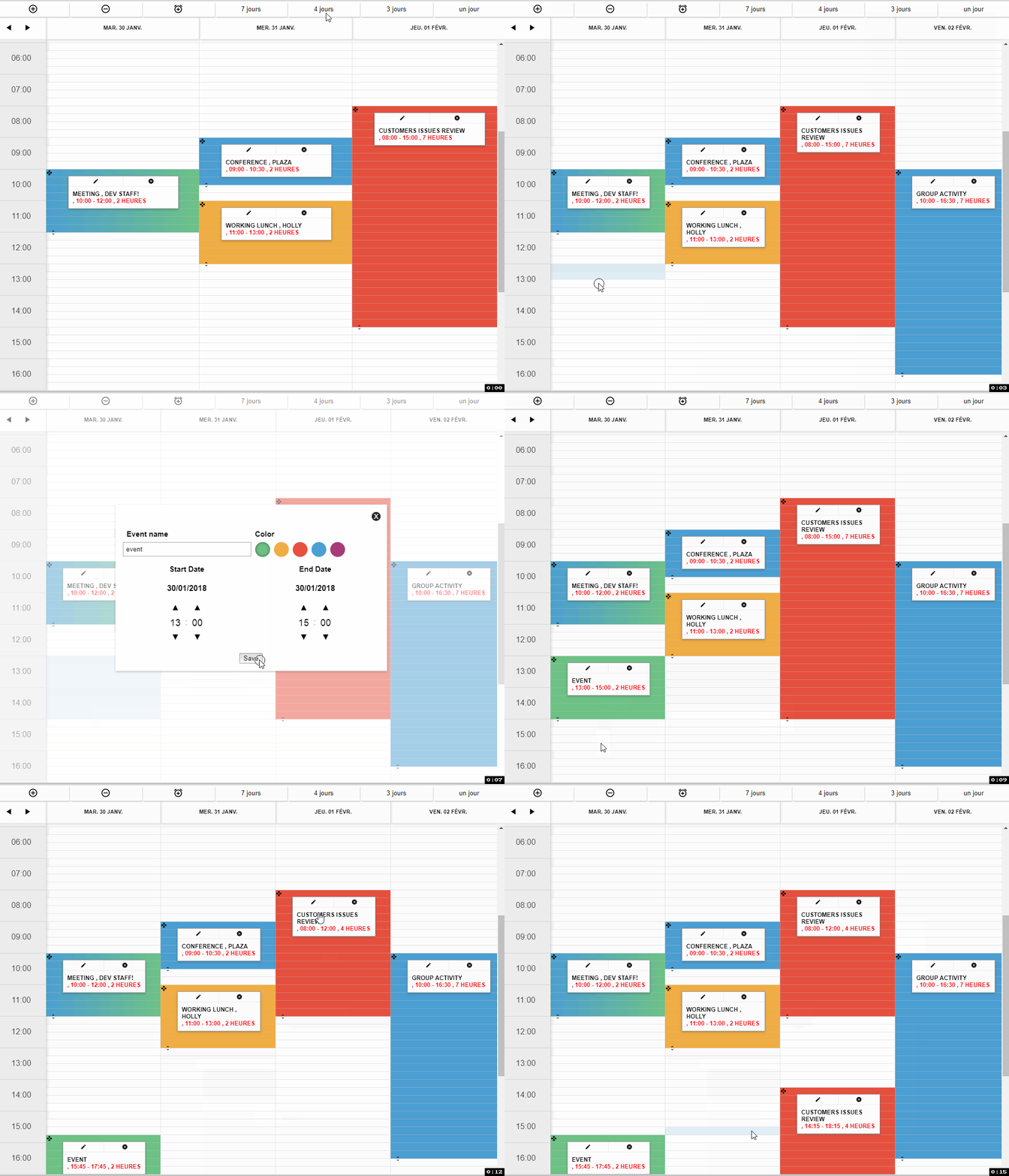
react-agenda is an advanced agenda that you can quickly integrate into your app. It's a simple yet effective solution for events management. [`https://revln9.github.io/react-agenda`](https://revln9.github.io/react-agenda/#/)
## Installation
The easiest way to use react-agenda is to install it from NPM
```js
npm install react-agenda --save
```
This will install the agenda component , along other components like the form to add and edit events and the modal , then add these two lines at the beginning of your CSS file.
```js
@import '~react-agenda/build/styles.css';
@import '~react-datetime/css/react-datetime.css';
```
Note that the library uses [`moment`](https://moment.js.com) and moment locale (for internationalization), [`react-datetime`](https://github.com/YouCanBookMe/react-datetime) is also used in the forms to help with time picking. Those will get installed if NPM doesn't detect them into your app.
## Usage
this will get you started with the basic requirements.
```js
import React from 'react';
import { ReactAgenda , ReactAgendaCtrl , guid , Modal } from 'react-agenda';
require('moment/locale/fr.js'); // this is important for traduction purpose
var colors= {
'color-1':"rgba(102, 195, 131 , 1)" ,
"color-2":"rgba(242, 177, 52, 1)" ,
"color-3":"rgba(235, 85, 59, 1)"
}
var now = new Date();
var items = [
{
_id :guid(),
name : 'Meeting , dev staff!',
startDateTime : new Date(now.getFullYear(), now.getMonth(), now.getDate(), 10, 0),
endDateTime : new Date(now.getFullYear(), now.getMonth(), now.getDate(), 12, 0),
classes : 'color-1'
},
{
_id :guid(),
name : 'Working lunch , Holly',
startDateTime : new Date(now.getFullYear(), now.getMonth(), now.getDate()+1, 11, 0),
endDateTime : new Date(now.getFullYear(), now.getMonth(), now.getDate()+1, 13, 0),
classes : 'color-2 color-3'
},
];
export default class Agenda extends React.Component {
constructor(props){
super(props);
this.state = {
items:items,
selected:[],
cellHeight:30,
showModal:false,
locale:"fr",
rowsPerHour:2,
numberOfDays:4,
startDate: new Date()
}
this.handleCellSelection = this.handleCellSelection.bind(this)
this.handleItemEdit = this.handleItemEdit.bind(this)
this.handleRangeSelection = this.handleRangeSelection.bind(this)
}
handleCellSelection(item){
console.log('handleCellSelection',item)
}
handleItemEdit(item){
console.log('handleItemEdit', item)
}
handleRangeSelection(item){
console.log('handleRangeSelection', item)
}
render() {
return (
<div>
<ReactAgenda
minDate={now}
maxDate={new Date(now.getFullYear(), now.getMonth()+3)}
disablePrevButton={false}
startDate={this.state.startDate}
cellHeight={this.state.cellHeight}
locale={this.state.locale}
items={this.state.items}
numberOfDays={this.state.numberOfDays}
rowsPerHour={this.state.rowsPerHour}
itemColors={colors}
autoScale={false}
fixedHeader={true}
onItemEdit={this.handleItemEdit.bind(this)}
onCellSelect={this.handleCellSelection.bind(this)}
onRangeSelection={this.handleRangeSelection.bind(this)}/>
</div>
);
}
}
```
## Properties
#### ReactAgenda
This is the main component , it can be used as a standalone to display upcoming or past events
| property |type | default | description |
| -------- | ---- | ----------- | ----- |
| items | array | [ ] |Array of event objects to be displayed on the calendar |
| minDate | date | new Date() | (Required) Minimal date to display |
| maxDate | date | new Date() + 3months | (Required) Maximal to display |
| startDate | date | new Date() | (Required) The starting date of the agenda view |
| startAtTime | int | 0 | The starting time of the agenda (Hour) |
| endAtTime | int | 0 | The ending time of the agenda (Hour) |
| headFormat | string | "ddd DD MMM" | The model used to format the header dates |
| cellHeight | int | 15 | Height of a single cell in px |
| locale | string | 'en' | Locale zone represented by two characters (fr ,en , de...etc) |
| numberOfDays | int | 4 | Number of days to be displayed (columns) |
| rowsPerHour | int | true | Number of cells in one hour
| itemColors | obj | 4 colors | (Required) Main rgba colors to be used on items ```colors={'colorKey':'rbga(210 ,110, 184 ,1)', 'colorKey2':...} ```|
| itemComponent | function or component | AgendaItem | Item component of an event , see below for props |
| autoScale | bool | false | If true , **numberOfDays** will be calculated from the window width |
| fixedHeader | bool | true | if the header of the agenda should be in a fixed position |
| helper | bool | true | A helper that shows up the time range selection when you drag select |
| onRangeSelection | func (cells) | | Array of the selected cells ( strings of dates) , fires only if more than one cell is selected |
| onChangeEvent | func (items,item) | | (Required for drag & drop) Callback when an event is modified (drag&drop) , first param is the array of events with the modified item , second param is the modified item only |
| onChangeDuration | func (items,item) | | (Required for drag & resize ) Callback when an event **Duration** is modified (drag&drop) , first param is the array of events with the modified item , second param is the modified item only |
|onItemEdit | func (items,item) | |(Required for item edition) Callback for the edit button on every item, returns the item object itself |
|onCellSelect | func (cell) | |(Required) when user click on a single cell , callback is fired with a date string as param |
|onItemRemove | func (items,item) | |(Required for item deletion) Callback for the remove button on every item, returns the new items array(for convenience) and the item object that has been removed from the array |
|onDateRangeChange | func (startDate,endDate) | | Callback for navigation buttons on top left , the params are object dates |
#### ReactAgendaCtrl
This component is used to display and process the add/edit form , it needs to be placed with the ReactAgenda component (side by side) , and will give you a fully featured form to add and edit events. Check this page to see how to use it [`source`]( https://github.com/Revln9/react-agenda/blob/master/example/src/agenda/agenda.js)
```js
<ReactAgendaCtrl
items={this.state.items}
itemColors={colors}
selectedCells={this.state.selected}
Addnew={this.addNewEvent}
edit={this.editEvent} />
```
| property | Type | Required | Description |
| -------- | ------ | ----------- | --------|
| items | Array | true | Array of event objects to be displayed on the calendar |
| itemColors | Object | true | (Required) Main rgba colors to be used on items ```colors={'colorKey':'rbga(210 ,110, 184 ,1)', 'colorKey2':...} ``` it needs to be the same object passed to the main component |
| selectedCells | Array | false | The array representing the selected cells from the **onRangeSelection** callback |
| Addnew | func (items,newItems) | | Returns the **new items** and the updated **items** array (for convenience). Note that when you select cells from different days , every day will have his own item (event) |
| edit |func (items,item) | | Returns the updated items array and the edited item. |
#### itemComponent
This component is used to display the details of a single event in the agenda , by default , react-agenda uses the **ReactAgendaItem** [`source`](https://github.com/Revln9/react-agenda/blob/master/src/reactAgendaItem.js) component to render items , but you can replace it with your own component , check out the example below
```js
var AgendaItem = function(props){
console.log( ' item component props' , props)
return <div style={{display:'block', position:'absolute' , background:'#FFF'}}>
{props.item.name}
<button onClick={()=> props.edit(props.item)}>Edit </button>
</div>
}
```
| property | Type | Required | Description |
| -------- | ------ | ----------- | --------|
| item | Array | true | Array of event objects to be displayed on the calendar |
| itemColors | Object | true | (Required) Main rgba colors to be used on items ```colors={'colorKey':'rbga(210 ,110, 184 ,1)', 'colorKey2':...} ``` it needs to be the same object passed to the main component |
| selectedCells | Array | false | The array representing the selected cells from the **onRangeSelection** callback |
| Addnew | func (items,newItems) | | Returns the **new items** and the updated **items** array (for convenience). Note that when you select cells from different days , every day will have his own item (event) |
| edit |func (items,item) | | Returns the updated items array and the edited item. |
### Events object
The event object can contain any data you wish to keep or display on that event . There are however some required fields that must be populated.
```
{
_id :guid(),
name : 'Meeting , dev staff!',
startDateTime : new Date(new Date().getFullYear(), new Date().getMonth(), new Date().getDate()+1, 10, 0),
endDateTime : new Date(new Date().getFullYear(), new Date().getMonth(), new Date().getDate()+1, 12, 0),
classes : 'color-1'
},
```
| Key | Type | Required | Description |
| -------- | ---- | ----------- | --------|
| _id | string | true | unique identifier of each item (event) you can use the **guid()** function once you import it which returns a random id |
| startDateTime | Date | true | Date of event start (javascript date object) |
| endDateTime | Date | true | Date of event end (javascript date object) |
| classes | string | true | the color key of your colors object you wish to apply , this will also be given as a class to the cells involved.|
### Modal
The Modal is a simple Utility Component With a single callback, **clickOutside** that will get fired when the user clicks outside of a the modal-content div or uses the close button.
```
{
this.state.showModal?
<Modal clickOutside={()=>this.setState({showModal:false])} >
<div className="modal-content">
<ReactAgendaCtrl
items={this.state.items}
itemColors={colors}
selectedCells={this.state.selected}
Addnew={this.addNewEvent}
edit={this.editEvent} />
</div>
</Modal>:''
}
```
| property | Type | Required | Description |
| -------- | ---- | ----------- | --------|
| title | string | false | this text will be displayed as the title of the modal |
| frameless | bool | false | whether to display a modal with or without frame |
| clickOutside | func (event) | true | function to close the modal (check example) |
| children | HTML elements, components| true | The content of the modal.|
## Demo & Examples
To build the example locally, run:
```js
git clone https://github.com/Revln9/react-agenda.git
cd react-agenda/example
npm install
npm start
```
Then open [`localhost:3000`](http://localhost:3000) in a browser.
### Notes
## License
The MIT License (MIT)
Permission is hereby granted, free of charge, to any person obtaining a copy
of this software and associated documentation files (the "Software"), to deal
in the Software without restriction, including without limitation the rights
to use, copy, modify, merge, publish, distribute, sublicense, and/or sell
copies of the Software, and to permit persons to whom the Software is
furnished to do so, subject to the following conditions:
The above copyright notice and this permission notice shall be included in all
copies or substantial portions of the Software.
THE SOFTWARE IS PROVIDED "AS IS", WITHOUT WARRANTY OF ANY KIND, EXPRESS OR
IMPLIED, INCLUDING BUT NOT LIMITED TO THE WARRANTIES OF MERCHANTABILITY,
FITNESS FOR A PARTICULAR PURPOSE AND NONINFRINGEMENT. IN NO EVENT SHALL THE
AUTHORS OR COPYRIGHT HOLDERS BE LIABLE FOR ANY CLAIM, DAMAGES OR OTHER
LIABILITY, WHETHER IN AN ACTION OF CONTRACT, TORT OR OTHERWISE, ARISING FROM,
OUT OF OR IN CONNECTION WITH THE SOFTWARE OR THE USE OR OTHER DEALINGS IN THE
SOFTWARE.
Copyright (c) 2018 Sami Chetbi.