rc-menu-rtl
Version:
rtl menu ui component for react
419 lines (380 loc) • 11.6 kB
Markdown
# rc-menu
---
react menu component. port from https://github.com/kissyteam/menu
[![NPM version][npm-image]][npm-url]
[![build status][travis-image]][travis-url]
[![Test coverage][coveralls-image]][coveralls-url]
[![gemnasium deps][gemnasium-image]][gemnasium-url]
[![node version][node-image]][node-url]
[![npm download][download-image]][download-url]
[npm-image]: http://img.shields.io/npm/v/rc-menu.svg?style=flat-square
[npm-url]: http://npmjs.org/package/rc-menu
[travis-image]: https://img.shields.io/travis/react-component/menu.svg?style=flat-square
[travis-url]: https://travis-ci.org/react-component/menu
[coveralls-image]: https://img.shields.io/coveralls/react-component/menu.svg?style=flat-square
[coveralls-url]: https://coveralls.io/r/react-component/menu?branch=master
[gemnasium-image]: http://img.shields.io/gemnasium/react-component/menu.svg?style=flat-square
[gemnasium-url]: https://gemnasium.com/react-component/menu
[node-image]: https://img.shields.io/badge/node.js-%3E=_0.10-green.svg?style=flat-square
[node-url]: http://nodejs.org/download/
[download-image]: https://img.shields.io/npm/dm/rc-menu.svg?style=flat-square
[download-url]: https://npmjs.org/package/rc-menu
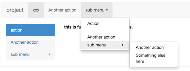
## Screenshot
## Usage
```jsx
import Menu, {SubMenu, MenuItem} from 'rc-menu';
ReactDOM.render(<Menu>
<MenuItem>1</MenuItem>
<SubMenu title="2">
<MenuItem>2-1</MenuItem>
</SubMenu>
</Menu>, container);
```
## install
[](https://npmjs.org/package/rc-menu)
## API
### Menu props
<table class="table table-bordered table-striped">
<thead>
<tr>
<th style="width: 100px;">name</th>
<th style="width: 50px;">type</th>
<th style="width: 50px;">default</th>
<th>description</th>
</tr>
</thead>
<tbody>
<tr>
<td>className</td>
<td>String</td>
<td></td>
<td>additional css class of root dom node</td>
</tr>
<tr>
<td>mode</td>
<td>String</td>
<th>vertical</th>
<td>one of ["horizontal","inline","vertical-left","vertical-right"]</td>
</tr>
<tr>
<td>activeKey</td>
<td>Object</td>
<th></th>
<td>initial and current active menu item's key.</td>
</tr>
<tr>
<td>defaultActiveFirst</td>
<td>Boolean</td>
<th>false</th>
<td>whether active first menu item when show if activeKey is not set or invalid</td>
</tr>
<tr>
<td>multiple</td>
<td>Boolean</td>
<th>false</th>
<td>whether allow multiple select</td>
</tr>
<tr>
<td>selectable</td>
<td>Boolean</td>
<th>true</th>
<td>allow selecting menu items</td>
</tr>
<tr>
<td>selectedKeys</td>
<td>String[]</td>
<th>[]</th>
<td>selected keys of items</td>
</tr>
<tr>
<td>defaultSelectedKeys</td>
<td>String[]</td>
<th>[]</th>
<td>initial selected keys of items</td>
</tr>
<tr>
<td>openKeys</td>
<td>String[]</td>
<th>[]</th>
<td>open keys of SubMenuItem</td>
</tr>
<tr>
<td>defaultOpenKeys</td>
<td>String[]</td>
<th>[]</th>
<td>initial open keys of SubMenuItem</td>
</tr>
<tr>
<td>onSelect</td>
<td>function({key:String, item:ReactComponent, domEvent:Event, selectedKeys:String[]})</td>
<th></th>
<td>called when select a menu item</td>
</tr>
<tr>
<td>onClick</td>
<td>function({key:String, item:ReactComponent, domEvent:Event, keyPath: String[]})</td>
<th></th>
<td>called when click a menu item</td>
</tr>
<tr>
<td>onOpenChange</td>
<td>(openKeys:String[]) => void</td>
<th></th>
<td>called when open/close sub menu</td>
</tr>
<tr>
<td>onDeselect</td>
<td>function({key:String, item:ReactComponent, domEvent:Event, selectedKeys:String[]})</td>
<th></th>
<td>called when deselect a menu item. only called when allow multiple</td>
</tr>
<tr>
<td>triggerSubMenuAction</td>
<td>Enum { hover, click }</td>
<th>hover</th>
<td>which action can trigger submenu open/close</td>
</tr>
<tr>
<td>openAnimation</td>
<td>{enter:function,leave:function}|String</td>
<th></th>
<td>animate when sub menu open or close. see rc-animate for object type.</td>
</tr>
<tr>
<td>openTransition</td>
<td>String</td>
<th></th>
<td>css transitionName when sub menu open or close</td>
</tr>
<tr>
<td>subMenuOpenDelay</td>
<td>Number</td>
<th>0</th>
<td>delay time to show popup sub menu. unit: s</td>
</tr>
<tr>
<td>subMenuCloseDelay</td>
<td>Number</td>
<th>0.1</th>
<td>delay time to hide popup sub menu. unit: s</td>
</tr>
<tr>
<td>forceSubMenuRender</td>
<td>Boolean</td>
<th>false</th>
<td>whether to render submenu even if it is not visible</td>
</tr>
<tr>
<td>getPopupContainer</td>
<td>Function(menuDOMNode): HTMLElement</td>
<th>() => document.body</th>
<td>Where to render the DOM node of popup menu when the mode is horizontal or vertical</td>
</tr>
<tr>
<td>builtinPlacements</td>
<td>Object of alignConfigs for <a href="https://github.com/yiminghe/dom-align">dom-align</a></td>
<th>see <a href="./src/placements.jsx">placements.jsx</a></th>
<td>Describes how the popup menus should be positioned</td>
</tr>
<tr>
<td>itemIcon</td>
<td>ReactNode | (props: MenuItemProps) => ReactNode</td>
<th></th>
<td>Specify the menu item icon.</td>
</tr>
<tr>
<td>expandIcon</td>
<td>ReactNode | (props: SubMenuProps & { isSubMenu: boolean }) => ReactNode</td>
<th></th>
<td>Specify the menu item icon.</td>
</tr>
</tbody>
</table>
### Menu.Item props
<table class="table table-bordered table-striped">
<thead>
<tr>
<th style="width: 100px;">name</th>
<th style="width: 50px;">type</th>
<th style="width: 50px;">default</th>
<th>description</th>
</tr>
</thead>
<tbody>
<tr>
<td>className</td>
<td>String</td>
<td></td>
<td>additional css class of root dom node</td>
</tr>
<tr>
<td>disabled</td>
<td>Boolean</td>
<th>false</th>
<td>no effect for click or keydown for this item</td>
</tr>
<tr>
<td>key</td>
<td>Object</td>
<th></th>
<td>corresponding to activeKey</td>
</tr>
<tr>
<td>onMouseEnter</td>
<td>Function({eventKey, domEvent})</td>
<th></th>
<td></td>
</tr>
<tr>
<td>onMouseLeave</td>
<td>Function({eventKey, domEvent})</td>
<th></th>
<td></td>
</tr>
<tr>
<td>itemIcon</td>
<td>ReactNode | (props: MenuItemProps) => ReactNode</td>
<th></th>
<td>Specify the menu item icon.</td>
</tr>
</tbody>
</table>
### Menu.SubMenu props
<table class="table table-bordered table-striped">
<thead>
<tr>
<th style="width: 100px;">name</th>
<th style="width: 50px;">type</th>
<th style="width: 50px;">default</th>
<th>description</th>
</tr>
</thead>
<tbody>
<tr>
<td>popupClassName</td>
<td>String</td>
<td></td>
<td>additional css class of root dom node</td>
</tr>
<tr>
<td>title</td>
<td>String/ReactElement</td>
<td></td>
<td>sub menu's content</td>
</tr>
<tr>
<td>overflowedIndicator</td>
<td>String/ReactElement</td>
<td>···</td>
<td>overflow indicator when menu overlows in horizontal mode</td>
</tr>
<tr>
<td>key</td>
<td>Object</td>
<th></th>
<td>corresponding to activeKey</td>
</tr>
<tr>
<td>disabled</td>
<td>Boolean</td>
<th>false</th>
<td>no effect for click or keydown for this item</td>
</tr>
<tr>
<td>onMouseEnter</td>
<td>Function({eventKey, domEvent})</td>
<th></th>
<td></td>
</tr>
<tr>
<td>onMouseLeave</td>
<td>Function({eventKey, domEvent})</td>
<th></th>
<td></td>
</tr>
<tr>
<td>onTitleMouseEnter</td>
<td>Function({eventKey, domEvent})</td>
<th></th>
<td></td>
</tr>
<tr>
<td>onTitleMouseLeave</td>
<td>Function({eventKey, domEvent})</td>
<th></th>
<td></td>
</tr>
<tr>
<td>onTitleClick</td>
<td>Function({eventKey, domEvent})</td>
<th></th>
<td></td>
</tr>
<tr>
<td>popupOffset</td>
<td>Array</td>
<th></th>
<td>The offset of the popup submenu, in an x, y coordinate array. e.g.: `[0,15]`</td>
</tr>
<tr>
<td>expandIcon</td>
<td>ReactNode | (props: SubMenuProps) => ReactNode</td>
<th></th>
<td>Specify the menu item icon.</td>
</tr>
<tr>
<td>itemIcon</td>
<td>ReactNode | (props: SubMenuProps & { isSubMenu: boolean }) => ReactNode</td>
<th></th>
<td>Specify the menu item icon.</td>
</tr>
</tbody>
</table>
### Menu.Divider props
none
### Menu.ItemGroup props
<table class="table table-bordered table-striped">
<thead>
<tr>
<th style="width: 100px;">name</th>
<th style="width: 50px;">type</th>
<th style="width: 50px;">default</th>
<th>description</th>
</tr>
</thead>
<tbody>
<tr>
<td>title</td>
<td>String|React.Element</td>
<th></th>
<td>title of item group</td>
</tr>
<tr>
<td>children</td>
<td>React.Element[]</td>
<th></th>
<td>MenuItems belonged to this group</td>
</tr>
</tbody>
</table>
## Development
```
npm install
npm start
```
## Example
http://localhost:8001/examples/index.md
online example: http://react-component.github.io/menu/examples/
## Test Case
```
npm test
npm run chrome-test
```
## Coverage
```
npm run coverage
```
open coverage/ dir
## License
rc-menu is released under the MIT license.