primereact
Version:
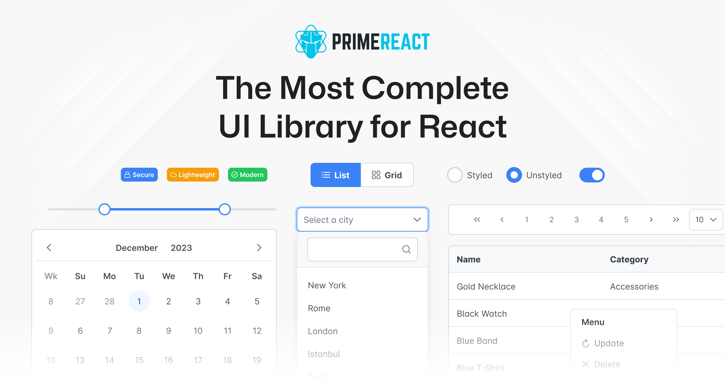
PrimeReact is an open source UI library for React featuring a rich set of 90+ components, a theme designer, various theme alternatives such as Material, Bootstrap, Tailwind, premium templates and professional support. In addition, it integrates with Prime
68 lines (46 loc) • 2.85 kB
Markdown
[](https://opensource.org/licenses/MIT)
[](https://badge.fury.io/js/primereact)
[](https://snyk.io/advisor/npm-package/primereact)

[](https://github.com/primefaces/primereact/actions/workflows/node.js.yml)
[](https://discord.gg/gzKFYnpmCY)
[](https://stackoverflow.com/questions/tagged/primereact)
[](https://github.com/orgs/primefaces/discussions)
[](https://www.primereact.org)
PrimeReact is a rich set of open source UI Components for React. See [PrimeReact homepage](https://primereact.org/) for live showcase and documentation.
PrimeReact is available at [npm](https://www.npmjs.com/package/primereact).
```
npm install primereact
yarn add primereact
pnpm add primereact
```
Each component can be imported individually so that you only bundle what you use. Import path is available in the documentation of the corresponding component.
```javascript
//import { ComponentName } from 'primereact/{componentname}';
import { Button } from 'primereact/button';
export default function MyComponent() {
return (
<Button label="PrimeReact" />
)
}
```
PrimeReact has two theming modes; styled or unstyled.
**Styled Mode**
Styled mode is based on pre-skinned components with opinionated themes like Material, Bootstrap or PrimeOne themes. Theme is the required css file to be imported, visit the [Themes](https://primereact.org/theming) section for the complete list of available themes to choose from.
```javascript
// theme
import 'primereact/resources/themes/lara-light-cyan/theme.css';
```
**Unstyled Mode**
Unstyled mode is disabled by default for all components. Using the PrimeReact context, set `unstyled` as true to enable it globally. Visit the [Unstyled mode](https://primereact.org/unstyled) documentation for more information and examples.
<a href="https://github.com/primefaces/primereact/graphs/contributors">
<img src="https://contrib.rocks/image?repo=primefaces/primereact" />
</a>