ohayolibs
Version:
Ohayo is a set of essential modules for ohayojp.
189 lines (141 loc) • 5.01 kB
Markdown
---
order: 5
title: 定制主题
type: Documents
---
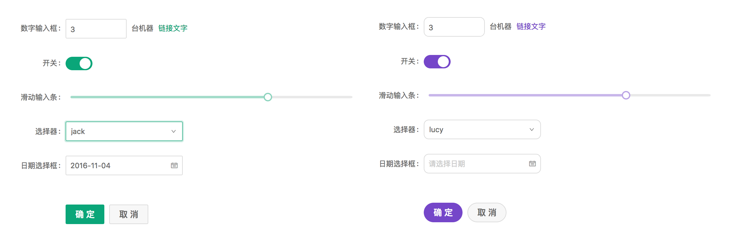
Ant Design 设计规范上支持一定程度的样式定制,以满足业务和品牌上多样化的视觉需求,包括但不限于主色、圆角、边框和部分组件的视觉定制。
## 定制方式
Ant Design 的样式使用了 [Less](http://lesscss.org/) 作为开发语言,并定义了一系列全局/组件的样式变量,你可以根据需求进行相应调整,默认样式变量:[NG-ZORRO](https://github.com/NG-ZORRO/ng-zorro-antd/blob/master/components/style/themes/default.less)、[ohayojp]() 两部分。
### 初始化项目时定制主题
在初始化项目时 `ng add ohayojp` 时选择自定义主题即可自动配置好自定义主题的相关文件,修改 `src/styles/theme.less` 文件内容就可以自定义主题。
## 官方主题
我们提供了一些官方主题,欢迎在项目中试用,并且给我们提供反馈。
- 🌑 暗黑主题(9+ 支持)
- 📦 紧凑主题(9+ 支持)
### 方式一
在样式文件 `src/styles/theme.less` 更改 `default` 为 `dark` 或 `compact` 覆盖主题变量。
```less
// - `default` 默认主题
// - `dark` 🌑 暗黑主题(9+ 支持)
// - `compact` 📦 紧凑主题(9+ 支持)
@import '~@ohayo/theme/theme-default.less';
// ==========The following is the custom theme variable area==========
// @primary-color: #f50;
```
### 方式二
如果项目不使用 Less,可在 CSS 文件或者 `angular.json` 的 `styles` 字段中,全量引入 `dark.css` 或者 `compact.css`。
样式文件中:
```css
@import "~@ohayo/theme/dark.css";
```
`angular.json` 中
```json
{
"build": {
"options": {
"styles": [
"node_modules/@ohayo/theme/dark.css"
]
}
}
}
```
## 主题切换
当使用 @angular/cli 的方式配置主题时必须为每个主题单独打包应用,当你想切换主题而不重新加载应用时(就像这个网站),你可以使用下面的方法将主题编译到单独的样式文件,并在运行时切换:
注意:确保与主题变量相关的样式存在全局样式中,而不是组件样式中,因为组件样式优先级更高将会导致样式无法被覆盖。
1. 安装依赖
```bash
# via yarn
yarn add ng-alain-plugin-theme -D
# via npm
# npm i --save-dev less ng-alain-plugin-theme
```
> [ng-alain-plugin-theme](https://github.com/ohayojp/plugin-theme) 是专门针对 ohayojp 生成 `color.less` 及主题CSS文件。
在 `ohayojp.json` 内新增 `theme` 节点:
```json
{
"$schema": "./node_modules/ohayojp/schema.json",
"theme": {
"list": [
{
"theme": "dark"
},
{
"key": "dust",
"modifyVars": {
"@primary-color": "#F5222D"
}
}
]
}
}
```
最后运行以下命令:
```bash
npx ng-alain-plugin-theme -t=themeCss
```
会在 `src/assets/style.dark.css` 和 `src/assets/style.dust.css` 生成两个样式文件。
2. 运行时切换样式
动态创建 `link` 标签,将样式文件动态加载在应用中,反之移除。
> 完整代码请参考 [theme-btn](https://github.com/ohayojp/ohayojp/tree/master/src/app/layout/default/theme-btn)。
```ts
changeTheme(theme: 'default' | 'dark'): void {
if (theme === 'dark') {
const style = document.createElement('link');
style.type = 'text/css';
style.rel = 'stylesheet';
style.id = 'dark-theme';
style.href = 'assets/style.dark.css';
} else {
const dom = document.getElementById('dark-theme');
if (dom) {
dom.remove();
}
}
}
```
> 注意:如果你使用 `@ohayo/chart` 或第三方组件,可能需要手动修改组件来支持相应的主题。
## 组件开发问题
以上主题切换方式是在一个将所有 Less 样式内容独立于 `src/styles.less` 下面,当正常情况下,还会在组件内定义,就像:
```ts
@Component({
selector: 'app-dashboard-analysis',
templateUrl: './analysis.component.html',
styleUrls: ['./analysis.component.less'],
changeDetection: ChangeDetectionStrategy.OnPush,
})
export class DashboardAnalysisComponent {}
```
```less
// analysis.component.less
@import '~@ohayo/theme/index';
:host ::ng-deep {
color: @text-color;
}
```
由于组件内定义的样式独立运行在 Angular 下面,是无法根据 `@import '~@ohayo/theme/theme-compact.less';` 的引入来整体切换成暗黑系,如果你希望在组件内也同样使用暗黑系,则必须将:
```diff
// analysis.component.less
- @import '~@ohayo/theme/index';
+ @import '~@ohayo/theme/theme-dark';
```
或者,重新针对某一个主题重新定义:
```less
// analysis.component.less
[data-theme='dark'] {
:host ::ng-deep {
// 针对暗黑系重新定义
}
}
```
或紧凑主题:
```less
[data-theme='compact'] {
:host ::ng-deep {
// 针对紧凑重新定义
}
}
```
## 相关文章
- [组件样式](/theme/component-styles)