ohayolibs
Version:
Ohayo is a set of essential modules for ohayojp.
189 lines (141 loc) • 4.89 kB
Markdown
---
order: 5
title: Customize Theme
type: Documents
---
Ant Design allows you to customize some basic design aspects in order to meet the needs of UI diversity from business and brand, including primary color, border radius, border color, etc.
## Less variables
We are using [Less](http://lesscss.org/) as the development language for styling. A set of less variables are defined for each design aspect that can be customized to your needs.
### Customize theme with schematics
Run `ng add ohayojp`, set up custom theme file, then modified the file `src/styles/theme.less`.
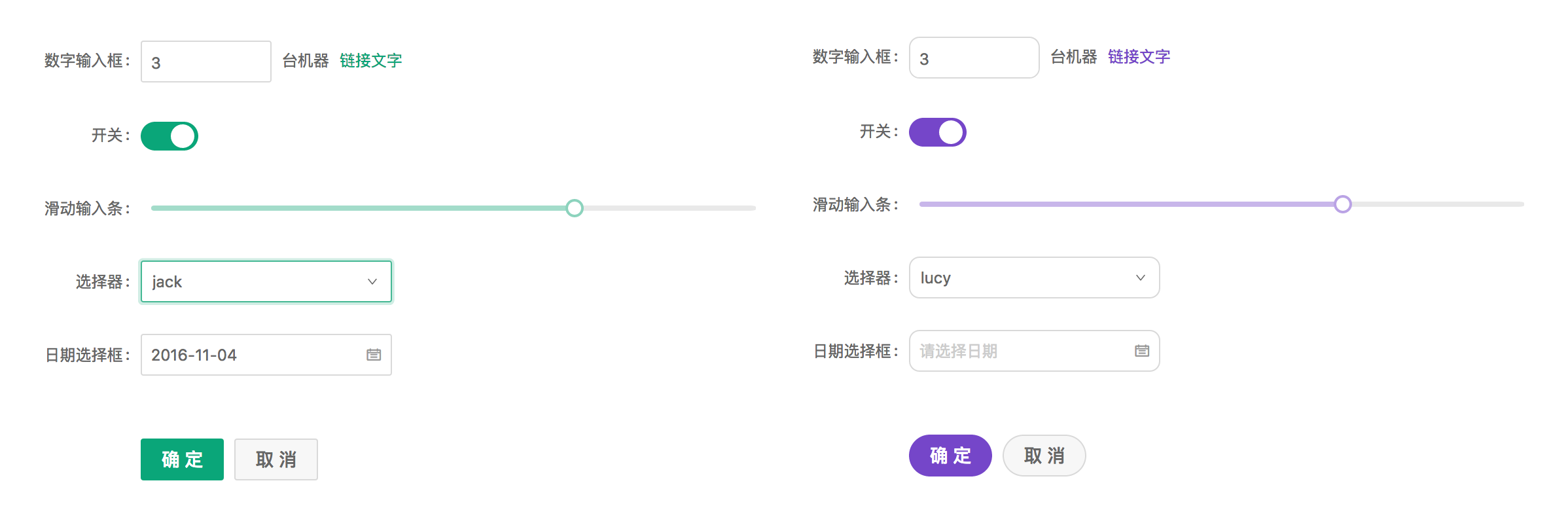
## Official Themes
We have some official themes, try them out and give us some feedback!
- 🌑 Dark Theme (supported in 9+)
- 📦 Compact Theme (supported in 9+)
### Method 1
In the style file `src/styles/theme.less`, change `default` to `dark` or `compact` to override theme variables.
```less
// - `default` Default Theme
// - `dark` 🌑 Dark Theme (supported in 9+)
// - `compact` 📦 Compact Theme (supported in 9+)
@import '~@ohayo/theme/theme-default.less';
// ==========The following is the custom theme variable area==========
// @primary-color: #f50;
```
### Method 2
If the project does not use Less, you can include `dark.css` or `compact.css` in the CSS file or add to the `angular.json` config.
CSS file:
```css
@import "~@ohayo/theme/dark.css";
```
angular.json
```json
{
"build": {
"options": {
"styles": [
"node_modules/@ohayo/theme/dark.css"
]
}
}
}
```
## Switch Theming
When using @angular/cli to configure themes, you must build applications for each theme. When you want to switch themes without reloading the application (like this website), you can use the following method to compile the theme into a style file, and switch at runtime:
Note: Make sure theme variables exist in global styles, not in component scope styles, because component styles that have higher priority will prevent the theme override.
1. Install Dependencies
```bash
# via yarn
yarn add ng-alain-plugin-theme -D
# via npm
# npm i --save-dev less ng-alain-plugin-theme
```
> [ng-alain-plugin-theme](https://github.com/ohayojp/plugin-theme) is to generate `color.less` and theme CSS files for ohayojp.
Add `theme` node in `ohayojp.json`:
```json
{
"$schema": "./node_modules/ohayojp/schema.json",
"theme": {
"list": [
{
"theme": "dark"
},
{
"key": "dust",
"modifyVars": {
"@primary-color": "#F5222D"
}
}
]
}
}
```
Finally, run the following command:
```bash
npx ng-alain-plugin-theme -t=themeCss
```
Two style files will be generated in `src/assets/style.dark.css` and `src/assets/style.dust.css`.
2. Switch Theme at Runtime
Dynamically create a `link` tag, dynamically load style files into the application, and remove them otherwise.
> A complete code, please refer to [theme-btn](https://github.com/ohayojp/ohayojp/tree/master/src/app/layout/default/theme-btn)。
```ts
changeTheme(theme: 'default' | 'dark'): void {
if (theme === 'dark') {
const style = document.createElement('link');
style.type = 'text/css';
style.rel = 'stylesheet';
style.id = 'dark-theme';
style.href = 'assets/style.dark.css';
} else {
const dom = document.getElementById('dark-theme');
if (dom) {
dom.remove();
}
}
}
```
Note: If you use `@ohayo/chart` or third-party component, you may need to manually modify the component to support the corresponding theme.
## Component development issues
The above theme switching method is based on the fact that all Less style content is independent of `src/styles.less`. Sometimes, it is also defined in the component, like:
```ts
@Component({
selector: 'app-dashboard-analysis',
templateUrl: './analysis.component.html',
styleUrls: ['./analysis.component.less'],
changeDetection: ChangeDetectionStrategy.OnPush,
})
export class DashboardAnalysisComponent {}
```
```less
// analysis.component.less
@import '~@ohayo/theme/index';
:host ::ng-deep {
color: @text-color;
}
```
Because the styles defined in the component run independently under Angular, it is impossible to switch to the dark theme as a whole according to the introduction of `@import '~@ohayo/theme/theme-compact.less';`, if you want the same in the component To use the dark series, you must:
```diff
// analysis.component.less
- @import '~@ohayo/theme/index';
+ @import '~@ohayo/theme/theme-dark';
```
Or, redefine for a component theme:
```less
// analysis.component.less
[data-theme='dark'] {
:host ::ng-deep {
// Redefining the dark theme
}
}
```
Or compact theme:
```less
[data-theme='compact'] {
:host ::ng-deep {
// Redefining the compact theme
}
}
```
## Related articles
- [Component styles](/theme/component-styles)