nwp-color-picker
Version:
Angular-Material inspired color picker.
119 lines (99 loc) • 10.4 kB
Markdown
Angular-Material based color picker with no jQuery or other DOM/utility library dependencies.
[](http://badges.enytc.com/for/npm/md-color-picker)
[](http://badges.enytc.com/for/bower/brianpkelley/md-color-picker)
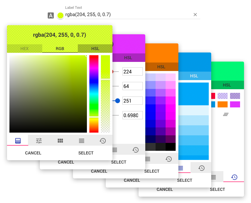
Try out the demo here: **[GitHub Page](http://brianpkelley.github.io/md-color-picker/)**
1. Download [tinycolor.js](https://github.com/bgrins/TinyColor) 1.2.1 or higher. Other versions may work, though 1.2.1 was used to develop this.
2. Install `md-color-picker`.
```bash
npm install md-color-picker
```
```bash
bower install md-color-picker
```
- [Angular Material](https://material.angularjs.org)
- [ngCookies](https://docs.angularjs.org/api/ngCookies) (optional)
The only other dependency is [tinycolor.js](https://github.com/bgrins/TinyColor) which is an exceptional color manipulation library.
- Include the css.
````html
<link href="path/to/md-color-picker/dist/mdColorPicker.min.css" rel="stylesheet" />
````
- Include the javascript.
````html
<script src="path/to/tinycolor/dist/tinycolor-min.js"></script>
<script src="path/to/md-color-picker/dist/mdColorPicker.min.js"></script>
````
- Add dependencies to your application (ngCookies is optional)
````javascript
var app = angular.module('myApp', ['ngMaterial','ngCookies', 'mdColorPicker']);
````
- Place the directive wherever it is needed. _note:_ this breaks the old version 0.1 as it now uses _ng-model_ instead of _value_
````html
<div md-color-picker ng-model="valueObj"></div>
````
Options may be set either by an options object on the `md-color-picker` attribute and/or using attributes. If an option is present on both the options object and as an attribute, the attribute will take precedence.
**Setting options by scope object**
```js
// Controller
$scope.scopeVariable.options = {
label: "Choose a color",
icon: "brush",
default: "#f00",
genericPalette: false,
history: false
};
```
```html
<div md-color-picker="scopeVariable.options" ng-model="scopeVariable.color"></div>
```
**Setting options by attribute**
```html
<div
md-color-picker
ng-model="scopeVariable.color"
label="Choose a color"
icon="brush"
default="#f00"
md-color-generic-palette="false"
md-color-history="false"
></div>
```
| Option Object name | Attribute Option name | Type | Default | Description |
|--------------------- |--------------------------- |------------- |-------------------- |------------------------------------------------------------------------------------------------------------------------------------------------------------------------------------------------------------------------------------------------------ |
| type | type | Int | 0 | Default output type. 0: hex, 1: rgb, 2: hsl |
| label | label | String | "" | The lable for the input. |
| icon | icon | String | "" | Material Icon name. https://design.google.com/icons/ |
| random | random | Boolean | false | Select a random color on open |
| default | default | Color | "rgb(255,255,255)" | Default color |
| openOnInput | open-on-input | Boolean | true | Open color picker when user clicks on the input field. If disabled, color picker will only open when clicking on the preview. |
| hasBackdrop | has-backdrop | Boolean | true | Dialog Backdrop. https://material.angularjs.org/latest/api/service/$mdDialog |
| clickOutsideToClose | click-outside-to-close | Boolean | true | Dialog click outside to close. https://material.angularjs.org/latest/api/service/$mdDialog |
| skipHide | skip-hide | Boolean | true | Allows for opening multiple dialogs. https://github.com/angular/material/issues/7262 |
| preserveScope | preserve-scope | Boolean | true | Dialog preserveScope. https://material.angularjs.org/latest/api/service/$mdDialog |
| clearButton | md-color-clear-button | Boolean | true | Show the "clear" button inside of the input. |
| preview | md-color-preview | Boolean | true | Show the color preview circle next to the input. |
| alphaChannel | md-color-alpha-channel | Boolean | true | Enable alpha channel. |
| spectrum | md-color-spectrum | Boolean | true | Show the spectrum tab. |
| sliders | md-color-sliders | Boolean | true | Show the sliders tab. |
| genericPalette | md-color-generic-palette | Boolean | true | Show the generic palette tab. |
| materialPalette | md-color-material-palette | Boolean | true | Show the material colors palette tab. |
| history | md-color-history | Boolean | true | Show the history tab. |
| defaultTab | md-color-default-tab | String, Int | "spectrum" | Which tab should be selected when opening. Can either be a string or index. If the value is an index, do not count hidden/disabled tabs. <ul><li>spectrum</li><li>sliders</li><li>genericPalette</li><li>materialPalette</li><li>history</li></ul> |
This is still in a very early beta, and is rapidly changing (3 versions before initial commit). I am open to any and all help anyone is willing to put in. Will update as we go.
## Known issues / TODO
- [ ] Prevent focus from opening color picker on window/tab activation.
- [ ] Focus on preview input when user starts typing.
- [ ] Clean up code.
- [ ] Javascript
- [ ] CSS / LESS
- [X] Build script cleaned up and static server integrated for development