nuxt-unlayer
Version:
Module used to add the Unlayer email builder to your Nuxt app.
644 lines (643 loc) • 22.7 kB
TypeScript
export type DisplayMode = "email" | "web" | "popup";
export type ThemeColor = "light" | "dark";
export type DockPosition = "right" | "left";
export interface AppearanceConfig {
readonly theme?: ThemeColor | undefined;
readonly panels?: {
readonly tools?: {
readonly dock: DockPosition;
} | undefined;
} | undefined;
}
interface StringList {
[key: string]: string;
}
export interface Design {
readonly body: Record<string, any>;
readonly counters: Record<string, any>;
readonly schemaVersion?: number;
}
export interface FileInfo {
readonly accepted: File[];
readonly attachments: File[];
}
export interface FileUploadDoneData {
readonly progress: number;
readonly url?: string | undefined;
}
export interface ImageExport {
readonly url: string;
readonly design: Design;
}
export interface ImageExportOptions {
readonly fullPage?: boolean;
readonly mergeTags?: MergeTag;
}
export interface ZipExport {
readonly url: string;
readonly design: Design;
}
export interface ZipExportOptions {
readonly mergeTags?: MergeTag;
}
export interface PDFExport {
/** This is the URL of the generated PDF */
readonly url: string;
readonly design: Design;
}
export interface PDFExportOptions {
readonly mergeTags?: MergeTag;
}
export interface HTMLExport {
/** This is the full HTML of the design, starting with the opening `<html>` tag to the closing `</html>` tag. */
readonly html: string;
/** This is the JSON of the design */
readonly design: Design;
/**
* This includes the chunks of HTML separately in case you want to build your own layout. Check the [chunk parameters](https://docs.unlayer.com/docs/export-html#section-chunk-parameters) below.
*/
readonly chunks?: Chunk;
readonly amp?: Record<string, any> | undefined;
}
export interface Chunk {
/** This is the body part of the HTML that is added inside the `<body></body>` tags. */
readonly body?: string;
/** This is the CSS required for the design to render properly. You can add it inside the `<style></style>` tags. */
readonly css?: string;
/** This is the JS required for the design to render properly. You can add it inside the `<script></script>` tags. */
readonly js?: string;
/** This includes any web fonts or [custom fonts](https://docs.unlayer.com/docs/font-management) used in the design so you can load them. */
readonly fonts?: Font[];
}
export interface PlainTextExport {
/** This is the full plain text of the design */
readonly text: string;
/** This is the JSON of the design */
readonly design: Design;
}
export interface PLainTextExportOptions {
/** Links and buttons will not be included */
readonly ignoreLinks?: boolean;
/** Image alt text will not be included */
readonly ignoreImages?: boolean;
/** Pre-header text for emails will not be included. */
readonly ignorePreheader?: boolean;
/**
* If you want the Merge Tags in your design to be replaced by different values, you can pass the mergeTags object to export options.
*/
readonly mergeTags?: MergeTag;
}
export interface HtmlOptions {
readonly cleanup?: boolean;
readonly minify?: boolean;
readonly mergeTags?: MergeTag;
}
export interface User {
readonly id?: number | undefined;
readonly name?: string | undefined;
readonly email?: string | undefined;
[key: string]: any;
}
export interface MergeTagValue {
readonly name: string;
readonly value: string;
readonly sample?: string;
}
export interface SimpleMergeTag {
readonly [key: string]: MergeTagValue;
}
export interface GroupedMergeTag {
readonly [key: string]: {
readonly name: string;
readonly mergeTags: SimpleMergeTag;
readonly rules?: {
readonly [key: string]: ConditionalMergeTagRule;
};
};
}
export interface ConditionalMergeTagRule {
readonly name: string;
readonly before: string;
readonly after: string;
}
export type MergeTag = SimpleMergeTag | GroupedMergeTag;
export interface GroupedSpecialLink {
readonly name: string;
readonly specialLinks: Array<SimpleSpecialLink | GroupedSpecialLink>;
}
export interface SimpleSpecialLink {
readonly name: string;
readonly href: string;
readonly target: string;
}
export type SpecialLink = SimpleSpecialLink | GroupedSpecialLink;
export interface ToolPropertiesConfig {
readonly [key: string]: {
value: string;
};
}
export interface ToolConfig {
readonly enabled?: boolean | undefined;
readonly position?: number | undefined;
readonly properties?: ToolPropertiesConfig | StringList | undefined;
readonly usageLimit?: number | undefined;
readonly icon?: string | undefined;
readonly [key: string]: any;
}
export interface ToolsConfig {
readonly [key: string]: ToolConfig;
}
export interface EditorConfig {
readonly minRows?: number | undefined;
readonly maxRows?: number | undefined;
readonly autoSelectOnDrop?: boolean | undefined;
readonly confirmOnDelete?: boolean | undefined;
}
export interface Font {
defaultFont?: boolean;
type?: "google" | string;
label: string;
value: string;
url?: string;
weights?: number[];
}
export type FontList = Font[];
export interface FontConfig {
showDefaultFonts?: boolean;
customFonts?: FontList;
}
export interface ColorPicker {
readonly presets?: string[];
}
export interface CustomButton {
name: string;
text: string;
icon: string;
onSetup: () => object;
onAction: (data: any, callback: Function) => void;
}
export interface TextEditor {
/**
* You can change the default font sizes available in the text editor.
*
* @see https://docs.unlayer.com/docs/font-sizes
*/
readonly fontSizes?: string[];
/** You can enable or disable the browser spell checker for the text editor. */
readonly spellChecker?: boolean;
/** You can enable or disable tables editing for the text editor. */
readonly tables?: boolean;
/** By default, clean pasting is set to `confirm`. You can set it to any of the following values. */
readonly cleanPaste?: boolean | "confirm" | "basic" | string;
/** By default, emoticons are turned on in the text editor. If you want to disable it, you can turn this off. */
readonly emojis?: boolean;
/**
* You can enable or disable the inline font controls such as font family, font size, and text alignment.
*
* **We do not recommend enabling this feature because these controls are available natively in the right panel and that works better with responsiveness across devices.**
*/
readonly inlineFontControls?: boolean;
/**
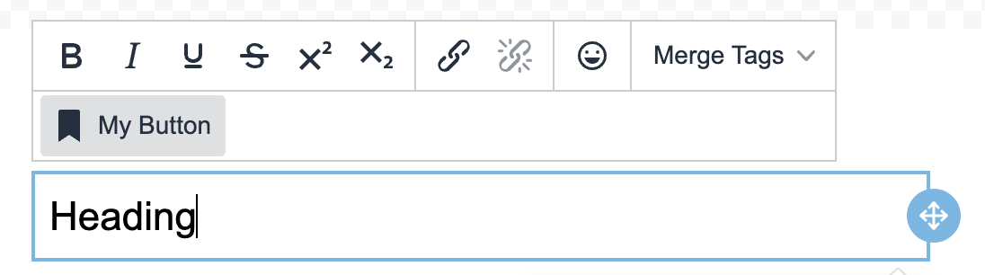
* You can add custom buttons to the text editor to build more advanced and powerful controls for text.
*
* 
*
* @example
*
* features: {
textEditor: {
customButtons: [
{
name: 'my_button',
text: 'My Button',
icon: 'bookmark',
onSetup: () => {},
onAction: (data, callback) => {
console.log(data.text);
callback(data.text + ' Updated');
},
},
],
},
},
*/
readonly customButtons?: CustomButton[];
}
export interface ImageEditor {
enabled?: boolean;
tools?: {
resize?: boolean;
};
}
export interface StockImage {
enabled?: boolean;
safeSearch?: boolean;
defaultSearchTerm?: string;
}
export interface Feature {
/**
* You can choose to hide the mobile / desktop preview icons from the little actions box at the bottom.
*
* @see https://docs.unlayer.com/docs/features#mobile--desktop-preview
*/
preview?: boolean;
/**
* We have a Uploads tab that can show all uploaded images for the user. It's enabled by default but you can disable it if you want.
*
* 🚧 Premium Feature
*
* @see https://docs.unlayer.com/docs/features#user-uploads
*/
userUploads?: boolean;
/**
* We have a built-in stock images library with millions of royalty-free images from Unsplash, Pexels and Pixabay.
*
* It's enabled by default but you can disable it if you want. You can also choose to change the safe searching option and the default search term.
*
* 🚧 Premium Feature
*
* @see https://docs.unlayer.com/docs/features#stock-images
*/
stockImages?: StockImage;
/**
* The Audit tab flags common accessibility-related issues so you can address them before finishing your design.
*
* It helps identify issues like missing links, missing alternate text, etc. You can enable or disable this feature.
*
* 🚧 Premium Feature
*
* @see https://docs.unlayer.com/docs/features#audit-content
*/
audit?: boolean;
/**
* This is a great feature for linking within a page. It lets users define sections of a page and then link buttons or links to those sections.
*
* @see https://docs.unlayer.com/docs/features#page-anchors
*/
pageAnchors?: boolean;
/**
* You can choose to hide the undo / redo buttons from the little actions box at the bottom.
*
* If you choose to hide the undo / redo buttons, you may want to turn on [delete confirmation](https://docs.unlayer.com/docs/confirm-on-delete) setting.
*
* @see https://docs.unlayer.com/docs/features#undo--redo
*/
undoRedo?: boolean;
/**
* You can enable or disable the browser spell checker for the text editor.
*
* @see https://docs.unlayer.com/docs/features#text-editor
*/
textEditor?: TextEditor;
/**
* If you are using the editor in `displayMode` email, users can set a preheader.
*
* A preheader is the short summary text that follows the subject line when viewing an email from the inbox.
*
* By default, preheader text is turned on. If you want to disable it, you can turn it off.
*
* @see https://docs.unlayer.com/docs/features#preheader-text
*/
preheaderText?: boolean;
/**
* Smart Merge Tags is a human-friendly version of merge tags to add dynamic content in your designs.
*
* With this feature, users are able to easily identify merge tags within highlighted field and they see human-friendly names instead of code.
*
* By default, smart merge tags are enabled. If you want to disable it, you can turn it off.
*
* @see https://docs.unlayer.com/docs/features#smart-merge-tags
*/
smartMergeTags?: boolean;
/**
* If you would like to allow SVG image uploads, you can use the following feature flag. By default, SVG image uploads are disabled.
*
* @see https://docs.unlayer.com/docs/features#svg-images
*/
svgImageUpload?: boolean;
/**
* If you would like users to be able to receive a test email in their inbox, you can enable the Send Test Email button.
*
* @see https://docs.unlayer.com/docs/features#send-test-email
*/
sendTestEmail?: boolean;
/**
* You can change the default color presets for the color picker.
*
* @see https://docs.unlayer.com/docs/color-picker-presets
*/
colorPicker?: ColorPicker;
}
export type EditorProps = {
/**
* This is the template display mode which can be `email`, `web` or `popup`.
*
* @default "email"
*/
displayMode?: DisplayMode;
/**
* This is the project ID from Unlayer. You can get it from the project settings page.
*/
projectId?: number | null;
/**
* This is the locale you want to load the editor in. We have many translations available.
*
* @default "en-US"
*
* @see https://docs.unlayer.com/docs/localization
*/
locale?: string;
/**
* These are the appearance options to change the look and feel of the editor.
*
* @see https://docs.unlayer.com/docs/themes
*/
appearance?: AppearanceConfig;
/**
* This is the info of the user who is using the editor. You can pass id, name and email.
*
* Unique id is required to enable [user saved blocks](https://docs.unlayer.com/docs/user-saved-blocks).
*/
user?: User;
/**
* This is an array of objects. You can pass the merge tags to display in the editor.
*
* @see https://docs.unlayer.com/docs/merge-tags
*/
mergeTags?: MergeTag;
/**
* You can pass design tags in this object.
*
* @see https://docs.unlayer.com/docs/design-tags
*/
designTags?: Record<string, any>;
/**
* You can pass special links in this object
*
* @see https://docs.unlayer.com/docs/special-links
*/
specialLinks?: SpecialLink[];
/**
* These are the options for tools and custom tools.
*
* @see https://docs.unlayer.com/docs/tools
*/
tools?: ToolsConfig;
/**
* This is an array of objects. You can pass custom blocks here.
*
* @see https://docs.unlayer.com/docs/custom-blocks
*/
blocks?: Array<Record<string, any>>;
/**
* These are some editor options for different functions of the editor
*
* @see https://docs.unlayer.com/docs/editor-options
*/
editor?: EditorConfig;
/**
* You can pass custom fonts here
*
* 🚧 Premium Feature
*
* @see https://docs.unlayer.com/docs/font-management
*/
fonts?: FontConfig;
/**
* Sanitizes HTML output to prevent executable JavaScript from being inserted.
*/
safeHtml?: boolean;
/**
* Custom JavaScript URL or source.
*
* 🚧 Premium Feature
*
* @see https://docs.unlayer.com/docs/custom-js-css
*/
customJS?: string[];
/**
* Custom CSS URL or source.
*
* 🚧 Premium Feature
*
* @see https://docs.unlayer.com/docs/custom-js-css
*/
customCSS?: string[];
/**
* This is the text direction of html output which can be `rtl` or `ltr`.
*/
textDirection?: "ltr" | "rtl";
/**
* You can enable or disable certain features of the Unlayer editor. Most of these are enabled by default but can be turned off using the following configuration.
*
* @see https://docs.unlayer.com/docs/features
*/
features?: Feature;
};
export type LinkTypeFieldOption = {
value: string;
label: string;
enabled?: boolean;
};
export interface LinkTypeField {
name: string;
label: string;
defaultValue?: string | LinkTypeFieldOption[] | undefined;
enabled?: boolean;
placeholderText?: string;
inputType?: any;
isClearable?: boolean;
isCreatable?: boolean;
isMulti?: boolean;
limit?: number;
limitMessage?: string;
validationRegex?: string;
options?: LinkTypeFieldOption[];
onCreateOption?: (inputValue: string, meta: object, done: (newOption: LinkTypeFieldOption) => void) => void;
}
export interface LinkType {
name: string;
label: string;
enabled?: boolean;
attrs?: {
href?: string;
target?: string;
onClick?: string | Function;
class?: string;
[key: string]: any;
};
fields?: LinkTypeField[];
}
export type LinkTypes = LinkType[];
export type LinkTypesSharedConfig = Pick<LinkType, "attrs" | "fields">;
export type EditorInstance = {
frame?: Record<string, any> | null;
init(config?: Record<string, any>): void;
destroy(): void;
version: string | undefined;
loadEditor(config: Record<string, any>): void;
renderEditor(config: Record<string, any>): void;
initEditor(config: Record<string, any>): void;
/**
* We have a few pre-built blocks available with different column sizes. You can add your own blocks with custom column sizes. Each block can have up to 12 columns.
*
* @param cells An array of column numbers that you want to register as cells.
*
* @see https://docs.unlayer.com/docs/custom-columns
*/
registerColumns(cells: number[]): void;
registerCallback(type: string, callback: Function): void;
registerCallback(type: "image", callback: (file: FileInfo, done: (data: FileUploadDoneData) => void) => void): void;
unregisterCallback(type: string): void;
registerProvider(type: string, callback: Function): void;
unregisterProvider(type: string): void;
reloadProvider(type: string): void;
addEventListener(type: string, callback: Function): void;
addEventListener(type: "editor:ready", callback: () => void): void;
addEventListener(type: "design:loaded", callback: (data: Design) => void): void;
addEventListener(type: "design:updated", callback: (data: any) => void): void;
addEventListener(type: "image:uploaded", callback: (data: {
image: {
url: string;
height?: number | string;
width?: number | string;
};
}) => void): void;
removeEventListener(type: string): void;
setDesignId(id: string | null): void;
setDesignMode(designMode: string): void;
setDisplayMode(displayMode: DisplayMode): void;
loadProject(projectId: number): void;
loadUser(user: User): void;
loadTemplate(templateId: number): void;
loadStockTemplate(stockTemplateId: string): void;
setLinkTypes(linkTypes: LinkTypes): void;
setLinkTypesSharedConfig(linkTypesSharedConfig: LinkTypesSharedConfig | null): void;
setMergeTags(mergeTags: MergeTag): void;
setSpecialLinks(specialLinks: SpecialLink[]): void;
setDisplayConditions(displayConditions: any): void;
setLocale(locale: string | null): void;
setTextDirection(textDirection: "rtl" | "ltr" | null): void;
setTranslations(translations: any): void;
/**
* The editor loads with a blank design by default. You can use this function to reset the design to blank state and let the user can start from scratch.
*
* You can also specify a background color for the body here.
*
* @param bodyValues default values that should be set after loading the blank design
*/
loadBlank(bodyValues?: object): void;
/**
* This is how you can load an existing design in the editor.
*
* @param design The design object that you want to load in the editor.
*/
loadDesign(design: Design): void;
/**
* This is how you can save the design currently loaded in the editor. It will send you the current design's JSON in the callback function.
*
* @param callback The callback function that will be called with the current design's JSON
*/
saveDesign(callback: (data: Design) => void, options?: any): void;
/**
* This is how you can export the design's HTML.
*
* @example
*
* ```js
* editor.value?.exportHtml(function(data) {
var json = data.design; // design json
var html = data.html; // final html
// Do something with the json and html
});
```
*/
exportHtml(callback: (data: HTMLExport) => void, options?: HtmlOptions): void;
exportLiveHtml(callback: (data: any) => void, options?: any): void;
/**
* Similar to export HTML function, you can also export a design in plain text.
*
* This is useful if you want to send an email in multiple formats for different email clients.
*
* @example
*
* ```js
* editor.value?.exportPlainText(function(data) {
* var json = data.design; // design json
* var text = data.text; // final plain text
* // Do something with the json and text
* }, { ignoreLinks: true, ignoreImages: true, ignorePreheader: true });
* ```
*
* @see https://docs.unlayer.com/docs/export-plain-text
*/
exportPlainText(callback: (data: PlainTextExport) => void, options?: PLainTextExportOptions): void;
/**
* Similar to the Export HTML function, you can also export a design in image format.
*
* This would upload the generated image to your connected File Storage and send the link to the callback function.
*
* @example
*
* ```js
* editor.value?.exportImage(function(data) {
* var url = data.url; // image url
* var json = data.design; // design json
* // Do something with the json and url
* },{ fullPage: true });
* ```
* @see https://docs.unlayer.com/docs/export-image
*/
exportImage(callback: (data: ImageExport) => void, options?: ImageExportOptions): void;
exportPdf(callback: (data: PDFExport) => void, options?: PDFExportOptions): void;
exportZip(callback: (data: ZipExport) => void, options?: ZipExportOptions): void;
setAppearance(appearance: Partial<AppearanceConfig>): void;
/**
* You can programmatically set values for the Body panel options.
*
* @param bodyValues default values that should be set after loading the blank design
*/
setBodyValues(bodyValues: any, bodyId?: number): void;
setDesignTagsConfig(designTagsConfig: any): void;
setMergeTagsConfig(mergeTagsConfig: any): void;
showPreview(payload: {
device?: any;
resolution?: number;
}): void;
hidePreview(): void;
canUndo(callback: (result: boolean) => void): void;
canRedo(callback: (result: boolean) => void): void;
/**
* You can choose to hide the undo / redo buttons from the little actions box at the bottom.
*
* If you choose to hide the undo / redo buttons, you may want to turn on delete confirmation setting.
*
* @see https://docs.unlayer.com/docs/features#undo--redo
*/
undo(): void;
/**
* You can choose to hide the undo / redo buttons from the little actions box at the bottom.
*
* If you choose to hide the undo / redo buttons, you may want to turn on delete confirmation setting.
*
* @see https://docs.unlayer.com/docs/features#undo--redo
*/
redo(): void;
audit(callback: (data: {
status: "FAIL" | "PASS";
errors: any[];
}) => void): void;
setValidator(validator: any | null): void;
setToolValidator(tool: string, validator: any | null): void;
updateTabs(tabs: any): void;
clearValidators(): void;
registerContainerExporter(): void;
registerItemExporter(): void;
registerTool(): void;
registerPropertyEditor(): void;
registerTab(): void;
createPanel(): void;
createViewer(): void;
createWidget(): void;
};
export {};