npmc
Version:
a package manager for JavaScript
731 lines (512 loc) • 15.5 kB
Markdown
<h1 align="center">
<br>
<br>
<img width="300" alt="Ink" src="media/logo.png">
<br>
<br>
<br>
</h1>
> React for CLIs. Build and test your CLI output using components.
[](https://travis-ci.org/vadimdemedes/ink)
## Install
```
$ npm install ink@next
```
## Usage
```jsx
import React, {Component} from 'react';
import {render, Color} from 'ink';
class Counter extends Component {
constructor() {
super();
this.state = {
i: 0
};
}
render() {
return (
<Color green>
{this.state.i} tests passed
</Color>
);
}
componentDidMount() {
this.timer = setInterval(() => {
this.setState({
i: this.state.i + 1
});
}, 100);
}
componentWillUnmount() {
clearInterval(this.timer);
}
}
render(<Counter/>);
```
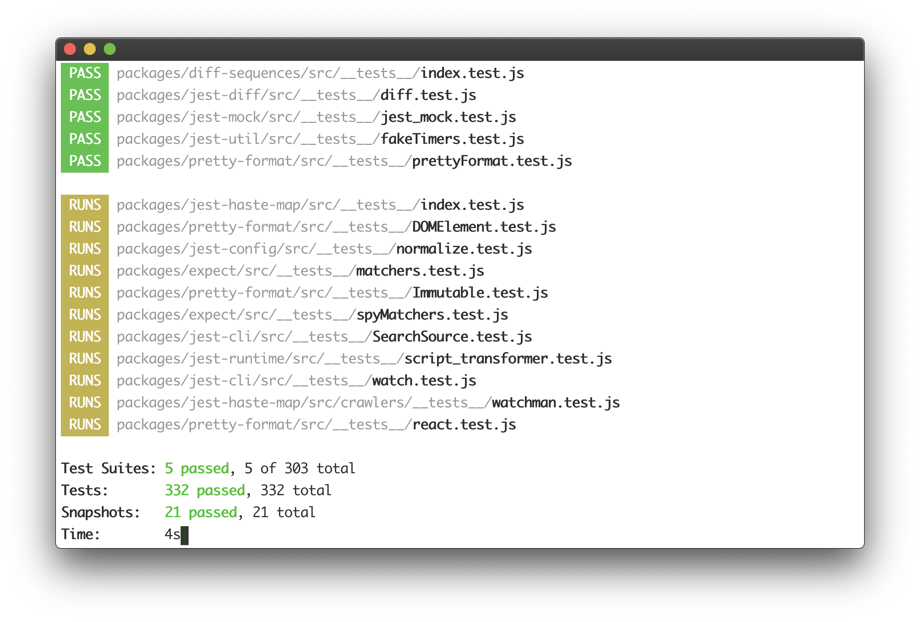
<img src="media/demo.svg" width="600">
You can also check it out live on [repl.it sandbox](https://ink-counter-demo.vadimdemedes.repl.run/).
Feel free to play around with the code and fork this repl at [https://repl.it/@vadimdemedes/ink-counter-demo](https://repl.it/@vadimdemedes/ink-counter-demo).
## Built with Ink
- [emoj](https://github.com/sindresorhus/emoj) - Find relevant emoji on the command-line.
- [emma](https://github.com/maticzav/emma-cli) - Terminal assistant to find and install npm packages.
- [swiff](https://github.com/simple-integrated-marketing/swiff) - Multi-environment command line tools for time-saving web developers.
## Table of Contents
- [Getting Started](#getting-started)
- [Examples](#examples)
- [API](#api)
- [Building Layouts](#building-layouts)
- [Built-in Components](#built-in-components)
- [Useful Components](#useful-components)
## Getting Started
Ink's goal is to provide the same component-based UI building experience that React provides, but for command-line apps. It uses [yoga-layout](https://github.com/facebook/yoga) to allow Flexbox layouts in the terminal. If you are already familiar with React, you already know Ink.
The key difference you have to remember is that the rendering result isn't a DOM, but a string, which Ink writes to the output.
To ensure all examples work and you can begin your adventure with Ink, make sure to set up Babel with a React preset. After [installing Babel](https://babeljs.io/docs/en/usage), configure it in `package.json`:
```json
{
"babel": {
"presets": [
"@babel/preset-react"
]
}
}
```
Don't forget to import `React` into every file that contains JSX:
```jsx
import React from 'react';
import {render, Box} from 'ink';
const Demo = () => (
<Box>
Hello World
</Box>
);
render(<Demo/>);
```
## Examples
- [Jest](examples/jest/jest.js) - Implementation of basic Jest UI [(live demo)](https://ink-jest-demo.vadimdemedes.repl.run/).
- [Counter](examples/counter/counter.js) - Simple counter that increments every 100ms [(live demo)](https://ink-counter-demo.vadimdemedes.repl.run/).
## API
Since Ink is a React renderer, it means that all features of React are supported.
Head over to [React](https://reactjs.org/) website for documentation on how to use it.
In this readme only Ink's methods will be documented.
#### render(tree, options)
Returns: `App`
Mount a component and render the output.
##### tree
Type: `ReactElement`
##### options
###### stdout
Type: `Stream`<br>
Default: `process.stdout`
Output stream where app will be rendered.
###### stdin
Type: `Stream`<br>
Default: `process.stdin`
Input stream where app will listen for input.
###### exitOnCtrlC
Type: `Boolean`<br>
Default: `true`
Configure whether Ink should listen to Ctrl+C keyboard input and exit the app.
This is needed in case `process.stdin` is in [raw mode](https://nodejs.org/api/tty.html#tty_readstream_setrawmode_mode), because then Ctrl+C is ignored by default and process is expected to handle it manually.
###### debug
Type: `Boolean`<br>
Default: `false`
If `true`, each update will be rendered as a separate output, without replacing the previous one.
```jsx
import React, {Component} from 'react';
import {render, Box} from 'ink';
class Counter extends Component {
constructor() {
super();
this.state = {
i: 0
};
}
render() {
return (
<Box>
Iteration #{this.state.i}
</Box>
);
}
componentDidMount() {
this.timer = setInterval(() => {
this.setState(prevState => ({
i: prevState.i + 1
}));
}, 100);
}
componentWillUnmount() {
clearInterval(this.timer);
}
}
const app = render(<Counter/>);
setTimeout(() => {
// Enough counting
app.unmount();
}, 1000);
```
There's also a shortcut to avoid passing `options` object:
```jsx
render(<Counter>, process.stdout);
```
#### App
This is the object that `render()` returns.
##### unmount
Manually unmount the whole Ink app.
```jsx
const app = render(<MyApp/>);
app.unmount();
```
##### waitUntilExit
Returns a promise, which resolves when app is unmounted.
```jsx
const app = render(<MyApp/>);
setTimeout(() => {
app.unmount();
}, 1000);
await app.waitUntilExit(); // resolves after `app.unmount()` is called
```
## Building Layouts
Ink uses [Yoga](https://github.com/facebook/yoga) - a Flexbox layout engine to build great user interfaces for your CLIs.
It's important to remember that each element is a Flexbox container.
Think of it as if each `<div>` in the browser had `display: flex`.
See `<Box>` built-in component below for documentation on how to use Flexbox layouts in Ink.
### Built-in Components
#### <Box>
`<Box>` it's an essential Ink component to build your layout. It's like a `<div style="display: flex">` in a browser.
Import:
```js
import {Box} from 'ink';
```
##### Padding
###### paddingTop
Type: `number`<br>
Default: `0`
###### paddingBottom
Type: `number`<br>
Default: `0`
###### paddingLeft
Type: `number`<br>
Default: `0`
###### paddingRight
Type: `number`<br>
Default: `0`
###### paddingX
Type: `number`<br>
Default: `0`
###### paddingY
Type: `number`<br>
Default: `0`
###### padding
Type: `number`<br>
Default: `0`
```jsx
<Box paddingTop={2}>Top</Box>
<Box paddingBottom={2}>Bottom</Box>
<Box paddingLeft={2}>Left</Box>
<Box paddingRight={2}>Right</Box>
<Box paddingX={2}>Left and right</Box>
<Box paddingY={2}>Top and bottom</Box>
<Box padding={2}>Top, bottom, left and right</Box>
```
##### Margin
###### marginTop
Type: `number`<br>
Default: `0`
###### marginBottom
Type: `number`<br>
Default: `0`
###### marginLeft
Type: `number`<br>
Default: `0`
###### marginRight
Type: `number`<br>
Default: `0`
###### marginX
Type: `number`<br>
Default: `0`
###### marginY
Type: `number`<br>
Default: `0`
###### margin
Type: `number`<br>
Default: `0`
```jsx
<Box marginTop={2}>Top</Box>
<Box marginBottom={2}>Bottom</Box>
<Box marginLeft={2}>Left</Box>
<Box marginRight={2}>Right</Box>
<Box marginX={2}>Left and right</Box>
<Box marginY={2}>Top and bottom</Box>
<Box margin={2}>Top, bottom, left and right</Box>
```
##### Flex
###### flexGrow
Type: `number`<br>
Default: `0`
See [flex-grow](https://css-tricks.com/almanac/properties/f/flex-grow/).
```jsx
<Box>
Label:
<Box flexGrow={1}>
Fills all remaining space
</Box>
</Box>
```
###### flexShrink
Type: `number`<br>
Default: `1`
See [flex-shrink](https://css-tricks.com/almanac/properties/f/flex-shrink/).
```jsx
<Box width={20}>
<Box flexShrink={2} width={10}>
Will be 1/4
</Box>
<Box width={10}>
Will be 3/4
</Box>
</Box>
```
###### flexDirection
Type: `string`<br>
Allowed values: `row`, `row-reverse`, `column` and `column-reverse`
See [flex-direction](https://css-tricks.com/almanac/properties/f/flex-direction/).
```jsx
<Box>
<Box marginRight={1}>X</Box>
<Box>Y</Box>
</Box>
// X Y
<Box flexDirection="row-reverse">
<Box>X</Box>
<Box marginRight={1}>Y</Box>
</Box>
// Y X
<Box flexDirection="column">
<Box>X</Box>
<Box>Y</Box>
</Box>
// X
// Y
<Box flexDirection="column-reverse">
<Box>X</Box>
<Box>Y</Box>
</Box>
// Y
// X
```
###### alignItems
Type: `string`<br>
Allowed values: `flex-start`, `center` and `flex-end`
See [align-items](https://css-tricks.com/almanac/properties/f/align-items/).
```jsx
<Box alignItems="flex-start">
<Box marginRight={1}>X</Box>
<Box>{`A\nB\nC`}</Box>
</Box>
// X A
// B
// C
<Box alignItems="center">
<Box marginRight={1}>X</Box>
<Box>{`A\nB\nC`}</Box>
</Box>
// A
// X B
// C
<Box alignItems="flex-end">
<Box marginRight={1}>X</Box>
<Box>{`A\nB\nC`}</Box>
</Box>
// A
// B
// X C
```
###### justifyContent
Type: `string`<br>
Allowed values: `flex-start`, `center`, `flex-end`, `space-between` and `space-around`.
See [justify-content](https://css-tricks.com/almanac/properties/f/justify-content/).
```jsx
<Box justifyContent="flex-start">
<Box>X</Box>
</Box>
// [X ]
<Box justifyContent="center">
<Box>X</Box>
</Box>
// [ X ]
<Box justifyContent="flex-end">
<Box>X</Box>
</Box>
// [ X]
<Box justifyContent="space-between">
<Box>X</Box>
<Box>Y</Box>
</Box>
// [X Y]
<Box justifyContent="space-around">
<Box>X</Box>
<Box>Y</Box>
</Box>
// [ X Y ]
```
#### <Color>
The `<Color>` compoment is a simple wrapper around [the `chalk` API](https://github.com/chalk/chalk#api).
It supports all of the chalk's methods as `props`.
Import:
```js
import {Color} from 'ink';
```
Usage:
```jsx
<Color rgb={[255, 255, 255]} bgKeyword="magenta">
Hello!
</Color>
<Color hex="#000000" bgHex="#FFFFFF">
Hey there
</Color>
<Color blue>
I'm blue
</Color>
```
#### <Text>
This component can change the style of the text, make it bold, underline, italic or strikethrough.
Import:
```js
import {Text} from 'ink';
```
##### bold
Type: `boolean`<br>
Default: `false`
##### italic
Type: `boolean`<br>
Default: `false`
##### underline
Type: `boolean`<br>
Default: `false`
##### strikethrough
Type: `boolean`<br>
Default: `false`
Usage:
```jsx
<Text bold>I am bold</Text>
<Text italic>I am italic</Text>
<Text underline>I am underline</Text>
<Text strikethrough>I am strikethrough</Text>
```
#### <Static>
`<Static>` component allows permanently rendering output to stdout and preserving it across renders.
Components passed to `<Static>` as children will be written to stdout only once and will never be rerendered.
`<Static>` output comes first, before any other output from your components, no matter where it is in the tree.
In order for this mechanism to work properly, at most one `<Static>` component must be present in your node tree and components that were rendered must never update their output. Ink will detect new children appended to `<Static>` and render them to stdout.
**Note:** `<Static>` accepts only an array of children and each of them must have a unique key.
Example use case for this component is Jest's output:
Jest continuosuly writes the list of completed tests to the output, while updating test results at the bottom of the output in real-time. Here's how this user interface could be implemented with Ink:
```jsx
<Fragment>
<Static>
{tests.map(test => (
<Test key={test.id} title={test.title}/>
))}
</Static>
<Box marginTop={1}>
<TestResults passed={results.passed} failed={results.failed}/>
</Box>
</Fragment>
```
See [examples/jest](examples/jest/jest.js) for a basic implementation of Jest's UI.
#### <AppContext>
`<StdinContext>` is a [React context](https://reactjs.org/docs/context.html#reactcreatecontext), which exposes a method to manually exit the app (unmount).
Import:
```js
import {AppContext} from 'ink';
```
##### exit
Type: `Function`
Exit (unmount) the whole Ink app.
Usage:
```jsx
<AppContext.Consumer>
{({ exit }) => (
{/* Calling `onExit()` from within <MyApp> will unmount the app */}
<MyApp onExit={exit}/>
)}
</AppContext.Consumer>
```
#### <StdinContext>
`<StdinContext>` is a [React context](https://reactjs.org/docs/context.html#reactcreatecontext), which exposes input stream.
Import:
```js
import {StdinContext} from 'ink';
```
##### stdin
Type: `Stream`<br>
Default: `process.stdin`
Stdin stream passed to `render()` in `options.stdin` or `process.stdin` by default.
Useful if your app needs to handle user input.
Usage:
```jsx
<StdinContext.Consumer>
{({ stdin }) => (
<MyComponent stdin={stdin}/>
)}
</StdinContext.Consumer>
```
##### setRawMode
Type: `function`<br>
See [setRawMode](https://nodejs.org/api/tty.html#tty_readstream_setrawmode_mode).
Ink exposes this function via own `<StdinContext>` to be able to handle <kbd>Ctrl</kbd>+<kbd>C</kbd>, that's why you should use Ink's `setRawMode` instead of `process.stdin.setRawMode`.
Usage:
```jsx
<StdinContext.Consumer>
{({ setRawMode }) => (
<MyComponent setRawMode={setRawMode}/>
)}
</StdinContext.Consumer>
```
#### <StdoutContext>
`<StdoutContext>` is a [React context](https://reactjs.org/docs/context.html#reactcreatecontext), which exposes stdout stream, where Ink renders your app.
Import:
```js
import {StdoutContext} from 'ink';
```
##### stdout
Type: `Stream`<br>
Default: `process.stdout`
Usage:
```jsx
<StdoutContext.Consumer>
{({ stdout }) => (
<MyComponent stdout={stdout}/>
)}
</StdoutContext.Consumer>
```
## Useful Components
- [ink-text-input](https://github.com/vadimdemedes/ink-text-input) - Text input.
- [ink-spinner](https://github.com/vadimdemedes/ink-spinner) - Spinner.
- [ink-select-input](https://github.com/vadimdemedes/ink-select-input) - Select (dropdown) input.
- [ink-link](https://github.com/sindresorhus/ink-link) - Link component.
- [ink-box](https://github.com/sindresorhus/ink-box) - Box component.
- [ink-gradient](https://github.com/sindresorhus/ink-gradient) - Gradient color component.
- [ink-big-text](https://github.com/sindresorhus/ink-big-text) - Awesome text component.
- [ink-image](https://github.com/kevva/ink-image) - Display images inside the terminal.
### Incompatible components
These are components that haven't migrated to Ink 2 yet:
- [ink-progress-bar](https://github.com/brigand/ink-progress-bar) - Configurable component for rendering progress bars.
- [ink-console](https://github.com/ForbesLindesay/ink-console) - Render output from `console[method]` calls in a scrollable panel.
- [ink-confirm-input](https://github.com/kevva/ink-confirm-input) - Yes/No confirmation input.
- [ink-checkbox-list](https://github.com/MaxMEllon/ink-checkbox-list) - Checkbox.
- [ink-quicksearch](https://github.com/aicioara/ink-quicksearch) - Select Component with fast quicksearch-like navigation
- [ink-autocomplete](https://github.com/maticzav/ink-autocomplete) - Autocomplete.
- [ink-table](https://github.com/maticzav/ink-table) - Table component.
- [ink-broadcast](https://github.com/jimmed/ink-broadcast) - Implementation of react-broadcast for Ink.
- [ink-router](https://github.com/jimmed/ink-router) - Implementation of react-router for Ink.
- [ink-tab](https://github.com/jdeniau/ink-tab) - Tab component.
- [ink-select](https://github.com/karaggeorge/ink-select) - Select component.
- [ink-scrollbar](https://github.com/karaggeorge/ink-scrollbar) - Scrollbar component.
- [ink-text-animation](https://github.com/yardnsm/ink-text-animation) - Text animation component.
- [ink-figlet](https://github.com/KimotoYanke/ink-figlet) - Large text component with Figlet fonts.
- [ink-divider](https://github.com/JureSotosek/ink-divider) - A divider component.
## License
MIT © [Vadim Demedes](https://github.com/vadimdemedes)