node-red-contrib-dashbored
Version:
A customizable dashboard for NodeRed
39 lines (34 loc) • 934 B
Markdown
# Toggle Button
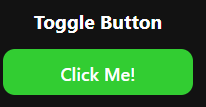
Switches between two states. Useful for on/off applications.
## Properties
* `Text`: The text of the button
* `On Value`: The value where the state of the button is "on"
* `Off Value`: The value where the state of the button is "off"
## Messages
### Input
Sending a payload will set the state
```
{
"topic": "set",
"payload": {
"state": <state>
}
}
```
### Output
This sends a payload containing the state
```
{
"topic": "set",
"payload": {
"state": <state>
}
}
```
## CSS
* `.on`: The class added to the button when it's "on"
* `.off`: The class added to the button when it's "off"
* `#widget`: Apply styling to the widget container
* `#title`: Apply styling to the title
* `#content`: Apply styling to the content under the title