node-red-contrib-dashbored
Version:
A customizable dashboard for NodeRed
48 lines (42 loc) • 1.68 kB
Markdown
# Draggable Volume
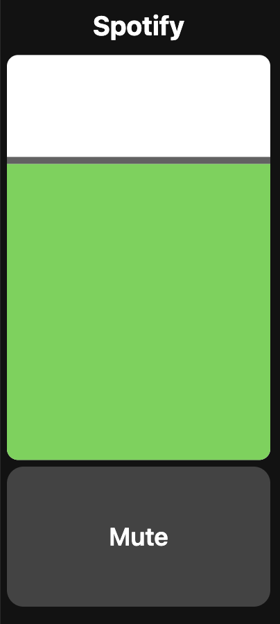
Provides a volume widget that can be interacted with by dragging the volume bar instead of clicking the +/- buttons in the [Volume Widget](https://github.com/haydendonald/NodeRed-Dashbored/blob/main/doc/widgetTypes/volume.md).
## Properties
* `Mute Enabled (muteEnabled)`: If enabled the mute button will be shown, if not it will be hidden
* `Muted Value (mutedValue)`: The muted state
* `Unmuted Value (unmutedValue)`: The un-muted state
* `Set Value on Release (setValueOnRelease)`: Send the value to NodeRed when the user releases their finger (Note: If this is disabled ask/password functionality will be ignored)
## Messages
### Input
Sending a payload will set the volume
```
{
"topic": "set",
"payload": {
"volume": <0-100%>,
"muted": <mutedValue / unmutedValue>
}
}
```
### Output
This sends a payload containing the state
```
{
"topic": "set",
"payload": {
"volume": <0-100%>,
"muted": <mutedValue / unmutedValue>
"previousVolume": <0-100%>
"previousMuted": <mutedValue / unmutedValue>
}
}
```
## CSS
* `#widget`: Apply styling to the widget container
* `#title`: Apply styling to the title
* `#content`: Apply styling to the content under the title
* `#volumeLevelContainer`: The styling for the container
* `#volumeLevelTop`: The styling for the volume "bar"
* `#volumeLevelHandle`: The styling for the "bar" for the user to drag
* `.button`: The style for the buttons
* `.mutedColor`: The color when the channel is muted