ngx-otp-pin-input
Version:
An Angular library for OTP input fields, providing a customizable and user-friendly way to handle one-time passwords.
148 lines (109 loc) • 4.05 kB
Markdown
# ngx-otp-input
**ngx-otp-input** is an Angular component for capturing one-time password (OTP) inputs. Perfect for authentication flows, verification forms, or secure user inputs.
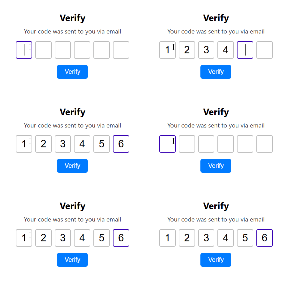
## Features
- Configurable OTP length (default: 4 digits)
- Customizable input styles: size, font, border, spacing
- Supports keyboard navigation (arrow keys, backspace)
- Paste support for OTPs
- Supports Angular Reactive form binding
- Can be disabled to prevent user input
## Installation
```bash
npm install ngx-otp-input
```
## Usage
### 1. Import the Module
Add `NgxOtpInput` to your application's module imports:
```typescript
import { NgxOtpInput } from "ngx-otp-input";
@NgModule({
declarations: [AppComponent],
imports: [NgxOtpInput], // Add the module here
bootstrap: [AppComponent],
})
export class AppModule {}
```
### 2. Use in Templates
Add the OTP input component to your template:
```typescript
import { Component } from '@angular/core';
@Component({
selector: 'app-root',
templateUrl: './app.component.html',
styleUrls: ['./app.component.scss']
})
export class AppComponent {
config:OtpInputConfig = {
length: 6,
className: 'otp-input',
style: {
width: 50,
height: 50,
fontSize: 28,
spacing: 10,
borderWidth: 2,
borderRadius: 5,
borderColor: '#ccc',
borderFocusColor: '#6200ea'
}
}
}
```
```html
<ngx-otp-input (onOtpChange)="onOtpChange($event)" [config]="config"></ngx-otp-input>
```
### 3. Bind with Angular Forms
Works seamlessly with reactive forms or `ngModel`.
**Using formControl:**
```html
<form [formGroup]="otpForm">
<ngx-otp-input formControlName="otp"></ngx-otp-input>
</form>
```
In your component class:
```typescript
this.otpForm = this.fb.group({
otp: [""],
});
```
**Using ngModel:**
```html
<ngx-otp-input [(ngModel)]="otpValue" name="otp"></ngx-otp-input>
```
### 4. Listen for OTP Changes
Subscribe to `onOtpChange` to get OTP input updates:
```html
<ngx-otp-input (onOtpChange)="ratingChange($event)"></ngx-otp-input>
```
```typescript
onOtpChange(otp: string) {
console.log('OTP:', otp);
}
```
### 5. Disable the Component
Disable input by setting `[disabled]` to `true`:
```html
<ngx-otp-input [disabled]="true"></ngx-otp-input>
```
## Input Properties (`OtpInputConfig`)
| Property | Type | Default | Description |
| ---------------------- | ------- | --------- | ------------------------------- |
| length | number | 4 | Number of OTP digits |
| className | string | | CSS class applied to each input |
| style.width | number | 40 | Width of each input box (px) |
| style.height | number | 40 | Height of each input box (px) |
| style.fontSize | number | 26 | Font size of input text (px) |
| style.spacing | number | 12 | Gap between inputs (px) |
| style.borderWidth | number | 2 | Border width of inputs (px) |
| style.borderRadius | number | 4 | Border radius of inputs (px) |
| style.borderColor | string | '#BDBDBD' | Default border color |
| style.borderFocusColor | string | '#3700B3' | Border color when focused |
| disabled | boolean | false | Disables input interaction |
## Output Events
| Event | Type | Description |
| ----------- | -------------------- | --------------------------------- |
| onOtpChange | EventEmitter<string> | Emits the current OTP input value |
## License
This project is licensed under the MIT License. (©) [Vipin](https://github.com/vipinkc4).
Happy coding! 🚀