ngx-i24-circular-progress
Version:
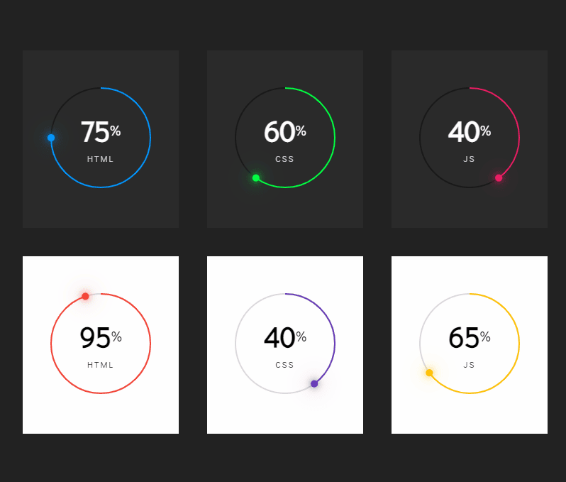
A lightweight plugin to render a simple, animated circular progress bar.
117 lines (93 loc) • 4.86 kB
Markdown
# NgxI24CircularProgress
[](https://www.npmjs.com/package/ngx-i24-circular-progress)
[](https://www.npmjs.com/package/ngx-i24-circular-progress)
>A lightweight plugin to render a simple, animated circular progress bar.
## Features
* highly customizable
* very easy to implement
## Demo
[](https://stackblitz.com/edit/ngx-i24-circular-progress-demo)
* [Link](https://stackblitz.com/edit/ngx-i24-circular-progress-demo)
## Get started
#### Installation
```
$ npm i ngx-i24-circular-progress@latest
```
#### Example
##### TS
###### Module
```typescript
import { NgxI24CircularProgressModule } from 'ngx-i24-circular-progress';
@NgModule({
declarations: [ AppComponent ],
imports: [BrowserModule, NgxI24CircularProgressModule ],
bootstrap: [AppComponent]
})
export class AppModule { }
```
###### Component
```typescript
import { Component } from '@angular/core';
@Component({
selector: 'app-root',
templateUrl: './app.component.html',
styleUrls: ['./app.component.scss']
})
export class AppComponent {
option = {
primaryColor: '#0495fc',
secondaryColor: '#191919',
percentColor: '#fff',
textColor: '#ffffffbf',
text: 'html',
circleRadius: 70
};
number = 75;
}
```
##### HTML
```html
<ngx-i24-circular-progress [option]="option" [number]="number"></ngx-i24-circular-progress>
```
## Options
| Property (Type) | Default | Description|
| - | - | - |
| **number** | 0 | The percent value |
| option -> primaryColor | #0495fc | The color of the active bar |
| option -> secondaryColor | #191919 | The color of the inactive bar |
| option -> strokeWidth | 2 | The stroke width of the circle |
| option -> dotWidth | 5 | The width and the height of the dot |
| option -> numberColor | #000 | The color of the number |
| option -> percentColor | #000 | The color of the percent sign |
| option -> textColor | #000000bf | The color of the text |
| option -> numberFontSize | '2.5em' | The font size of the number |
| option -> percentFontSize | '0.5em' | The font size of the percent sign |
| option -> textFontSize | '0.75em' | The font size of the text |
| option -> percent | 50 | The value must be between `0 - 100` |
| option -> text | 'css' | - |
| option -> circleRadius | 70 | The radius of the circle |
| option -> spaceBetweenNumberPercent | 3px | The space between number and percent sign |
## Other Projects
| Name | Link | Description|
| - | - | - |
| ngx-i24-circular-progress | [Link](https://www.npmjs.com/package/ngx-i24-circular-progress) | A lightweight plugin to render a simple, animated circular progress bar. |
| ngx-i24-progress-bar | [Link](https://www.npmjs.com/package/ngx-i24-progress-bar) | A lightweight plugin to render a simple, animated progress bar. |
| ngx-weekday-picker | [Link](https://www.npmjs.com/package/ngx-weekday-picker) | Lightweight plugin to a pick weekday. |
| ngx-i24-color-picker | [Link](https://www.npmjs.com/package/ngx-i24-color-picker) | A lightweight plugin to pick a color. |
| ngx-i24-checkbox | [Link](https://www.npmjs.com/package/ngx-i24-checkbox) | A lightweight plugin to display a modern checkbox. |
## Support
[](https://www.buymeacoffee.com/yaseenref)
## Copyright
Copyright (c) 2022 Yaseen Alrefaee, contributors. Released under the MIT
<!-- This library was generated with [Angular CLI](https://github.com/angular/angular-cli) version 14.0.0.
## Code scaffolding
Run `ng generate component component-name --project ngx-i24-circular-progress` to generate a new component. You can also use `ng generate directive|pipe|service|class|guard|interface|enum|module --project ngx-i24-circular-progress`.
> Note: Don't forget to add `--project ngx-i24-circular-progress` or else it will be added to the default project in your `angular.json` file.
## Build
Run `ng build ngx-i24-circular-progress` to build the project. The build artifacts will be stored in the `dist/` directory.
## Publishing
After building your library with `ng build ngx-i24-circular-progress`, go to the dist folder `cd dist/ngx-i24-circular-progress` and run `npm publish`.
## Running unit tests
Run `ng test ngx-i24-circular-progress` to execute the unit tests via [Karma](https://karma-runner.github.io).
## Further help
To get more help on the Angular CLI use `ng help` or go check out the [Angular CLI Overview and Command Reference](https://angular.io/cli) page. -->