ngx-custom-form-error
Version:
This library makes showing errors in angular forms easier.
357 lines (273 loc) • 10.8 kB
Markdown
# NgxCustomFormError
NgxCustomFormError helps you display form errors in easiest and most consistent way possible.
Visit link below to see some common use cases for this package.
<br/>
<a target="_blank" href="https://ngx-custom-form-error-test.netlify.app/">Some Form Input Demo</a>
<br/>
<a target="_blank" href="https://stackblitz.com/github/basu-dev/ngx-custom-form-error?file=projects%2Fngx-custom-form-error-test%2Fsrc%2Fapp%2Fapp.component.html">Source Code For the Demo</a>
## How To Use
The discussion below has following sections.
1. <a href="#setup">Setup</a>
2. <a href="#manual">Providing each error messages manually.</a>
3. <a href="#config">Using global config for error messages.</a>
4. <a href="#improve">Improving the Global Config for specific field inputs.</a>
5. <a href="#label">Providing Label to the config from template</a>
6. <a href="#extra">Extra Feature for Max Input Length</a>
7. <a href="#scenarios">Handling different scenarios</a>
8. <a href="#full-config">Full Config Example</a>
<div id='setup'></div>
### Setup
Install the pacakge and add it in the module you want to use.
```bash
npm i ngx-custom-form-error
```
```ts
@NgModule({
...
imports:[
...,
NgxCustomFormError
]
})
```
```ts
this.form = this.fb.group({
foodName: ["", [Validators.required, Validators.maxLength(25)]],
maxRating: [, [Validators.required, Validators.max(5)]],
});
```
We will use the form shown above and discuss various ways of showing errors.
<div id='manual'></div>
### Different ways of showing error messages
> You need to wrap your element that has `formControlName` inside `c-form-error` element.
#### 1. Prividing each error messages manually
```html
<form [formGroup]="form" class="form-group">
<div class="form-field">
<c-form-error
required="Food Name is required"
maxLength="Food Name cannot exceed 25 characters."
>
<label class="required">Food Name</label>
<input class="form-control" formControlName="foodName" />
</c-form-error>
</div>
<div class="form-field">
<c-form-error
required="Star Rating is required"
max="Star Rating cannot be greater than 5"
>
<label class="required">Star Rating</label>
<input type="number" class="form-control" formControlName="starRating" />
</c-form-error>
</div>
</form>
```
<div id='config'></div>
2. **Using global config for error messages.**
For this you have to provide a config of error messages while adding `NgxCustomFormError` in the imports array
```ts
@NgModule({
imports:[
NgxCustomFormErrorModule
.rootConfig(<IErrorConfig>{
onTouchedOnly: true,
required: 'The field is required',
maxLength:'Input is too long',
max:'Value too large',
})
]
})
```
In the above config, wee see the default messages (which are obviously not good since these are too generic.) for `required` , `maxLength` and `max` error case.
In addition to that, `onTouchedOnly` is set to true, so that error only shows up once the input is touched.
In this case you don't need to pass any input to the `c-form-error` element. The error message shows up from the config.
```html
<form [formGroup]="form" class="form-group">
<div class="form-field">
<c-form-error>
<label class="required">Food Name</label>
<input class="form-control" formControlName="foodName" />
</c-form-error>
</div>
<div class="form-field">
<c-form-error>
<label class="required">Star Rating</label>
<input type="number" class="form-control" formControlName="starRating" />
</c-form-error>
</div>
</form>
```
<div id='improve'></div>
### Improving the Global Config for specific field inputs
As mentioned above, the error message `It is required` is obviously no enough. We want the message to be like `Food Name is required` and instead of `Input too long` we want `Food Name cannot exceed 25 characters`.
So lets update our config file to accomodate that feature.
```ts
@NgModule({
imports:[
NgxCustomFormErrorModule
.rootConfig(<IErrorConfig>{
onTouchedOnly: true,
required: (label: string) => `${label} is required`,
maxLength: (label: string, data: { requiredLength: number; }) =>
`${label ?? 'It'} cannot exceed ${data.requiredLength} characters.`,
max: (label: string, data: { max: number; }) =>
`${label ?? 'It'} cannot be greater than ${data.max}.`
}),
]
})
```
The error message in the config can either be string or function that takes two arguments (label and data).
> I will provide a config with all the properties at the end of this page. You can customize the config as your wish and paste that in your global config.
As we can see from the config, we somehow need to pass value to the `label` that is being used in the config function whereas the data property is passed by the Angular Form itself when error occurs.
<div id='label'></div>
#### Providing Label to the config from template
```html
<form [formGroup]="form" class="form-group">
<div class="form-field">
<c-form-error>
<label cLabel class="required">Food Name</label>
<input class="form-control" formControlName="foodName" />
</c-form-error>
</div>
<div class="form-field">
<c-form-error>
<label cLabel class="required">Star Rating</label>
<input type="number" class="form-control" formControlName="starRating" />
</c-form-error>
</div>
</form>
```
You can see the `cLabel` directive is added to `<label>` tag.
What we do is use the `innerText` of the element that has `cLabel` directive as label for the error message.
Now the error message looks just like we expected. eg. `Food Name is required`.
If you do not have `<label>` tag in your form you can pass `label` input to the
`<c-form-control>` element.
```html
<c-form-error label="Food Name">
<input class="form-control" formControlName="foodName" />
</c-form-error>
```
<div id='extra'></div>
### Extra Feature for Max Input Length
If we ant to include a visual indicator of max length of input lik in the image below, we can do that.
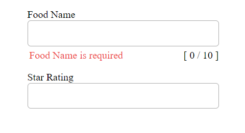
You can do it by providing `maxLengthCoung` input to the `<c-form-error>` element.
```html
<c-form-error [maxLengthCount]="25">
<label cLabel class="required">Food Name</label>
<input class="form-control" formControlName="foodName" />
</c-form-error>
```
> Unfortunately, currently I haven't found a way to use the `maxLengthCount` provided in the form validators. So we need to pass the it manually.
<br/>
<div id='scenarios'></div>
### Handling different scenarios
<br>
**1. What if we have a message for `required` in the config but we want different error message.**
- We can provide input to the `<c-form-element>` directly.
```html
<c-form-error required="I want this error message not the one in config.">
</c-form-error>
```
**2. Can we not show error message in the UI although error message is there in config file, but only want to use maxLength Indicator.**
- Well in this case we can set the errorMessage we don't want to show to null.
```html
<c-form-error [required]="null" [maxLength]="null" [maxLengthCount]="25">
</c-form-error>
```
**3. What if we want to use different config file for different modules?**
- We can provide two types of config.
- One on the root level. That need to be on the topmost level of you module tree. It's better to place in your `app.module.ts`.
It uses the syntax `NgxCustomFormErrorModule.rootConfig(<IErrorConfig>{...})`
- If you want to use different config in in any other module, you can use the syntax `NgxCustomFormErrorModule.childConfig(<IErrorConfig>{...})`.
What this will do is override the root config. You can override one or all config in root config.
**4. Styilng you should be aware of.**
- Let's see an examble below
```html
<div class="form-field">
<label cLabel></label>
<input formControlName="name" />
</div>
```
```css
.form-field > label {
...;
}
.form-field > input {
...;
}
```
If you are using these type of selectors with immediate child, you will be in trouble while using `<c-form-error>` tag.
```html
<div class="form-field">
<c-form-error>
<label cLabel></label>
<input formControlName="name" />
</c-form-error>
</div>
```
Now, those selectors no longer work as `label` and `input` are not immediate child of `.form-field`
So you need to change style to
```css
.form-field label {
...;
}
.form-field input {
...;
}
```
**5. What if we want to add \* sign inside label tag to show it is required**
Let's see the scenario
```html
<c-form-error>
<label cLabel>Food Name <span class="required">*</span></label>
...
</c-form-error>
<style>
.required {
color: red;
}
</style>
```
- **Solutions**
- As we know, we can also pass `label` as input to the `<c-form-error>` tag. So don't use `cLabel` directive altogether.
- In case of `cLabel` directive, it takes innerText of the element that has this directive,
so you can create another `span` tag for the `Food name` and use `cLabel` tag there
```html
<c-form-error>
<label><span cLabel>Food Name</span> <span class="required">*</span></label>
...
</c-form-error>
```
- The **best option** is not to use extra markup for just a `red star` use `css` with `pseudo` selector instead.
```html
<c-form-error>
<label cLabel class="required">Food Name</label>
...
</c-form-error>
<style>
.required::after {
content: "*";
color: red;
}
</style>
```
<div id='full-config'></div>
### Full Global Config Example
You can use the config below and update as per your requirement.
```ts
NgxCustomFormErrorModule.rootConfig(<IErrorConfig>{
onTouchedOnly: true,
errorTextColor: 'var(--text-danger)',
addErrorClassToElement: true,
errorClass: 'control-error',
email: 'Please enter a valid email',
required: (label: string) => `${label ?? 'It'} is required`,
pattern: (label: string) => `${label ?? 'It'} doesn't match required pattern.`,
minLength: (label: string, data: { requiredLength: number; }) => `${label ?? 'It'} should contain at least ${data.requiredLength} characters.`,
maxLength: (label: string, data: { requiredLength: number; }) => `${label ?? 'It'} cannot exceed more than ${data?.requiredLength} characters.`,
min: (label: string, data: { min: number; }) => `${label ?? 'It'} should be greater than ${data.min}.`,
max: (label: string, data: { max: number; }) => `${label ?? 'It'} cannot be greater than ${data?.max}.`,
}),
```