ng2-color-picker
Version:
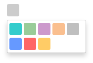
Simple color picker for Angular 2
83 lines (56 loc) • 2.85 kB
Markdown
[](https://badge.fury.io/js/ng2-color-picker) [](https://opensource.org/licenses/mit-license.php) [](https://www.versioneye.com/nodejs/ng2-color-picker/0.1.12) [](https://travis-ci.org/AndyMeps/ng2-color-picker)
[](https://nodei.co/npm/ng2-color-picker/)
# ng2-color-picker
Simple color picker for Angular 2
## Dependencies
The module relies on `ngx-bootstrap` for dropdown functionality.
## Installation
To include in your project install via NPM with:
```
npm install --save ng2-color-picker
```
You will then need to include the module to your app.module.ts:
```typescript
import { ColorPickerModule } from 'ng2-color-picker';
// ...
@NgModule({
imports: [
ColorPickerModule
]
})
///...
```
Finally, include the component in your HTML as per the next section.
## HTML Component Markup
Once the module is installed, you will need to add HTML markup to include the picker in a component.
The minimum requirement is an `[(ngModel)]` attribute, which should provide a string representation of a color, and an `[availableColors]` attribute, which should provide a `string[]` of available colors.
```html
<color-picker
[(ngModel)]="color"
[availableColors]="availableColors">
</color-picker>
```
It is possible to configure `ng2-color-picker` by providing a configuration object to the `[pickerConfig]` attribute (see the next section for more details on this object):
```html
<color-picker
[(ngModel)]="color"
[availableColors]="availableColors"
[pickerConfig]="pickerOptions">
</color-picker>
```
## Configuration
`ng2-color-picker` exposes an interface to provide an indication of valid configuration properties, this can be referenced as a type for your configuration object by importing it:
```typescript
import { IColorPickerConfiguration } from 'ng2-color-picker';
```
Which can then be used as the configuration object type in your component:
```typescript
public pickerOptions: IColorPickerConfiguration;
```
Current list of configuration options, types and default values:
| Property | Type | Default | Description. |
| -------- | ---- | ------- | ------------ |
| width | `number` | 25 | Width of the picker control. |
| height | `number` | 25 | Height of the picker control. |
| borderRadius | `number` | 4 | Radius of the picker control border. |