ng-toast-stack
Version:
Beautiful & easy to use toast stack messages, having auto close, pause, resume functionality and customization.
129 lines (100 loc) • 4.39 kB
Markdown
# ng-toast-stack
An Angular module for **beautiful & easy to use toast stack messages**, having auto close, pause, resume functionality and complete customization ability...
## Installation
NPM:
```
npm i ng-toast-stack
```
## Importing in project
**Step 1**
-- Import **NgToastStackModule** in the module you want to use it, For e.g, in *app.module.ts*
```js
import { BrowserAnimationsModule } from '/platform-browser/animations';
import { NgToastStackModule } from 'ng-toast-stack';
({
...
imports: [
...
BrowserAnimationsModule,
NgToastStackModule
],
...
})
export class AppModule { }
```
**NOTE**- You'll need to import *BrowserAnimationsModule* in module you are using *ng-toast-stack* to have smooth animations.
**Step 2**
-- Add `<ng-toast-stack></ng-toast-stack>` on top of root component of the module you have imported *NgToastStackModule* in, for e.g. in *app.component.html*
-- This component is used to display toast notifications
```html
<ng-toast-stack></ng-toast-stack>
...
```
**NOTE**- The default *z-index* value is *1000* to show toast notification on top of everything on the page. To override, you can modify its class.
## Usage
To push toast notification from any component, you need to inject *NgToastStackService* in that component's .ts file, for e.g. app.component.ts and then you may call it from html or component file depending on your need.
```js
import { Component } from '/core';
import { NgToastStackService } from 'ng-toast-stack';
({
selector: 'app-root',
templateUrl: './app.component.html',
styleUrls: ['./app.component.css']
})
export class AppComponent {
...
constructor(private toast: NgToastStackService) {}
// To access toast in html file, set it to public instead of private
...
}
```
## Example
**-- SIMPLE WAY:**
Pass your message as string as argument
```js
example() {
this.toast.push('Example toast message')
}
```
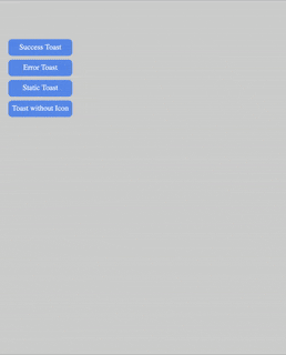
**-- SUCCESS:**
```js
this.toast.success('Example toast message')
```
**-- ERROR:**
```js
this.toast.error('Example toast message')
```
**-- STATIC:** (Doesn't closes automatically)
```js
this.toast.static('Example toast message')
```
**-- WITH CUSTOM OPTIONS:**
Pass object with atleast **msg** property as argument
```js
example(){
this.toast.push({
title: 'Example Toast' // title of the toast
msg: 'This is Toast message that will be displayed', // message of the toast
type: 'error', // type of toast
autoCloseTimer:6000, // closes after 6 seconds
})
}
```
**NOTE**- Only **msg** property must be sent to show toast message. Other properties have default values set (see table).
## TOAST OPTIONS
`msg` property is required
### Keys
| Name | Type | Default | Possible Values | Description |
| ----------------- | ------- | ------- | ----------------- | ----------------------------------------------------------------------------- |
| `type` | string | success | success / error | This is the type of toast notification, the Icon is shown based on type. |
| `title` | string | Success | - | Title of the toast notification. |
| `msg` | string | - | - | Message of the toast notification. |
| `autoClose` | boolean | true | true / false | If false, toast will not close automatically. |
| `autoCloseTimer` | number | 5000 | - | The duration after which toast should be closed. |
| `pauseOnHover` | boolean | true | true / false | If false, toast timer will not get paused on mouse-over event. |
## CREDITS
I would like to share credits for icon and design inspiration.
-- The toast notification and complete design is inspired by one of **Tailwindcss UI** official tutorial on youtube.
-- The Error notification icon is used from **hero icons**
-- The animated Success icon was searched from google. but I'm unable to find the actual author. If you are the real author of Success icon svg please let me know, I'll update.